Feeds:
Posts
Comments

Archive for the ‘Way out Creativity’ Category

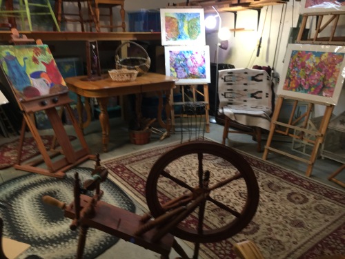
Almost a year — and what a year! I had decided never to blog again, as I so love NOT having to sit at my computer, when I have so many fun hands-on things to do. But in recent days, a current issue surfaced that I simply had to address or I would not have been able to live with myself. Yesterday, I posted that issue on my NORTHERN REFLECTIONS blog. Today, because an art blog is the most fun of all, I am hereback again.

Ever since I can recall, I have been besotted with leaves–especially those that drift from the trees in autumn. As a child, I colored fresh-fallen moist leaves with my crayons, and then pressed the colored leaves onto white cloth with a hot iron. For decades I have been gathering the perfect specimens of autumn bounty, and drying them beneath pages of heavy books. In recent years, I have made collages with these dried leaves on gallery wrap canvas panels, adding acrylic paints and a final fixative before hanging on the wall..

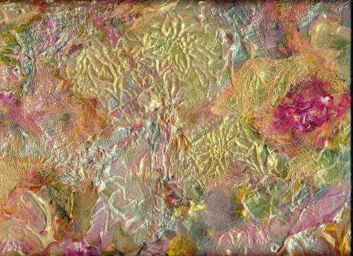
So for me, leaf art is nothing new. But this last fall, I was tardy in my gathering. By the time I was rustling and crunching around in the fallen leaves they were mainly dried, curled, and FRACTURED. Thus the idea of “Fractured Leaf Art” was hatched. The results were so intriguing, so nurturing to my voracious appetite for the abstract that I may never look back!

There are no two Fractured Leaf Paintings alike. And the process is so basic that any six-year-old, given the need for patience between stages, can produce a painting to be proud of. Since I have many young people in my family, I am eager and excited to share THE PROCESS!

I quickly discovered that the best Fractured Leaf Paintings (in my opinion) are achieved on Yupo Paper–that odd, shiny surface that is not paper but rather a “poly . . . . something”, in other words a kind of plastic. I spray the Yupo with clear water, and then spread 2 or 3 watercolors of my choice randomly around the surface, tilting the piece and causing the colors to merge. Then I press the fractured leaves or pieces of leaves onto the wet paint–again randomly. To this beginning I sporadically add more paint colors and salt, and press plastic food wrap (like Saran) over the entire surface. With my fingers, I crinkle and bunch up the food wrap, creating bubbles, creases, and a myriad of lines. This whole bit gets weighted down with heavy books, jars of brushes, or anything else with heft.

After a couple of days, I tentatively remove the food wrap to see if the surface is dry. Obviously Yupo takes longer to dry than normal watercolor paper, because the Yupo is not absorbent. When everything is really dry, I remove the leaves and scrape off the salt with an old credit card. Voila! Fractured Leaf Art.

At this point the painting may need a little tweaking, perhaps some more paint or the emphasis of a few lines or branches along the creases made by the food wrap.* Or the piece may be gorgeous as is. In the above pictured painting, I did not tweak. To me the painting was just right in its natural state, and realizing my tendency to overwork my art I decided to add no more.

Always, when using Yupo I spray the work with an acrylic fixative. While not striving for museums, I do want my art to last for at least a couple of lifetimes.

So you might have a go at Fractured Leaf Art. I definitely live in a four season zone. (Wisconsin: Spring, Summer, Autumn, and Winter/Winter/Winter.) Different locales have different trees, and it would be fun to expand my leaf knowledge. Perhaps my Florida family members will bring me some palm leaves.

Margaret L. Been — January 14, 2021

*When adding branches or lines, I have discovered a trick of using a DERWENT INKTENSE PENCIL which has been dampened, rather than a paint brush. The damp ink pencil adds a soft, blurry line rather than a harsh one. I favor organic as opposed to the popular geometric style of abstract art.

**An excellent Austrian fine artist does amazing paintings using all kinds of wild materials gleaned from her nature hikes. You can check out this mixed media artist and her books by GOOGLING her name, Waltraud Nawratil. You will not be disappointed.

Read Full Post »

Waiting for spring. Meanwhile, ideas keep surging through my head. Art concepts are ever stretching.

Since Joe and I no longer need a vehicle, we gave our well-used Honda van to a grandson who is a seminarian at a local theological center, and his wife and two year old daughter—whose name happens to be, believe it or not, Margaret Been.

A garage only has to sit empty (except for all the garden and home maintenance junk lining the walls) for a couple of days before brain seeds sprout. An outdoor room! An outdoor studio for art making and spinning gorgeous fibers into yarn. A place where kindred souls can visit, and neighbors can pause. Ever stretching!

This IS Wisconsin, which means the feasibility of enjoying a garage room is limited to the three summer months (given reasonable summer weather) and a few days at each end of the spectrum (given some surprise weather in spring and fall).

We put a small mock fireplace in the room. The decorative fireplace uses one light bulb to simulate burning logs, and a fan to blow a bit of hot air when desired—mainly for ambience, and not sufficient to handle our weather in a garage. (Indoors maybe!)

But dreams persist. Every day I linger for a few moments in this bit of summer heaven, just dreaming and thinking about family members and friends whom I will invite for art and fiber days.

I have two permanent art-making corners indoors, and I produce in these studios non-stop. Two spinning wheels, plus baskets of merino and silk in a riot of colors whirl constantly in our living room where the resulting skeins of yarn dangle from hooks and surfaces.

Art displays, a table on which to work, an area for storing brushes, paints, papers and additional art tools, another spinning wheel, and a (possible) lifetime supply of additional fibers join me in anticipating warm weather in the garage room.

My art goals are ever stretching as well—including a return to collage art between actual paintings. A few years back, I did a lot of collages from random materials and whatever abstract inspiration blossomed moment by moment.

Collages differ just as every artist is unique. Some are decidedly geometric; some feature words, photos, images of people and buildings, or symbols such as numbers. Others are more organic, kind of like an unkempt garden of color and flowing shapes. Or a messy landscape with tangled trees or turbulent seas. And mountains, plenty of mountains.

The materials are legion: gorgeous Oriental papers—Kozo, Mulberry and Rice Papers, and Japanese Lace; common old cheesecloth, tissue paper, and gauze; aluminum foil; ribbons, greeting cards, pieces of musical scores, and decorative gift wraps; wool fleece, yarn, string, and bits of fabric; seasonal and party napkins—with the backing papers torn off so the napkin design is translucent and delicate; acrylic and gouache paints—metallic and otherwise; dried leaves, flowers, twigs, and herbs; templates and stencils; poems; torn up bits of my paintings that didn’t impress me very much—-yet didn’t warrant the trash bin. Some of my kitty Louie’s fur from his grooming brush—with Louie’s permission of course!

And mediums: molding paste, gloss, matt, sand, glitter gel, gesso, bead gel, crackle gel, YES paste (although anything acrylic such as the above listed mediums plus acrylic paint acts as a glue).

Above is a sample of my collage art from a few years ago. It reminds me of some favorite things, and still hangs in our living room.

And finally, a collage of various paints and textured mediums.

Maybe our new summer garage room will facilitate the creation of more way out art! Meanwhile, Happy Stretching

Margaret L. Been — April 3rd, 2020

Read Full Post »

There are days when we want to paint, but do not know what! Times of desire and determination, but no actual inspiration.

That is most apt to happen to me during the winter months, “winter” meaning Wisconsin—where I am not inclined to wander around outdoors in the sub freezing and sometimes sub zero weather—-whereas in spring, summer, and autumn I spend considerable time outdoors. Since most of my inspiration comes from nature . . . well you can complete the thought!

Unlike many Wisconsin people, I am a winter wimp—contented to enjoy the beautiful snowy views from our cozy home rather than on skis, or in an ice fishing shack on a frigid lake.

Of course there is always nature outside our windows, at the bird feeders and across a quiet park to a forest and prairie preserve. But there are still times without a specific subject in mind for painting! And this year the snow and cold came early to our Badger State*. Like in October.

On days without a subject in mind, I simply spray my paper, dab on some colors and let them rip—tipping and bending the paper to see what the paint will do. In the above case, I DID use a brush to create kind of a bowl shape—thinking perhaps the paint (plus a bit of India ink) would decide to make a still life. But that is ALL I did—except to jiggle the paper and then press plastic food wrap over the surface while the colors were still wet.

The next day, when I removed the plastic, I was astonished. There was the face and partial body of a kitty. The colors and plastic wrap had produced a kitty! This is especially amazing to me because ever since last March we have had the most wonderful feline pet—Louie—a precious gift to my husband and me, from one of our daughters.

Our Louie is not blue; he is a gorgeous gray and taupe tabby with black stripes and markings that match on each side of his body—like seams in a well tailored garment. But I have never been much concerned with realism in my art. And I do have a lot of photos of Louie, for realism!

Maybe there is something to our subconscious being involved in our art. But I’m satisfied to believe that the paint, covered with plastic wrap, did the job! Maybe some of you viewers see a canine friend in the rendering, rather than our Louie. That’s okay. We’ve shared our hearts and space with many dogs, as well!

Margaret L. Been — November 12, 2019

*Possibly some readers may not know why Wisconsin is called the “Badger State”. Back in the 1800s, Cornish miners settled here, and mined lead and tin from the hills along the Wisconsin River. Before they built homes, the early miners slept in caves dug into the hills—like the animal badgers prevalent in the area.

Hence, we are Badgers, and proud of it—even though some Wisconsinites cause confusion by walking around with a foam facsimile of a wedge of cheese on their heads. MLB

Read Full Post »

An inventory of what I have done in my studio over the last year has proved a bit surprising—or maybe not!  For 8 months out of the 12, I have been gimped with ortho issues. A shoulder replacement in late 2017 had only just begun to heal when a hip kicked in saying, “Hey, it’s not fair. I want some of this attention.”

Two major hip surgeries later (the 1st, a total hip replacement and the 2nd, to repair a severely fractured femur with screws, metal hooks, and wires that make me think of civil engineered bridge construction) I am still hobbling and spending much of the time off my feet.

For several weeks it was 1 leg only, to navigate this “kid in an old body” to and from a cozy living room couch (my 24/7 hangout) to a bathroom (about 5 yards away), my piano right behind my couch, and an extra art studio which my wonderful husband set up for me at the nearby end of our dining room table.

Books, limited piano practice which—although done sitting down—wore me out, my French tutorial apps and a Public Television app on my I-pad (I re-watched the entire DOWNTON ABBEY), serial-shopping on Amazon (FUN/FUN/FUN!), Van Cliburn and other geniuses streaming through my devices into our fine speakers day and night (1 of which speakers was conveniently located beside my ear on my 24/7 couch), my knitting (how many cowls does anyone need?), and ART made up my life for much of 2018.

Who needs to cook, scrub floors, vacuum, and dust anyway?

I normally avoid medical discussions except with those professionals to whom Medicare is paying me to complain, but the above diatribe is to demonstrate how life can be a lot of fun under rather strange circumstances! And how art can thrive, when pain and disability prevail. One’s pain can literally be “drowned” in paint, especially the wet into wet method of working which I prefer.

Anyway, my inventory yielded a surprising 35 paintings that I actually like. (There are always the “duds” which get stashed on a shelf for possible reworking or salvaging parts; or sometimes they are so outrageous that I trash them.)

The keepers range from (3) 20″ x 24″ biggies, a 16″ x 20″, a handful of 11″ x 14″ renderings, and a preponderance of 12″ x 16″ paintings—obviously my favorite size. The paintings are predominately woodland scenes and funky individual trees—with a smattering of flowers, a sailboat in trouble, some landscapes with distant castles, a still life (my least favorite), and a huge, totally abstract on Yupo Paper which I LOVE most of all.

Although my inventory preferences are not exactly written in the proverbial stone, they are indicative—and it was fun reviewing a year of art making, body disability notwithstanding.

The year’s earnings amounted to $700.00 which constituted a donation to, and sale at, our local art group’s annual fundraiser. My dislike of office type stuff is such that I can find no record of which paintings I donated. I believe they were “masterpieces” from former years.

Also, I give paintings to interested friends and family members. As with club donations, my right hand (very happily) does not know what my left hand is doing.

I share many of my favorites via prints glued to notecards, thus bragging about my art while facilitating my passion for writing actual letters as opposed to emails.

Above are the end of 2018 renderings, hardly even dry when I photographed them with my I-phone camera. They tend to make me think of Spring, and they are my HAPPY NEW YEAR to you!

Margaret L. Been, December 31st, 2018

Read Full Post »

CS2.JPG

CS3.JPG

CS4

cs11.jpg

cs5.jpg

British fine artist Ann Blockley advocates picking an art subject about which one is passionate, and then building a file of photos, sketches, word descriptions, etc. dealing with the topic.  Eventually this resource will continue to seep in and ultimately create significant art.

I love the concept of building the resource file.  One subject very dear to me, a place where I spent some beautiful university and early marriage years, is the state of Colorado,  So I have been building a file of pleasant memories, focusing on that drop dead gorgeous part of the USA.

Specifically prominent in my memory is the environs of Colorado Springs and Manitou Springs—where my husband, our first child Laura, and I lived in 1956.  Our home was four rows of cottages up from Canyon Avenue on a foothill looming over stately Victorian mansions, where the wealthy of the late 1800s and early 1900s gathered to drink the allegedly-healthful waters of Manitou Springs.

In 1956, Colorado Springs was a sleepy Southwestern town of about 27,000 people—only slightly disturbed by the presence of the military, of which my husband was a part at Fort Carson.  Construction of the Air Force Academy began about the time Joe left the army for civilian life, when we returned to our native Wisconsin.

When we lived in Manitou Springs we were a young family, and we had only a primitive box camera in our limited stash of possessions—plus just a bit of extra cash for buying film.  I have only a few snapshots from that era, and naturally they are closeups of Laura—our darling first child.

So to resurrect the familiar scenic views of our neighborhood, I resorted to GOOGLE, and “he/she/or it” referred me to everything I could recall and more—views of Williams Canyon, The Cave of the Winds, the charming adobe houses and motels along Colorado Avenue in Old Colorado City, and of course The Garden of the Gods which we could see from our high-on-a-foothill bathroom window in Manitou Springs.

I printed out a stack of the online photos for my file, and added a string of my own sketches, rough watercolor and colored pencil renderings, plus word impressions—samples of which are pictured above.

The above drawing of a building is noteworthy—not my crude sketch but the history of the Colorado Springs area landmark, a mini castle called Glen Eyrie.  Glen Eyrie was built in 1871 by General William Jackson Palmer—the founder of Colorado Springs.  “The Glen”, as the castle is frequently called, is set on 750 acres.  There are 97 rooms of scenic Old World ambience, now tastefully refurbished with every modern convenience.

I recall this building to be dark and mysterious in 1956, and I always wondered about it when we drove by.  Whether or not refurbishing by new owners as of 1953 had begun when we lived in the neighborhood of The Glen, I cannot recall.

But if you GOOGLE “Glen Eyrie” as it is today, as well as it was before remodeling, you will see an amazing transformation in keeping with the castle’s Old World charm.  The “new owners of 1953” were and still are a Christian Campus and Community Ministry, THE NAVIGATORS* with a combined emphasis on evangelism and Biblical discipleship.

Glen Eyrie serves as a year-round NAVIGATORS’ conference center, especially meaningful to me as two of our six children were successfully “navigated” through the University of Wisconsin system via the NAVIGATORS.  Both our son, Karl, and daughter, Martina, have spent fruitful times at Glen Eyrie.

Thus my art file is building.  I am still waiting for some fantastic art to emerge, but oh what fun anyway!  Thank you, Ann Blockley.

Meanwhile, since all of Colorado and New Mexico are special to me, I do have a backlog of paintings inspired by vacations in those states.  Come along and see for yourself.


Remaining Days 1.jpg

And more!

Margaret L. Been — November 14th, 2018

*THE NAVIGATORS MINISTRY was founded by an evangelist, Dawson Trotman (1906-1956).  Trotman died while rescuing a young girl from drowning in a water-skiing accident, in New York State.  Since then, the ministry which Dawson Trotman began has resonated world-wide.  The Navigators Ministry has been used by God to save countless individuals from spiritual drowning. 

A beautiful picture of the truth of Psalm 116:15, “Precious in the sight of the Lord is the death of His saints.”

Read Full Post »

Acrylic2

Back after a long hiatus—time enough for a new hip, a lazy summer, and plenty of physical therapy.  But artmaking was a huge part of the therapy.  Standing is easier for me than sitting, no matter what.  And regardless of whatever this body is up to, if I can create something I am a happy woman!

Above is a 20″ x 24″ painting that should be titled, “Love/Hate”.  Being a bit vociferous about opinions, I have long claimed that I hate acrylics.  They have seemed so fake appearing and stupid to me—stubborn, inflexible, hard to shove around, incapable of producing those wonderful watercolor “cauliflowers”, and totally lacking in subtlety.  Especially when gouache can do the job of building depth and texture, although gouache needs to be preserved with glass or an acrylic (there is that word!) fixative–and acrylic paint needs only itself for permanence.

Then, amazingly, I came across books and a DVD by a new-to-me British artist:  Soraya French who has painted in most all media, but absolutely LOVES acrylics.  The material struck me as somewhere out there, to begin with.  But after reading, re-reading, viewing, and reviewing, “somewhere out there” closed in on me.  Soraya French has pried open my closed mind.

I recently completed “Love/Hate” and still was not sure which it was:  love or hate.  The piece went through many mutations, layer upon layer, changes of theme and subject matter, as well as variations of color dominance.  But hey, that’s acrylics:  layer upon layer.

While the painting was at its final stage of dampness, I truly thought it was tacky—like something one might win at the county fair for knocking off a row of mechanical ducks.  But suddenly the piece was dry and it took on a whole new life.  I kept staring at it, as it penetrated my psyche.  Hate disappeared, and Love became at least a “Like”.  The painting is now hanging in our dining room.

Love/Hate has a new name.  My original idea was to suggest autumn foliage.  The foliage changed to bare branches for winter, sailboat masts on a stormy sea, finally returning to the tree motif—but with an attitude more like spring than autumn.  So the new title is “An Autumn That Looks Like Spring”.  Fitting, as we have had a gloriously warm/hot September, and today is once again in the high 70s.

For me, trees are like lilies and haystacks to Monet—although repetition is where the comparison ends between Claude and me.  Rather ridiculous to mention the two of us in the same sentence.  But I am as genuinely obsessed with trees, as Monet was smitten with his favorite subjects.

Over the summer and my surgery-recovery-period I did some more trees, with a focus on texture and application of mixed media along with watercolors and gouache:  soft pastels, hard pastels, oil pastels, India ink, Derwent Inktense Sticks, and water soluble crayons (all of artist quality as anything less would prove disappointing).  Here is some of that harvest of trees:

TT2.jpg

More Tree Textures 2

Oil Pastels.JPG 2.JPG

In closing, I urge you to check out Soraya French’s website.  Another inspiring British lady—who has re-opened the doors to individuality, personality, and freedom in art.

Whereas from around the turn of the 19th/20th century right up to a couple of decades ago, freedom of expression in art was “trendy” (almost a given), in recent years there has been a definite swing back to photo-realism:  creating recognizable art such as “The Old Village Bridge”, “Apple Farm”,  “Country Church”, or realistic city scenes.

In our Wisconsin neighborhood, a familiar scene is the church with three spires high on a rural hill.  The site is called, “Holy Hill”.  It has been painted realistically more times than I can imagine, and a rendering of Holy Hill is recognized by anyone who has been around here for any time at all.

Beautiful!  Such art requires great skill, and deserves its place of respect.  But it is not, generally speaking, the art I desire to have much of on my walls.  More and more, I am drawn to mystery, unanswered questions, and the energy of abstraction–or semi-abstraction with a touch of realism, all with a focus on being as beautiful as possible.

In the arts, I see no value in trying to reproduce the ugliness of much of the world.  Art is a precious commodity, a timeless gift in keeping with great music and poetry—bestowed upon us to lift our souls.  Yes, we can and should portray all of life in terms of great sadness and poignancy as well as great joy; but the means of portrayal can be beautiful and the message behind the means, one of hope and anticipation of a better world.

Isn’t that why our Creator God has allowed us to reflect a token of His creativity, by making things with the gifts and resources He has provided for us—that we might in some tiny way attempt to fashion a better world?

Margaret L. Been  —  October 3, 2018

Read Full Post »

Growing more and more enamored with abstraction, especially that which is soft-edged, flowing, and organic as opposed to geometric, hard-edged, and harsh, I was tremendously pleased with the above 24″ x 20″ rendering—so pleased that I framed it and the mysterious painting is hanging high in our living room, brightening up the entire wall.

When I study the painting, I imagine different scenarios:  a moonlit swamp; a campfire; the triumph of light over darkness and joy over sorrow; the vicissitudes of a long life on earth.  The print which you see does not do justice to the colors therein; they vibrate and rock.  Recently, the “vibrate and rock” appealed to a seven year old great-grandson/friend who came for a visit and art making.

“I want to do one like that,” Deacon decided after studying my various paintings on our walls.  Then he excited me up to my earlobes by saying, “I like the way the colors run together.”  Do I have a kindred soul here, or what?

Deacon proceeded to create his own mystery painting.  He learned that simply painting color over color with a loaded brush creates blackish-brownish mud, which I praised and applauded because children’s art is ALWAYS wonderful.  Then I showed him how gently introducing colors to different areas of wet paper, while jiggling the paper to let the wet colors mingle, causes mysterious marks never to be reproduced in the exact same way.

There wasn’t time to introduce salt and plastic wrap which add texture to a painting, but hey—we quit art making in order to fly kites with Deacon’s great-grandfather (my Joe) in the park outside our front door.  Kites are important, and highly symbolic of our free and funky Boho lifestyle.

My, aren’t we full of metaphors and similes today!?!  Having written poetry most of my life (since I could first wield a pencil or pen), I tend to think in metaphors and similes.  They are everywhere and—like paintings and kites—the colorful ones are the most fun! 🙂

Margaret L. Been  —  May 2nd, 2018

Read Full Post »

Ice Tea again

It is often said that artists can create the world the way they wish it would be!  This may be true of most of the arts, and many crafts as well—where one is fashioning beauty from ashes—or victory in the midst of something that seems like defeat.  In my poetry, I have often featured the presence of light in apparently dark circumstances.

Without getting more ponderous, when indeed my mood is upbeat as I share with you, the above painting is the world the way I’m eager to experience it—and will in a few weeks.  Having lived in Wisconsin for all but three of my eighty-four years, I should know (and do!) that April in my home state is not like “April in Paris”.

Sometimes we get teased a bit with warm splashes, and these are meant to be savored but not viewed as the permanent seasonal weather change.  Meanwhile, we can paint (sing, write, dance) whatever weather we want—thereby creating our own reality:  our own private world.  A case in point is this painting, titled “Ice Tea Again”, reflecting a pastime which is HUGE in my estimation:  drinking ice tea on our patio beside our pretty little patio garden, while watching the birds and chipmunks that enjoy the hospitality of our feeders.

I have done many ice tea type paintings, but this one is unique.  Were you to actually see the painting, now framed in a 16″ by 20″ softly gilded frame, you would probably observe that something new has been added:  touches of mixed medium accents which add texture and individuality to the piece.

At this moment two amazing British artists—Ann Blockley and Soraya French—are vitalizing, coaching, and inspiring me via books and (in Ann’s case) DVDs to experiment with mixed media.  So “extras” have been added to this watercolor and gouache rendering, including areas of enhanced color on and around the flower shapes made with hard pastel pencils and Derwent Inktense sticks.  The winding vines were formed by streaking India ink from a pipette and letting it ooze around on the damp paper.  You may notice the sketchy lines drawn by oil pastels* in areas alongside the vines.  And, as always, thick applications of gouache have covered a plethora of boo-boos.

The above-mentioned artists, and many others, stress the importance of playing with the mediums, learning what they can do and not worrying about the outcome.  JUST PLAY!  This really appeals to me after a rather dragged out autumn and winter beginning with the loss of my beloved corgi in October and adding a challenging shoulder replacement to the mix.  I intend to play, while drinking volumes of ice tea!

Included in the “play”, is the fact that I am diving into water soluble oils.  This is happening at my newly acquired hardwood easel.  The easel doesn’t work for watercolor painting, as there is not room enough in the bedroom studio to flatten out the surface.  But oils can be done on a tilt.  While watercolors, gouache, and mixed medium play happens at my dining room studio, oils are slowly drying and developing on the easel.

Margaret L Been — April 14th, 2008

*When I received my order from DICK BLICK of a beautiful, magenta colored wood box of 60 oil pastels (Van Gogh brand) I reverted to childhood.  I can’t express the wonder and joy of running my fingers over the surface of these sticks, marveling at the gorgeous color gradations.

Read Full Post »

Art Tools

Here are some more items in my bag of tricks.  Working down through the horizontals:  a large comb for making streaky marks*.  I also use a small, rat tail comb; a tooth brush for spattering wet paint; tongue compressors—I can’t recall where in the world I got those things but they are great for measuring and marking on those rare occasions when I use a pencil; a candle for creating areas of wax resist; a defunct credit card for scratching lines—making streaky grasses, etc; a knitting needle for making branches; and a jar lid mainly for making moons.  I have several different size jar lids.

The verticals are craft Q tips of which I found hundreds—I think a lifetime supply—at a church rummage sale years ago, and a Mr. Clean Magic Eraser which rubs out areas of paint for various effects.

Not pictured are masking tape for masking out trees or buildings in order to preserve the white paper while painting a background, facial tissue for dabbing out clouds in a wet sky wash, and probably some other odds and ends which momentarily escape me.

I have always been a pack rat (albeit a very well organized one) and it’s so much fun to have an ongoing excuse for packing stuff in!  Fortunately, I grew up with parents who let me have my own bit of Heaven in my childhood bedroom (probably because I was compulsively tidy); and for nearly 64 years I’ve been blessed with a husband who also enjoys being a pack rat.  It could be disastrous if we disagreed on what is important in life! 🙂  MLB

*One of my favorite artists whose books and DVDs I treasure, British artist Shirley Trevena, introduced me to the comb streaking trick.  Shirley’s still life watercolors are intriguing.  Shirley says what she aims for is “an incredibly messy painting with lots of drips and blobs”, and she demonstrates how she “destroys” a painting—often with a comb streaked through wet paint, blurring the colors.  Shirley’s “incredibly messy”, “destroyed” paintings are gorgeous—whereas when I try her tricks the results are often simply incredibly messy and destroyed.  Good grief!!!

Anyway, for a treat you can GOOGLE “Shirley Trevena, artist”.  You won’t be disappointed!  🙂

Read Full Post »

winter-sunrise-4-1

I often giggle when I think of what comes out of my studio in contrast to the work of gifted, well-schooled artists!  Highly skilled artists may be among the most generously-encouraging-to-beginners group of professionals on earth.  We all are included in a vastly diverse culture where there is a place for most anyone at any level and inclination.

But I have a library of art books—both “how to” tutorials by well-known artists, and tomes of art history and criticism.  I love to study these books, and I do know the difference between classic art and smoke and mirrors—my off-the-cuff “hashtag” for a bag of tricks which I am delighted to share with any beginner who is eager to paint and willing to spend hours each week, building an inventory of paintings in his or her studio.

My 12″ x 16″ rendering below is titled “Between a Rock and a Hard Place”, and it is composed of tricks that my seven-year-old great-grandsons could perform if they decided to sit or stand still long enough,  I began by slathering gesso on the 140# cold press paper to create rocky slopes.  After the gesso dried, I sprayed the surface with water and applied different watercolors—jiggling the paper so the paints could blend and do their own thing,  When those paints dried, I streaked a thinned application of white gouache here and there to add mystery and a sense of age to the rocks.  VoilĂ .  Smoke and mirrors.

A Rock and a Hard Place

The next example displays a couple of favorite tricks:  plastic wrap and salt.  (I use Kosher salt, but any will do—creating slightly varying effects).  The paper used here is Yupo, that glass-like surface which is not really paper, but rather an amalgamation of chemicals.  (There is no middle ground with Yupo.  Artists either love it or hate it.  The lovers are the “let it all hang out” group of which I am one, and the haters are the perfectionists who do well with lots of control.)

Where you see crinkles and wrinkles, that is where the plastic wrap was applied.  It takes a long time for the paint to dry under plastic wrap on Yupo, and less time on a rag surface which is absorbent.  The spots and phased-out parts were done with salt.  The salt technique is far more spectacular on rag paper than on Yupo.  The painting at the top of this page shows the result of salting the wet paint on rag paper.  Salt can make snowflakes, clouds, stars, dandelion fluff, and many additional effects,

Thus you can see that whenever art making is a person’s dream, it can be done.  And every dream will materialize differently—as each of us is unique.  What fun we can have, sharing our ways to implement the smoke and mirrors!  🙂

Smoke and Mirrors.JPG

Read Full Post »

Older Posts »