Feeds:
Posts
Comments

Archive for the ‘Way out Creativity’ Category

Fall Night - Copy

Six months since my last entry.  I always taught our 6 children that they should never feel pressured to make excuses.  Reasons, okay, but excuses are lame.  Just admit, “I didn’t do it, make it, remember it, whatever.”

My only reason for not sitting down to my computer would be a feeble excuse:  I don’t like to have to stay indoors in the summer.  Well that doesn’t fly:  1) I could take my laptop outdoors; 2) I could blog on my I-pad; 3) Even in the summer there is some indoor weather in Wisconsin; and 4) Summer of 2017 is long gone.

All such flim-flam aside, here I am:  getting ready to celebrate the miraculous birth of our Lord with a wonderful big family.  (There are momentarily 53 of us, and number 54 is due today to come out, to meet the tribe.  She is our 19th great-grandchild, already named as of her 1st ultra-sound—“Margaret Rose” after her 2 paternal great-grandmas, of them being “moi”.  How wonderful is THAT!)

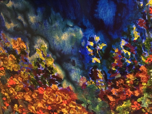
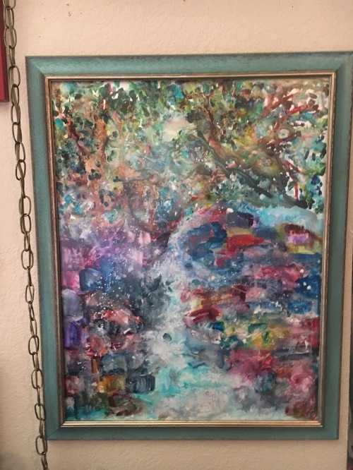
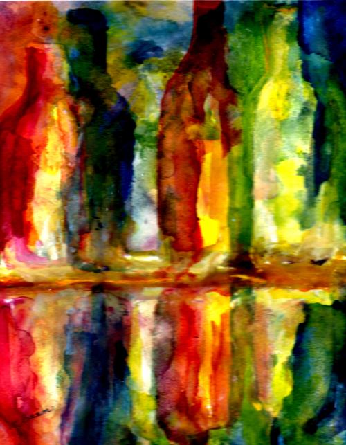
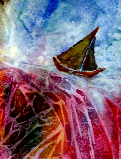
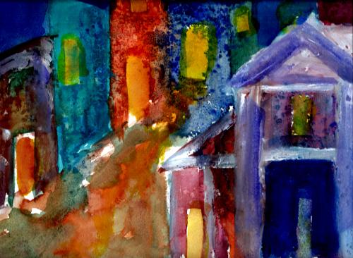
And here is some art, “Autumn Garden at Night”.  ⇑  The piece is gouache on a gallerywrap canvas, and it comes with poignant memories.  Beginning last March, our precious Pembroke Welsh Corgi, Dylan, started to decline.  He need to be taken out many times in a 24 hour period, so—like Robert Frost—I became very “acquainted with the night”.

March, April, and May nights were blustery, damp, and cold—but summer and early autumn were lovely.  Dylan and I, attached at the hip since Joe and I brought him home from a farm in Iowa in early 2004, had countless precious nocturnal jaunts in our quiet courtyard lit by the patio light and the rosy solar lights in my gardens.  Hence the above rendering.

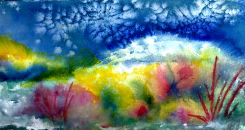
Our Denver son, Karl, would like this painting and it will be his as soon as I find a way to get it to him, hopefully barring UPS or Priority Mail.  But I am happy to have the picture in my computer, and on prints which I can share.  Dylan died peacefully in my arms on October 16th.  I think he had that famous corgi smile on his face right up to his last sigh.

Meanwhile, I worship a Living Savior and praise Him for LIFE—for people to love and “all creatures great and small”.  May God bless you and your families with a beautiful holiday season—wherever, and whomever you are.

Margaret L. Been — 12/18/17

Read Full Post »

Heading Home for Good.jpg

I doubt there is any middle ground with Yupo paper.  One either loves it or hates it.  The “haters” are those artists who demand control of their paints, and always work with an unflappable agenda in mind.  These folks create beautiful works of abject realism, and often artists of palpable realism are highly trained and amazingly gifted—especially if they achieve high end realism in watercolors.  Everyone knows that chasing watercolors is a bit like herding cats.

I am neither highly trained nor amazingly gifted, and fortunately the art I love the most does not fall in the category of abject realism.  My favorite artists, the French Impressionists, Post Impressionists, Les Fauves, etc. who worked largely in oils were realistic to a degree, but always with an intensely personal voice.  For anything other than “personal voice” I would use a camera—and for me, that wouldn’t be half as much fun as getting out the Yupo and letting the paints fly hither and thither.

Last week my good friend and fellow artist, Vikki, and I shared an art day at our dining room table.  We began on Yupo.  My rendering was, for starters, terribly generic and dreadfully similar to stacks of other paintings I’ve done:  tree – space – tree – space;  leaves and blossoms on tree – space – etc; and plomp – plomp – plomp – ad nauseum.

Now I detest—and desire to always eschew—the plagiarizing of any thing or any person, including myself.  So that night I looked over this Yupo thingy, almost upchucked, sprayed it with my trusty water bottle, pressed plastic clingy food wrap onto the entire surface, and went to bed.

The next day I removed the cling film and VOILÀ!  Something I could further develop and live with:  the suggestion of a Viking ship* with sails, and lots of turbulence all over the place.  So much better than plomp – plomp – plomp!

I added delineation and definition via gouache to the vessel and its surrounding sky and water—leaving a plethora of confusion, color, and turbulence in the sails as if the depicted journey was, like many of life’s journeys, fraught with distractions, dead-ends, and disasters.

However I am always a positive-note person, so then I named the piece:  “Heading for Home the Last Time”—reflecting my blessed assurance in a glorious destination through it all, and eternal joy in the presence of my Lord Jesus.

Margaret L. Been, May 2017

*Because this painting is matted and framed to 12″ x 16″, it was too large to entirely fit in my scanner.  Thus the ends of the ship do not completely show on the print.  The original in its full size is more representative of an actual Viking ship.  Since my husband is descended from Vikings, and loves ships, I wanted to be somewhat realistic.  🙂

Read Full Post »

Here is a bold venture:  a painting which turned out to be too large for the ready-made frames at our local craft stores.  I had grabbed an entire sheet of Yupo® and had a blast, painting and thinking I would crop the finished work to fit a 24″ x 20″ frame which I had on hand.  But I was pleased with the entire piece, and couldn’t figure out where, if any, I wanted to sacrifice part of it.

A brainy idea:  custom framing.  This is pricey indeed, and I will not do it very often.  But the result is satisfying.  Below you can see The Big One on a living room wall:

Wall 2

AW.JPG

Many layers of gouache were piled onto this painting, over washes of watercolor.  Actually called “Waterfall”, this rendering evokes memories of a real waterfall we had on our 14 plus acres up north, where we lived full time for eight years.

Our land bordered on two roads, one up and one down a hill.  Our home was on the downhill road, next to a lake.  In the spring, snow and ice melted from the above road and roared downhill to our back yard, over boulders and brush.  The sound was stirring, and so loud that it resonated through closed windows.  In the summer, the waterfall morphed into a trickling downhill creek—always refreshing to sit beside on one of the big boulders.

How beautiful to have mellow memories, and then to paint them (and have them framed)!

Margaret L. Been — April, 2017

NOTE:  Obviously I couldn’t scan this painting on my home scanner, so I photographed it with my cell phone.  Because the piece was framed with non-glare glass I could do that.  But I failed to get the entire bit into the top photo.  In the shot of the painting on the wall with its surrounding environment, you get a better idea of how the waterfall fans out at its base.

Read Full Post »

under

far-out

No, I haven’t been lazy since the last entry.  But most recent renderings have been too large to put through my scanner—like 16″ x 20″ and 20″ x 24″.  Large paintings can be photographed, but that never works for me as well as a scan.

Featured above are a couple of little guys that I’ve sandwiched in between the biggies.  In the top painting, the watery effect was achieved with thinned white gouache drifted randomly over the rocks.  The second painting was experimental, with lots of goopy gesso topped with acrylic bead gel.  When the gesso and gel were thoroughly dry, paint was added to drizzle and drip on the textured ground.

Meanwhile, I currently have a hole in my head.  Maybe that’s not so funny as it sounds, but HEY!  Let’s laugh.  Arthritis is the creator of a one centimeter gap, causing (GOOGLE this one!) a diagnosis of Atlanto Axial Instability.  In plain talk, I’m a BOBBLEHEAD—the treatment of which, at this stage and perhaps in lieu of surgery, is a very fashionable neck/head brace fitted for me at our local Hanger Clinic.

The pleasant young man who fitted the brace commented that I have a long neck.  Then he chuckled when I shared that my maiden name is “Longenecker”.  I doubt very much that he caught the double entendre cached in my name; he is too young.  Had he fully grasped the joke, his chuckle might have been a guffaw.  Moreover, unless you readers have connections with the 1930s and 40s you may not realize that once upon a time the word “neck” was a verb as well as a noun—with “necking” being an active, enjoyable present participle!  🙂

Grammar and vintage fun aside, my brace is downright elegant.  With a red tint in my hair, I look something like Queen Elizabeth the First.  So what in the world does this stream of consciousness wandering have to do with art?  Namely, this:  for years I’ve painted standing up, with my head bending over a waist high table.  Now that I’m de-bobbled by a neck brace, this position is no longer comfortable.  When the head falls forward and down, I feel more like Elizabeth the First’s motherthe Unfortunate Anne.

I refuse to stop painting, so what to do?  Joe and I cuddled on the couch with my I-Pad, and scrolled down pages of standing easels.  Unanimously we concluded that spending an arm and a leg just to accommodate my compromised head would be stupid.

Then suddenly a light went on in said head:  my sturdy, adjustable music stand.  Although my violin retired from active duty years ago, the music stand has continually served in the capacity of displaying art.  Now the music stand has morphed into a standing easel.

Voila!  There’s always a way to make minor adjustments—even major ones when needed.  Life is GOOD!  🙂

music-stand

Margaret L. Been — November 20th, 2016

NOTE:  Happy Thanksgiving!

Read Full Post »

winter-sunrise-4-1

Like many Wisconsin children in the 1930s and 40s, I loved winter.  We would race home from school, scarf down some hot cocoa and cookies, put on a few extra layers, and go outside to build snow forts or bombard each other with snowballs.  In the depths of winter, it would be almost dark by the time we quit and went inside to hang our wet wool snowsuits on a steam radiator to dry.  (Oh, the aroma of wet wool heating up!)

I recall several occasions where I realized I was getting sick and could feel a fever rising in my body.  Thinking the outdoor cold would squelch the flu bug (or whatever),  I’d avoid mentioning how I felt to my very solicitous mother, and stay outside as long as I could stand my hot cheeks and shivering self before going indoors and allowing myself to be put to bed with hot lemonade and honey.

(“Sick” was no joke in pre-penicillin days when front doors of homes frequently sprouted warning signs such as:  Scarlet Fever, Diptheria, Measles, etc.  Children were put to bed when they had a fever, no matter what!)

What in the world does all this nostalgia have to do with THE MESSY PALETTE?  Simply this:  Now I am 83 years old and I no longer LOVE winter!  I have become a WUSS!  Granted, snow is beautiful.  In fact, I actually go out and tramp around in the first couple of snowfalls.  But in recent years winter has gotten old very fast.  By March, when I’ve wanted to peel off layers of clothing and renew my store of solar energy, I have found the snowy cold weather to be absolutely annoying.

Now, suddenly, I am tired of being such a WUSS!  I have some really fun and funky leggings and tights, and a drawer full of lovely, colorful sweaters.  I can dress like a clown.  And I’m psyching myself up for winter with my paints.  Case in point is the above sample titled “Winter Sunrise.” 

Determined to put a positive spin on the days ahead, I have created a Three Pronged Plan:  1) putting on another sweater when the indoor temperature drops to 70 or 68 degrees, rather than bumping the thermostat to 75;  2) staying outdoors longer each time I need to take my beloved corgi out to do his jobs; and 3) the aforementioned—celebrating winter with my paints.

Sometimes old geezers* go into a second childhood mode.  Since our corgi Dylan LOVES to roll in the snow, maybe I’ll start rolling with him.  🙂

Margaret L. Been – 10/1/16 

*Yes, I know.  The expression “old geezers” is certainly not politically correct.  Yikes!  Who cares?  Anyway, I can use the label because I am one!  And proud of it!

art-statement-photo

Read Full Post »

In the last post, I shared the bottle painting—initially thought to be a failure but then, after a water bath, not so bad after all.  I had attributed the shiny reflection to that desperate act of dousing the work with water.

After much deliberation and messing about at my art table, it dawned on me:  It was not the water bath that added to the shine.  In that painting I’d used a substance called Gum Arabic which is known to add ease of flow, and shine when applied to with paint.  How exciting to have an “art epiphany”!  Now I can “shine” whenever the mood hits.

Determined to make more bottles with shiny reflections, I did the below encore on smaller paper to be framed at 11″ x14″:

Dans la Fenetre 4

After framing these bottles and hanging the painting near the aforementioned big one, I kept looking at the smaller painting and thinking BORING!  It was too “ploomp, ploomp, ploomp”, like those disgustingly trimmed and groomed evergreens planted around commercial buildings and clinics—or a battalion of hostas marching in a row, planted because someone had no concept of anything more wild, lovely, free, and imaginative to plant in the shade.

So I unframed the above and invested another half hour in messing about, arriving at the conclusion pictured below.  Now, I LIKE it!  It belongs on the wall with the 24″ x 20″ original—Gum Arabic and all.  Oh, so much better!

Dans la Fenetre 2

Margaret L. Been — May 10th, 2016

 NOTE:  Here is the wall.  After a few days of studying the paintings, I realized that the painted bottles were in sync with a shelf of real glass bottles in cobalt blue.


Bottles on the wall

Read Full Post »

More Rose up a FountainGarden in GouacheOn the Edgeblue and old pottery 2Out Back

These a only a few of my watercolor paintings which have been enhanced with gouache, a water soluble medium which is opaque unless greatly thinned with water.  Gouache does not dry permanently, as does acrylic paint; thus it really is a watercolor and it needs to be preserved behind glass.  But gouache adds heft and body, when desired.  In fact, gouache is also called “body color”.

More and more, I am adding some gouache to my foundation of transparent watercolors:  either a touch here and there, or larger areas built up to accentuate texture and brushstrokes.  My goal is to achieve a resemblance to the richness of oils.

I do have water-soluble oil paints, and have used them on occasion.  But the lengthy drying time puts me off, as I don’t have a lot of excess space in which to store works in progress.  Also, I don’t want to completely abandon transparency.  So transparent watercolors and gouache are the perfect combination for me.  And I think I have fallen in love with gouache!

Margaret L. Been — January 26, 2016

Red Cabin in Winter

Old Town

Proud

Read Full Post »

Textured Scenery

Watercolor painting has undergone a revolution in recent decades.  Once the stuff of faint, delicate washes and flat photographic detail, watercolor has become a medium of vibrant shades and palpable textures.  This is somewhat due to a plethora of new paint colors by many manufacturers plus products which add granulation, impasto, and crackles to the paints—and the liberating relaxation of what is acceptable:  including the use of salt, cling film, and tools for scraping.  (The most commonly used scraping tool seems to be a defunct credit card.)

I am grateful for the revolution.  As exquisite as they may be in the hands of a pro, those faint and delicate washes with photographic detail have never appealed to this amateur.  Much as I respect the age-old skill of the traditional watercolorist, I do not want “faint and delicate” on the walls of my home!  And I would not be true to myself if faint and delicate were my only options to paint.

Along with the watercolor revolution has come a fondness for the diffusion which occurs when wet paint is applied alongside semi-wet:  those beautiful “cauliflowers” and “blooms” such as you see in the upper right corner of the above rendering.  Once considered to be terrible, these blooms are now cherished by many artists.  Sometimes the blooms occur accidentally, but often they are intentional.  They can also be achieved by spraying water on semi-wet paint.  Actually I think that’s how I got the one pictured above.

I am going batty over texture.  The ethereal white streaks just left of center were made by wisping a layer of white gouache over paint which was dried under cling film.  The weird trees or whatever along the background were salted.  Table salt is okay, but since I love most everything Jewish I prefer Kosher salt.  The wildish plantings springing up on the right were done with a new kid on my art block—Indian ink.  And of course the green area was cling filmed while drying.  Not featured in this example are watercolor crayons and water soluble ink pencils which I frequently apply for texture.  And a great way to create speckles is to sprinkle sand-papered shavings from the end of a water soluble colored pencil, into wet paint.  Too much fun!

Up until now, all of my paintings have been done on either Arches 140# cold press (as above) or slippery YUPO paper.  I have held off ordering rough textured paper due to the accelerated price thereof—feeling that I should wait until I have a reasonable idea of what I am doing with my paints.

Well, I’ve been sloshing around in the colors for eight years now and recently I decided it was time to move on.  I ordered one sheet of Arches 140# rough surface, to see if I would like it.  Today I began to work on that first sheet.  Ha!  It was love at first brush stroke.  The rough texture causes far more irregularities with its crevasses and gullies, than one can possibly achieve on other papers.  So I just ordered three more sheets.  The sheets are 22″ x 30″.  I get a lot of paintings out of the big sheets, and these will go along way toward making our Wisconsin winter more pleasant.

Also, I really took a plunge, and ordered one sheet of 300# cold press.  Again, a price leap.  A sheet of 300# rough texture paper would have been even more pricey.  One step at a time.  The 300# papers do not buckle, no matter how wet they are.  So there is no need to dampen the back of a 300# painting and weight it down between paper towels and plastic mats laden with my huge atlas.

Little by little I am getting spoiled.  But I’m into painting for the long haul.  As long as the Lord keeps me on earth I hope to dink around with my brushes and explosions of color and texture!  🙂

Margaret L. Been, December 2014

Read Full Post »

.Beautiful Bouquet for Jamie

Recently our Denver son, Karl, visited us “back East”—in Wisconsin.  He spotted a painting I’d done for his sister, our daughter Debbie,  Rather than continuing to lose you readers in a string of our family connections, I’ll simply state that after seeing the painting, Karl said, “I’d like one like THAT.”

Wonderful!  So satisfying when someone likes your art, right?  But “one like THAT”—similar to, and in the time frame of, the above-pictured rendering–was done three years ago.  Now I’m trying to paint “one like THAT”, but I always come up with something different.

Maybe because of writing articles and stories for magazines and newspapers for decades, I’m sensitive to the ominous significance of plagiarism.  I have always been super cautious not to plagiarize someone else in my work.  Now that visual art has pushed my writing career to the background, I cannot even pick up a paintbrush and plagiarize myself!

Every individual who devotes huge chunks of time to art will attest to the fact that we change and grow.  I’m constantly exposing myself to different and new techniques and styles through books and DVDs.  When too weary at the end of a day to actually work in my studio (a card table in a corner of our bedroom), I immerse myself either in volumes of my beloved mid-to-late 19th century French artists or in the theories and works of present day water-media artists whom I find greatly inspiring:  Cheng-Khee Chee, Charles Reid, Barbara Nechis, Jean Haines, Shirley Trevena, Taylor Ikin, Clare Harrigan, and Karlyn Holman*, to name a few.

Although I never sit down at my art table with an open book or a DVD screen before me, I know that ideas for different approaches seep in through a kind of soul osmosis.  Constantly I enjoy delving and exploring fresh possibilities—even some that I’ve discovered on my own, such as mounding gouache on top of watercolors to achieve a textural effect resembling that of oil on canvas.

Hence I may never able to reproduce “one like THAT”.  But I’ll continue trying, and something will connect!  Scanned and emailed images of various new paintings are bombarding Karl, and when the right one appears on his computer screen he will reply, “Stop!  That’s it!”

One like THAT!

blue and old pottery 2


More Equinox

©Margaret L. Been, September 2014

*Many water-media artists tape their paper to a board before beginning to paint.  I prefer not to do this, as I enjoy tipping and wiggling my paper so that colors will run and form beautiful “cauliflowers”.  Some of the paper taping is done simply to prevent 140# cold press watercolor paper from buckling when wet.  Through her teaching, Karlyn Holman demonstrates the perfect solution for that—forever freeing artists for the need to tape their watercolor paper to a board.  Here is Karlyn’s wonderful trick.

Thoroughly wet the back of your finished painting.  Then make a sandwich:  a plastic placemat on a table or counter; clean paper toweling over the placemat; the painting face down on the paper toweling; another layer of paper toweling on top of the painting’s wet back; another layer of plastic placemat or whatever; and a large book, or several books, to weight down the sandwich.

Leave the sandwich overnight, and voila.  A perfectly flat painting.  If the watercolor paper is still damp, I repeat the sandwich process (omitting the wetting stage of course) until the painting is dry enough to mat.  COOL!  Thank you, Karlyn.  Wisconsin people are indeed brilliant!!!  🙂 )

Read Full Post »

« Newer Posts - Older Posts »