“It is well to have some water in your neighborhood, to give buoyancy and to float the earth.” Henry David Thoreau, WALDEN
We Wisconsin natives are akin to water. Forming a border on three sides of our state (Lake Michigan, Lake Superior, and “Old Man River”—the Mississippi) water defines whom we are, to a great degree. I grew up with water—a friendly creek at the base of my family’s property, a summer lake home, the gorgeous Black River bluffs outside my grandparents’ door, water/water/water.
For eight years Joe and I lived full time on a quiet flowage with the Big Elk River just around the corner from our bay. A favorite summer pastime of mine was to take my paddle boat, a book, suntan lotion and plenty of iced tea plus peanut butter and jelly sandwiches up the river where I dozed, read, swam, and ate my lunch. The latter was a bit foolish, due to a plethora of black bears nearly as abundant as water in the vicinity. As the years passed, we got more savvy about bears and Joe put a stop to my solitary picnics—but I could still paddle upstream, read, doze, and swim.
Now we live not on water, but surrounded by lakes and rivers in the unique Lake Country of Southern Wisconsin. A considerable benefit of water proximity is the abundance of winged water life: an abundance we enjoy every single day from March through mid-November. Great blue heron, sandhill cranes, Canada geese. and many kinds of ducks fly over constantly, along with additional shorebirds such as sandpipers and egrets.
Along with these seasonal neighbors, our little garden and patio area host year round friends—cardinals, sparrows, chickadees, etc., and summer residents: Baltimore orioles, mourning doves, robins, and those occasional warblers which stop enroute to northern nesting sites. And throughout the year, we watch nature’s undertakers—the turkey vultures soaring with their frayed wings over the woods beyond the park, while scouting for a decaying meal.
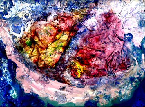
Winged life is as much of whom we are as the water which surrounds us. Thus it follows that birds appear in my art, along with water and wild woods. Also, frequently present are something we do not have in Wisconsin but rather are native to my “home away from home” state—Colorado. Obviously, that “something” would be mountains. We paint what we love! For me that also includes clouds and mist hanging over the water, woods, mountains, or whatever.
Just as we writers have a voice, ever developing as we live and grow, artists also speak through their work. I began in 2006—trying to paint realistic scenes which were at best colorful, but at worst totally humdrum and thoroughly uninspired. I’ve saved many of the early renderings, and I can’t get over how unoriginal they are.
Not skillful enough to produce a beautiful photo-realistic scene (which I greatly admire from fine artists!) it was only when I cut the fetters that had bound me to standard, realistic shapes and colors that I realized I actually do have an artist’s voice. Through books and DVDs, fine artists Barbara Nechis and (Wisconsin’s own) Karlyn Holman encouraged me to cut loose and sing! With my one and only true “strength” which is color, this was (and is!) possible.
When I paint what I love, invariably someone else will love it as well.* Time and again, I’ve offered a family member to choose from a group of paintings and he or she will pick what I like best. For 2 summers now, I’ve presented to a jury—to select paintings for inclusion in a summer exhibit at our local arts center; and each time the jury has chosen the paintings I prefer. I would never paint primarily to please others, but it seems a given that when we please ourselves others are pleased as well!
So curvilinear shapes of birds, trees, mountains, and flowers are continually surfacing—those things I love best. Having been translated from years of living in a semi-wild environment to a suburban locale, occasional abstractions of buildings and bridges will appear. But nearly always, these traces of man’s ingenuity float among masses of curvilinear shapes—often the shapes of winged life!
Margaret L. Been, ©2013
*Note: often when painting what I love, I think of a late fine artist in oils who painted what he loved—while amassing a fortune because so many others (including the Walt Disney Company) loved his work. Thomas Kinkade, the “Painter of Light” came to a tragic end. Yet his art tells me that despite his very human failings, he had a beautiful soul!
From blog browsing I’ve discovered that Kinkade’s paintings are controversial. Many object because they are either: 1) too realistic; 2) not realistic enough; 3) too idealistic; 4) not credible because one cannot tell where the light is coming from; 5) too commercialized; 6) ugly because they are popular; 7) not ugly enough (this critic believes that “real” art should be ugly because he believes that life itself is ugly); and 8) on and on ad nauseum.
I’m working hard on trying not to get unnecessarily angry, but these comments have taxed my resolve to the max. Although Kinkade’s art is not what I would choose to adorn my home, I believe that a valid function of the fine arts is to rise above the mundane while attempting to express a beauty intended for man before he (or she!) bit into that apple. My belief stands unaltered by the stupid criticisms listed above. Each artist has his or her personal concept of beauty, but striving for beauty is certainly a worthy raison d’être!
I question whether or not those critiquing Kinkade’s work are actually artists. My exposure to the art world has revealed to me a tremendous spirit of love and acceptance among those involved because: 1) making art is never easy, although it may look easy to the uninitiated viewer; and 2) every artist should be considered free to make art as they see life.
This spirit of love and acceptance has also caused me to realize that a penchant for beauty need not be the driving force behind all who make art. Showing life as it really is in this fallen world is also valid, along with showing even the ugliness of some people’s “reality”—whether or not I like that kind of art.
Some critics maintain that Kinkade was not a “real artist” because he was intensely popular during his career. He has been called a “hack”—a term normally applied to writers who produce for profit.
Hello, critics. Have you ever heard of William Shakespeare? I rest my case, although I might add, perhaps you “. . . doth protest too much, methinks.” Shakespeare’s HAMLET, Act III, scene II.
Read Full Post »