Feeds:
Posts
Comments

Archive for the ‘Painting Tricks’ Category

Ice Tea again

It is often said that artists can create the world the way they wish it would be!  This may be true of most of the arts, and many crafts as well—where one is fashioning beauty from ashes—or victory in the midst of something that seems like defeat.  In my poetry, I have often featured the presence of light in apparently dark circumstances.

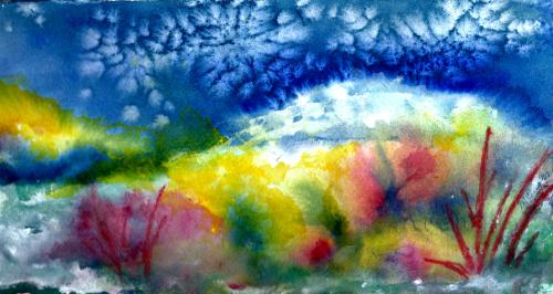
Without getting more ponderous, when indeed my mood is upbeat as I share with you, the above painting is the world the way I’m eager to experience it—and will in a few weeks.  Having lived in Wisconsin for all but three of my eighty-four years, I should know (and do!) that April in my home state is not like “April in Paris”.

Sometimes we get teased a bit with warm splashes, and these are meant to be savored but not viewed as the permanent seasonal weather change.  Meanwhile, we can paint (sing, write, dance) whatever weather we want—thereby creating our own reality:  our own private world.  A case in point is this painting, titled “Ice Tea Again”, reflecting a pastime which is HUGE in my estimation:  drinking ice tea on our patio beside our pretty little patio garden, while watching the birds and chipmunks that enjoy the hospitality of our feeders.

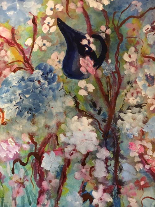
I have done many ice tea type paintings, but this one is unique.  Were you to actually see the painting, now framed in a 16″ by 20″ softly gilded frame, you would probably observe that something new has been added:  touches of mixed medium accents which add texture and individuality to the piece.

At this moment two amazing British artists—Ann Blockley and Soraya French—are vitalizing, coaching, and inspiring me via books and (in Ann’s case) DVDs to experiment with mixed media.  So “extras” have been added to this watercolor and gouache rendering, including areas of enhanced color on and around the flower shapes made with hard pastel pencils and Derwent Inktense sticks.  The winding vines were formed by streaking India ink from a pipette and letting it ooze around on the damp paper.  You may notice the sketchy lines drawn by oil pastels* in areas alongside the vines.  And, as always, thick applications of gouache have covered a plethora of boo-boos.

The above-mentioned artists, and many others, stress the importance of playing with the mediums, learning what they can do and not worrying about the outcome.  JUST PLAY!  This really appeals to me after a rather dragged out autumn and winter beginning with the loss of my beloved corgi in October and adding a challenging shoulder replacement to the mix.  I intend to play, while drinking volumes of ice tea!

Included in the “play”, is the fact that I am diving into water soluble oils.  This is happening at my newly acquired hardwood easel.  The easel doesn’t work for watercolor painting, as there is not room enough in the bedroom studio to flatten out the surface.  But oils can be done on a tilt.  While watercolors, gouache, and mixed medium play happens at my dining room studio, oils are slowly drying and developing on the easel.

Margaret L Been — April 14th, 2008

*When I received my order from DICK BLICK of a beautiful, magenta colored wood box of 60 oil pastels (Van Gogh brand) I reverted to childhood.  I can’t express the wonder and joy of running my fingers over the surface of these sticks, marveling at the gorgeous color gradations.

Read Full Post »

Bottle Fantasy--6Condo at Santa Fe--1WindowsWindows Series 2.jpgwindow scene made strange abd strangerMilwaukee South SideJars in a WindowDans la Fenetre 2.JPGBottles and Jars.jpg

When I began art making in in 2006, I entertained a short period of thinking each rendering had to be of a different subject.  But I quickly realized how silly that was, having had some exposure to art history in college.  Didn’t Monet do a lot of haystacks?  And lilies?

And how about Degas with his ballerinas?  Winslow Homer at sea?  Not to mention (but I will) Georgia O’Keeffe with her massive flowers and striking New Mexico scenes.  Not that I am placing myself on a level with the above, but rather to simply say it is good to paint favorite subjects again and again.  Each work will differ from its predecessor, and there is infinite variety possible via palette, season, details, mood, and the list goes on.  Again and again.

I like to do waterfalls, ships in peril (I don’t want to BE on one, just to paint it), trees waving in the wind, adobe structures, gardens, bowls of fruit—and pots, pitchers, bottles, and jars often in the setting of a windowsill.  There is something about the bones of structure, even in the evanescent ideas I like to present.

At the top of the page you see what is one of my very first attempts at watercolor.  In a book, I’d found a repro of a painting by Fine Artist Jeanne Dobie, where she portrayed bottles in a window not by painting the bottles themselves but rather through showing the liquid color contents of the bottles surrounded by white paper representing light.  Pretty leaky bottles (mine—Jeanne’s were stunning).  But that was 2006 and it was what it was.

The next one down is a quick colored pencil sketch through the window of a rented condo in Santa Fe NM, where we spent a wonderful Easter week with our son, Karl, and his family in 2008.  The NM scene is followed by three more window bits with stuff in the windows, then followed by an albeit primitive and super child-like rendering of Milwaukee’s South Side as viewed through a lobby window at St Luke’s Hospital where my husband was undergoing cardiac care.  That painting, as odd as it is, is close to my heart because of the stressful time it represents in our family.  Painting IS therapeutic!

The domes of Milwaukee’s South Side, historically Polish and Serbian, are followed by a 2013 window scene—getting just a little bit more presentable.  Then comes a 2016 scene which I like a lot.  The print doesn’t do the painting justice, as in real life the colors and shine are noteworthy—and so is the real life size, which is 20″ x 24″.  I like wet, blurry effect, which was achieved with Gum Arabic.  (I tend to get that name mixed up with what I put in my gluten-free baking:  Xanthum Gum.  I hope I don’t get the gums mixed up in the cookies!))

One more of blurry bottles.  I like the frayed and fringy effect in the yellow/purple on the right side—produced by wet color introduced alongside another, slightly drying paint.  This works best on wet paper, and I love it even though it drives some watercolorists crazy.

And finally, the 12″ x 16″ pictured below is my very latest studio creation.  The wood on the window was textured by dropping Winsor & Newton Texture Medium onto the wet paint with a pipette or medicine dropper—one more tool of the trade available with acrylic ink bottles, or from your local pharmacist.

Since I will probably go on doing window scenes, along with Peril at Sea, etc., I am covering the latest in this series with one name, “Dans la Fenêtre”—because I am besotted with the FRENCH LANGUAGE (in which my proficiency is nearly zero on a scale from one to ten.  🙂

Margaret L. Been — March 18, 2018

Read Full Post »

Art Tools

Here are some more items in my bag of tricks.  Working down through the horizontals:  a large comb for making streaky marks*.  I also use a small, rat tail comb; a tooth brush for spattering wet paint; tongue compressors—I can’t recall where in the world I got those things but they are great for measuring and marking on those rare occasions when I use a pencil; a candle for creating areas of wax resist; a defunct credit card for scratching lines—making streaky grasses, etc; a knitting needle for making branches; and a jar lid mainly for making moons.  I have several different size jar lids.

The verticals are craft Q tips of which I found hundreds—I think a lifetime supply—at a church rummage sale years ago, and a Mr. Clean Magic Eraser which rubs out areas of paint for various effects.

Not pictured are masking tape for masking out trees or buildings in order to preserve the white paper while painting a background, facial tissue for dabbing out clouds in a wet sky wash, and probably some other odds and ends which momentarily escape me.

I have always been a pack rat (albeit a very well organized one) and it’s so much fun to have an ongoing excuse for packing stuff in!  Fortunately, I grew up with parents who let me have my own bit of Heaven in my childhood bedroom (probably because I was compulsively tidy); and for nearly 64 years I’ve been blessed with a husband who also enjoys being a pack rat.  It could be disastrous if we disagreed on what is important in life! 🙂  MLB

*One of my favorite artists whose books and DVDs I treasure, British artist Shirley Trevena, introduced me to the comb streaking trick.  Shirley’s still life watercolors are intriguing.  Shirley says what she aims for is “an incredibly messy painting with lots of drips and blobs”, and she demonstrates how she “destroys” a painting—often with a comb streaked through wet paint, blurring the colors.  Shirley’s “incredibly messy”, “destroyed” paintings are gorgeous—whereas when I try her tricks the results are often simply incredibly messy and destroyed.  Good grief!!!

Anyway, for a treat you can GOOGLE “Shirley Trevena, artist”.  You won’t be disappointed!  🙂

Read Full Post »

winter-sunrise-4-1

I often giggle when I think of what comes out of my studio in contrast to the work of gifted, well-schooled artists!  Highly skilled artists may be among the most generously-encouraging-to-beginners group of professionals on earth.  We all are included in a vastly diverse culture where there is a place for most anyone at any level and inclination.

But I have a library of art books—both “how to” tutorials by well-known artists, and tomes of art history and criticism.  I love to study these books, and I do know the difference between classic art and smoke and mirrors—my off-the-cuff “hashtag” for a bag of tricks which I am delighted to share with any beginner who is eager to paint and willing to spend hours each week, building an inventory of paintings in his or her studio.

My 12″ x 16″ rendering below is titled “Between a Rock and a Hard Place”, and it is composed of tricks that my seven-year-old great-grandsons could perform if they decided to sit or stand still long enough,  I began by slathering gesso on the 140# cold press paper to create rocky slopes.  After the gesso dried, I sprayed the surface with water and applied different watercolors—jiggling the paper so the paints could blend and do their own thing,  When those paints dried, I streaked a thinned application of white gouache here and there to add mystery and a sense of age to the rocks.  Voilà.  Smoke and mirrors.

A Rock and a Hard Place

The next example displays a couple of favorite tricks:  plastic wrap and salt.  (I use Kosher salt, but any will do—creating slightly varying effects).  The paper used here is Yupo, that glass-like surface which is not really paper, but rather an amalgamation of chemicals.  (There is no middle ground with Yupo.  Artists either love it or hate it.  The lovers are the “let it all hang out” group of which I am one, and the haters are the perfectionists who do well with lots of control.)

Where you see crinkles and wrinkles, that is where the plastic wrap was applied.  It takes a long time for the paint to dry under plastic wrap on Yupo, and less time on a rag surface which is absorbent.  The spots and phased-out parts were done with salt.  The salt technique is far more spectacular on rag paper than on Yupo.  The painting at the top of this page shows the result of salting the wet paint on rag paper.  Salt can make snowflakes, clouds, stars, dandelion fluff, and many additional effects,

Thus you can see that whenever art making is a person’s dream, it can be done.  And every dream will materialize differently—as each of us is unique.  What fun we can have, sharing our ways to implement the smoke and mirrors!  🙂

Smoke and Mirrors.JPG

Read Full Post »