Feeds:
Posts
Comments

Archive for the ‘Post Impressionists’ Category

Heading Home for Good.jpg

I doubt there is any middle ground with Yupo paper.  One either loves it or hates it.  The “haters” are those artists who demand control of their paints, and always work with an unflappable agenda in mind.  These folks create beautiful works of abject realism, and often artists of palpable realism are highly trained and amazingly gifted—especially if they achieve high end realism in watercolors.  Everyone knows that chasing watercolors is a bit like herding cats.

I am neither highly trained nor amazingly gifted, and fortunately the art I love the most does not fall in the category of abject realism.  My favorite artists, the French Impressionists, Post Impressionists, Les Fauves, etc. who worked largely in oils were realistic to a degree, but always with an intensely personal voice.  For anything other than “personal voice” I would use a camera—and for me, that wouldn’t be half as much fun as getting out the Yupo and letting the paints fly hither and thither.

Last week my good friend and fellow artist, Vikki, and I shared an art day at our dining room table.  We began on Yupo.  My rendering was, for starters, terribly generic and dreadfully similar to stacks of other paintings I’ve done:  tree – space – tree – space;  leaves and blossoms on tree – space – etc; and plomp – plomp – plomp – ad nauseum.

Now I detest—and desire to always eschew—the plagiarizing of any thing or any person, including myself.  So that night I looked over this Yupo thingy, almost upchucked, sprayed it with my trusty water bottle, pressed plastic clingy food wrap onto the entire surface, and went to bed.

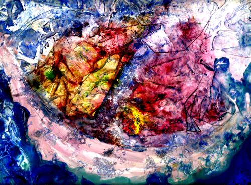
The next day I removed the cling film and VOILÀ!  Something I could further develop and live with:  the suggestion of a Viking ship* with sails, and lots of turbulence all over the place.  So much better than plomp – plomp – plomp!

I added delineation and definition via gouache to the vessel and its surrounding sky and water—leaving a plethora of confusion, color, and turbulence in the sails as if the depicted journey was, like many of life’s journeys, fraught with distractions, dead-ends, and disasters.

However I am always a positive-note person, so then I named the piece:  “Heading for Home the Last Time”—reflecting my blessed assurance in a glorious destination through it all, and eternal joy in the presence of my Lord Jesus.

Margaret L. Been, May 2017

*Because this painting is matted and framed to 12″ x 16″, it was too large to entirely fit in my scanner.  Thus the ends of the ship do not completely show on the print.  The original in its full size is more representative of an actual Viking ship.  Since my husband is descended from Vikings, and loves ships, I wanted to be somewhat realistic.  🙂

Read Full Post »

rollicking-autumn

At one point the above rendering looked exceedingly dark and dreary:  blues, greens, and browns—nice colors but in need of some life.  As I often do, I thought of the late artist, Thomas Kincade.*  In one of his books, he shared that his favorite part of every painting was at the very end, when he added the light.

Now recalling Kincade’s work, I think what he had in mind was a subtle, airbrushed glow of light and not the Van Gogh-ish streaks you see here.  But light is light.  With all due respect to Kincade who obviously was extremely gifted, I really love Van Gogh—and inexperienced as I am, it shows.  So streaks of light transformed this work from a dreary rainy day in late summer to rollicking autumn.  And that’s what I’ve named the piece:  Rollicking Autumn.

Margaret L. Been — 9/14/16

*I believe that Thomas Kincade was a tremendously sensitive man with a huge soul.  His tragic end stands in contrast to the content of his art—which, although not the kind of thing I like to hang on my walls, is quietly soothing and nostalgic.  His life was a sobering testimony to the travesty of fame and success á là Hollywood with all its phony glitz and deceptive glamour.

Read Full Post »

Windows to Beyond

Always Time for Tea 2

Art makes fascinating study.  I’m continually amazed at the varying views and disagreement between artists in every detail of painting.  Some staple or tape their paper to a board before proceding, while others (and I am one of these) just let the paper float so that they can lift and blend colors or rinse off areas which are still damp when so desired.  Many artists make value sketches before beginning to paint, and plan every brush stroke in advance, while others begin intuitively—letting the first blobs of paint on wet paper determine the subject of the work.

Some artists will say, “Never extend a shape to the edge of the paper or let part of an object disappear”, while others contend that disappearing shapes make a piece far more interesting.  (The latter suits my taste best, as you can see in my above still life titled “Always Time for Tea.”)

Both of my samples pictured here (the top one is titled “Windows to Beyond“) defy the supposedly “set in stone” art rule which insists that light comes forward and dark recedes.  Obviously the concept of advancing light and receding dark applies to the magnificent chiaroscuro (strong contrast between light and dark) works of the Old Masters which frequently featured portraits. 

Recently I was treated to a traveling exhibition of Rembrandt’s self-portraits at the Milwaukee Art Museum.  The face and form of the artist loomed prominently in lights and midtones, highlighted in subtle shadows and flanked by a definitive background of darks.  But I am not a “master” in any sense of the word.  Although I understand the chiaroscuro precept (among other art rules) I don’t consciously attempt to employ it.  Rather, I just sit down and paint—and invariably my darks come forward and my lights recede.  

Perhaps my darks are not true darks.  My handling of watercolor evokes the medium’s transparency and ability to diffuse, but I may never replicate the incredibly rich, velvet-textured darks produced by oils.  That’s okay.  I greatly appreciate the skills and materials which are way beyond my ken, and I’m thankful to have even a rudimentary degree of understanding concerning the principle of light and dark.  Also, quite possibly my darks come forth and my lights recede because my (perhaps one and only!) strength is COLOR.  As one of my favorite contemporary artists, Charles Reid explains: vibrant color always predominates.  Viva les couleurs! 

I delight in reading all and any art history I can get my hands on—and there is enough of it out there to keep me entertained for the rest of my life.  Most of the reading is enjoyable and informative, but I’m especially drawn to the artists who exploited color to the max—the Impressionists, Post Impressionists, and various other “Ists” of the 2nd half of the 19th Century into the early 20th.  Currently my most beloved painter of that era is Matisse who shocked the Parisian art world with his blatant use of color.  Matisse and his followers earned the title:  Les Fauves—meaning “Wild Beasts”.

Reading about artists and art movements is, to me, like eating chocolate or maple sugar—thrilling beyond words.  In fact, the reading is far better than candy!  I can’t get sick on reading art history!  Only more and more inspired, drawn, captivated, and excited about the entire amazing world of shape, texture, and COLOR!  🙂

Margaret L. Been ©2013

Read Full Post »


I wonder if there ever could be a more widely known and beloved painter than Monet!  Throughout the ages and centuries of Western Civilization art, some of the Renaissance masterpieces comprise what we could term the highest art—due to their richness, representation of genius, complexity, the variety of surfaces on which they were painted, and the Biblical themes they depict.  But when it comes to a universal love for paintings that we can live with, I believe the artist of choice would be Claude Monet.

Considered the “father” of Impressionism, that 19th century movement which revolutionized the art community in Paris and throughout Europe and America, Monet differed radically from some of his also famous contemporaries such as Manet, Renoir, and Degas in that—as he developed—Monet concentrated mainly on landscapes, water, and gardens while his fellow artists painted social gatherings at Parisian cafés, ballerinas, and nudes.

In his early years Monet traveled and painted around France, particularly to areas bordering the sea.  He evacuated for a brief period to London, during the Franco-Prussian war, and London became his favorite European city—perhaps partly due to the ever changing nuances of light and fog on the River Thames. 

In variance with his gregarious artist friends, Monet was a solitude-loving family man.  He is most widely remembered for his home and the gardens which he created at Giverny, about forty miles northwest of Paris, where he lived for forty some years.  The gardens deteriorated over the decades after Monet’s death in 1926, but since the late 1970s they have been restored to their former glory.  Monet was a master gardener who loved every inch of his turf as well as the ponds and Japanese foot bridge which he designed.  His plantings were conceived and arranged with his palette in mind, and he has left gardeners and art lovers a treasure of tranquil beauty.  

How many homes, perhaps some without even realizing it, contain traces of this artist/genius who helped to move the art mentality from a penchant for rigid, detailed reality to the more illusive and painterly qualities of color analysis and intricacy?  Below, you will find my tribute to a painter whom I love, an umbrella with a Monet print hanging from our living room ceiling—to the puzzlement of the little folks who visit here; they have never seen such unusual interior decorating in any other home. ↓ 

I love Monet for his Impressionistic mark, and even more for later pioneering the subsequent phases of art history—Post Impressionism and the beginnings of Abstract Expressionism.  Unlike some later Abstract painters who had an agenda (either political, social, or personal) to shock or debunk, Monet produced work that was life affirming.  He painted the scenes around his home and land, over and over—recording the times of day and changing seasons in haystacks, surrounding fields, and the famous ponds and gardens of Giverny.

Margaret L. Been

Note:  I am adding to my “Simply Art” page—trying to remember to add something at least once a week.  Today’s addition is my very latest watercolor on Yupo paper, titled “Country Roads”.  Now is the time of year when those roads beckon us and lead us into months of wonderful surprises and advenures!

Read Full Post »