Feeds:
Posts
Comments

Archive for the ‘Creative Living in a Condo’ Category

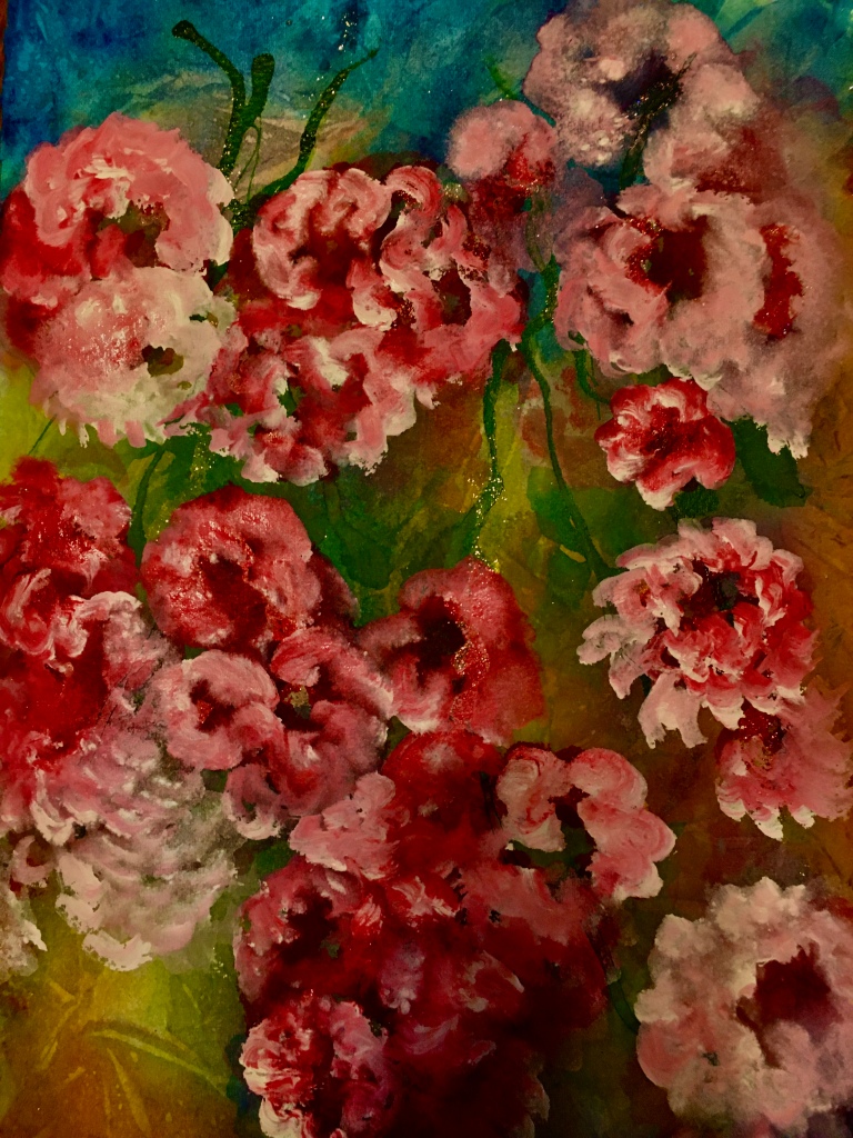
And flowers to you! Not yet in my garden, but always in my work area indoors.

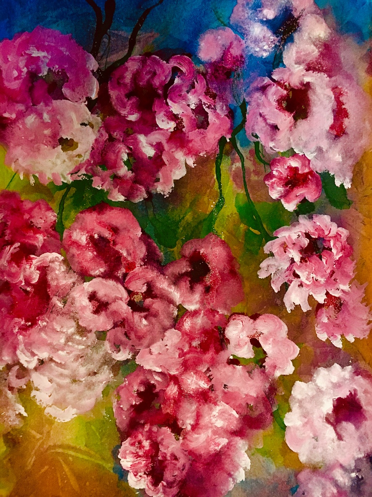
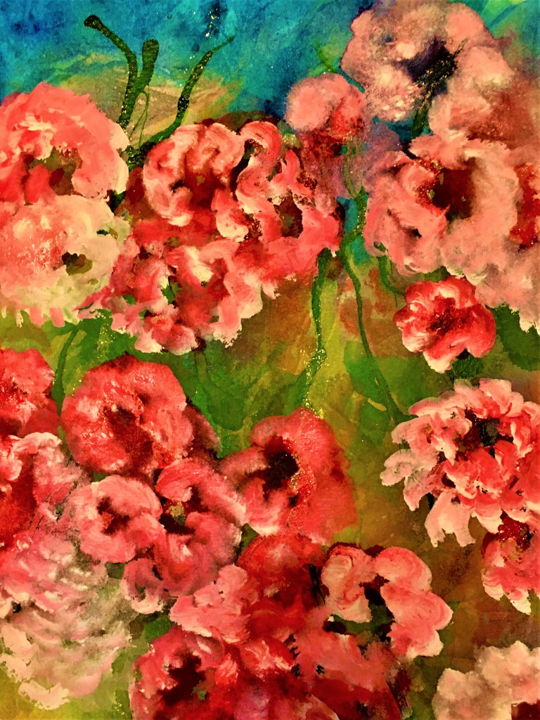
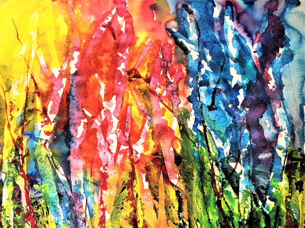
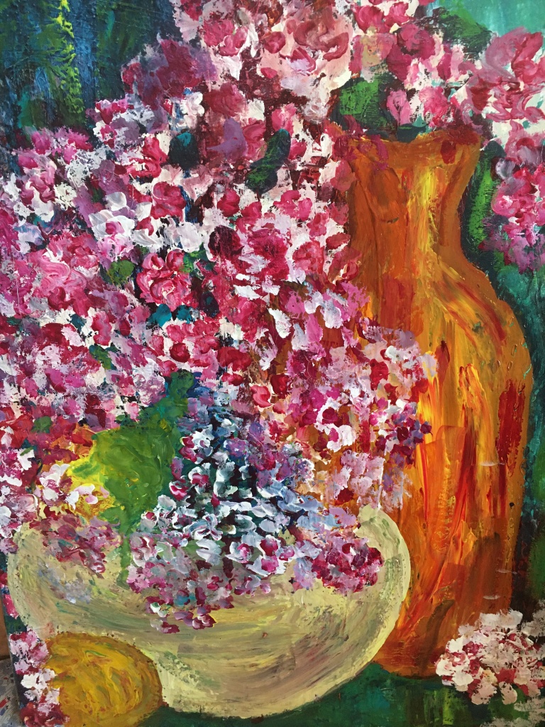
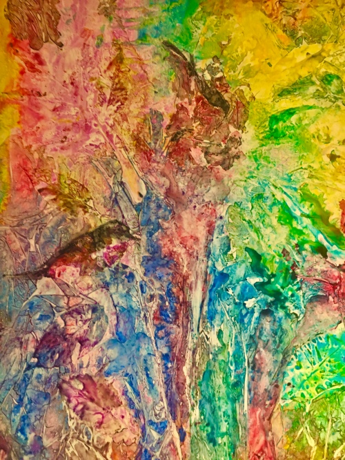
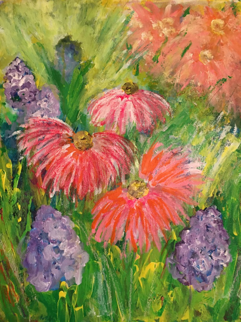
If these pics look similar, they are! Although cropped a bit on the bottom in the editing page, the top one is actually a print of the original watercolor/goauche painting. The next three are called, “Fun with the I-phone editing function.”

The phone IS fun! Whereas I used to have to scan the art into the computer, and could scan no more than computer paper-sized work, now I can photograph anything, any size—and just email it to myself, and voila! Into the computer art file.

And then to YOU! HAPPY EASTER!

Margaret L. Been — April 2nd, 2021

Read Full Post »

FLOWERS/FLOWERS/FLOWERS!

Wisconsin—February 2021. A scenic old-fashioned winter. Outside, white/white/white everywhere. Beautiful, but most of us in my circle of family and friends are saying “Enough!” Even my Louie (pussycat) is saying “Enough”. (I tend to be anthropomorphic about my cat; we talk to each other a lot.)

Both Louie and I spend a lot of time gazing out through the patio door to the garden and snowy landscape beyond. We watch the bird feeders, for different reasons. (Louie never gets out to fulfill his fantasies.) We wait eagerly for that first sign of life as March approaches, the moment when the returning morning sun blasts into my east-facing patio door, and our resident chipmunks emerge from their dens.

Meanwhile indoors, flowers! Green things, many colored things shooting up from the ground. Life is happening in my art corner. Lots of life emerging on Arches 140lb paper, and on YUPO paper as well.

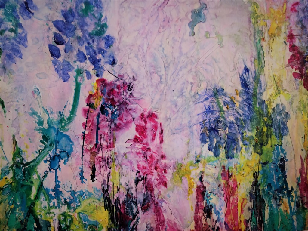
The above flowers are blooming on a 20″ x 24″ sheet of YUPO—that mysterious poly-something, a kind of shiny non-porous plastic that artists either love or HATE! The “lovers” are those who enjoy throwing paint around (shades of Jackson Pollack) and then standing back to see what will happen.

The “haters” of YUPO are those artists who favor control over their paints, and strive for detailed and accurate representation—illusive and nearly impossible on YUPO.

The above rendering is a mutation. My mind was so entrenched in flowers that I just kept adding, layering, slathering, throwing paint like crazy on the poor sheet of YUPO. Suddenly I realized that I had a huge, gunked-up MESS! It was horrible, even disgusting!

Enter: one of the charms of YUPO. You can wash, even scour the paint off many times and get back to the original with just a twinge of tint. Had the above been painted on actual paper, it would probably have been destined for the bin—although I may have tried to redeem it with gesso.

Anyway, this mess got marched to the sink where it was washed and washed—drenched in running water. I did not scour—but rather just rinsed until the ugly stuff had disappeared down the drain, and what remained—my very first layer—was something I could live with. Then, realizing my tendency to overwork I quit without another stroke.

Flowers in February—blooming from a one-track mind.

Margaret L. Been — February 22nd, 2021

Read Full Post »

It has dawned on me that I paint the same things over and over: woods, individual trees, flowers, grassy meadows, mountains, water with an occasional boat, and sky with an occasional castle thrown in. Portraits escape me; I simply do not have that skill. I constantly try and fail to make a convincing portrait of my cat, Louie. (Meanwhile, Louie has a lot of fun chewing on my pencil!)

So I am happy with woods, and the rest of the list of landscape and nature scenes! But my goal is to render each tree, each mountain or whatever, different from the last. American watercolor artist Barbara Necchis warns against plagiarizing ourselves, and she is right on. I do try to reproduce techniques and methods I have used on work I’ve been pleased with—often to realize that whatever I did was accidental.

Above is a newly created mixed media 20″ x 24″ which I deemed suitable for framing. It hangs high in my living room, in a red frame. Similar from past work, yet different. Much redder. Meanwhile, I will keep working on Louie! Someday I may get him right!

Margaret L. Been — February 14, 2021

Read Full Post »

When I began my art journey 15 years ago, I ordered art books and researched everything I could about water mediums. Instinctively I knew that oils—perhaps the most classic of all paints—were off limits to me, given my asthma and some nebulous irreversible lung disease which is currently non-threatening.

Although I love the transparent quality of watercolor paint, I have always been inspired to add dimension and texture to my work. From the start, I attempted to build texture with watercolors, achieving some vibrant depths of color. But the rough and rugged visuals I was after were beyond my reach until, via the art books, I discovered gouache.

Gouache can be thinned with water to achieve some degree of transparency. But straight from the tube, gouache quickly provides layers of impasto—almost simulating the appearance of oils. Unlike watercolors, gouache can be layered light over dark. In the above painting done with gouache on a gallery wrap canvas panel, you can see that I started with a heavy layer of blues and greens, and then painted the vase, flowers, etc.

Like watercolors (but unlike acrylics) gouache can be scrubbed away. So I always spray the canvas renderings with an acrylic fixative. The fixative is available in matt and gloss; I prefer the less popular but more glitzy look of gloss. Of course no fixative is needed for paintings on watercolor paper (I use 140# or heavier) framed behind glass.

In the early years of artmaking, I used gouache sparingly—mainly to add touches of white or to camouflage a boo-boo. Then gradually I began to use more and more blotches of color, until now when I have a drawer packed with every possible color of Da Vinci’s 37ml professional gouache. On some occasions, as in the above painting, I use gouache exclusively.

Unlike acrylics which are death to brushes, gouache is kind to the watercolor brushes. When well care for, washed after every using and always positioned to dry “brush up”, the brushes may last forever. I have had most of my brushes for years, starting with a few excellent ones and building a collection.

And, gouache paint is amazingly inexpensive. It’s a win/win deal. 🙂 Gouache is good!

Margaret L. Been — February 4th, 2021

Read Full Post »

This is my favorite so far, of the FRACTURED LEAF PAINTINGS. The bird, left of center part way up, was a leaf when I removed the plastic film and leaves. (Scroll down to the entry before last, for an explanation of the process).

So I tweaked a beak and tail feathers. Pardon me: not tweaked, TWEETED. (I can hear your groans.)

A smaller bird is perched farther up. The leaf/bird painting is 24″ x 20″, framed, and hanging in my living room.

Margaret L. Been — January 17th, 2021

Read Full Post »

I call it a “foray” because acrylics are uncharted territory for me. I haven’t invested enough time in this much-touted medium to understand how to use it. There is huge frustration whenever I begin to apply acrylic paint to paper; the paint just sits there. It doesn’t go anywhere. Perhaps I am lazy, and a bit spoiled by watercolors which do a lot of the work for me.

Anyway, this pictured sample of my resolve to finally get acquainted with acrylic paint turned out to be a keeper. In fact, I liked the painting enough to have it professionally framed—something that has happened only once before. In that instance I had produced a piece too humungous for a ready-made frame.

The painting is called, “Prairie Dance”. I selected it for today’s entry because it reminds me that SPRING WILL COME!

Margaret L. Been — January 15th, 2021

Read Full Post »

There is no way I will spend much time indoors when summer is fleeting. Rain or shine I can be outdoors either on our roofed-and-sheltered-on-three-sides patio, or out in the gardens. Every possible ounce of soul food (plus actual vitamin D) is in the process of being stashed

Like our resident chipmunks scurrying hither and thither with their cheek pouches loaded, I am hoarding a storehouse of images with camera and paints. But rather than scurry hither and thither, I move as slowly and deliberately as possible—unwilling to miss any of the fragrance, sights, or sounds of summer’s demise.

This laidback mentality is something I desire to maintain year around, and often succeed—especially at my vintage age when life is carefree and just plain fun! But during summer’s demise, lazing around is no trick. It just comes naturally!

Even my paint brushes are relaxed. They scarcely move—letting the paint do most of the work with a bit of help from me tipping and bending the paper. With lots of juicy watercolor and gouache, the artist is simply a behind-the-curtains director—welcoming the ad-libbing and improvising that occurs on stage.

Such are the lazy days of summer’s demise. ENJOY!

Margaret L. Been — 9/4/19

Read Full Post »

Last week I created the above atmospheric scene and was quite happy with it. So, in the above position I initialed the painting and then realized I had signed it upside down after matting. Not to be discouraged by anything, I covered the initials with my trusty friend, gouache. Then I accidentally dropped a bloop of gouache on the mat.

Next, I decided to simply paint the mat—rather than waste it by removing it, or adding another mat on the top. Also, I added a bit of mystery by gouaching over some of the color with white.

Above is the finale. This may not be a huge hit, but I had a lot of fun messing it up and making a funky rendering. Later in the week I received the following photo from my Granddaughter, Nicole, in Florida, of her daughter—my Great Granddaughter Josephine, using the same technique on a family photo. I decided that great minds think alike. And funky is cool! 🙂

Margaret L. Been — July 23. 2019

Read Full Post »


I am a fan of real correspondence, sometimes forgetting to check email for a week or two. To invoke an old saying: “Therein lies a tale.”

Since the beginning of my artmaking passion, I have been creating stationery by scanning or photographing paintings, emailing them to myself, and putting the pictures in my art file, to print out on heavy, high quality photo paper, and paste onto heavy blank stationery—preferably Strathmore’s watercolor blank cards with envelopes, available at most online art stores. (I love DICK BLICK!)

But that era is closing. The USPS is like the “old grey mare” who is not (I hate the word “ain’t” as used in the ditty) “what she used to be”; fat letters sometimes arrive at their destination all shredded and three weeks late, and some letters (fat or thin) never arrive. Our son, Eric, and I have mailed out gift cards which were stolen in the mail process—gone forever, never reaching their recipients.

Since I am still stuck in the Jane Austen era, I continue to write long letters and have discovered that gluing a picture—printed on heavy quality photo paper—onto a heavy quality note card, and mailed in a heavy quality envelope, is subject to: 1) two ounce mailing, meaning extra cost—although the recipients are worth it, or 2) possible shredding in the Post Office machines, or 3) being deliberately torn open and consequently trashed by some thief who thinks there might be a gift card within.

So “it is what it is”. In order to adjust to what may seem like old age paranoia but is indeed current age realism, I am cutting down the bulk of my letters, and making individual note cards by decorating the paper with Sharpies Ultrafine Markers, and skipping the extra weight of a glued-on heavy photo paper print.

My new stationery involves less heft and a lot more fun, as you can see above. I paint designs on the front and back of the blanks; long letters require an insert of an extra piece of lightweight computer paper. I use the logo, “Boho Designs”—since I have always been a bit BOHO, as anyone who has seen our home, or the contents of my clothes closet, will readily affirm.

I create these gems at night. We go to bed early, not to sleep but to read, listen to music, and in my case decorate the blank stationery. I do one or two in an evening, and my production is fast surpassing the output of Jane Austen style letters.

What a life! Artmaking at the end of a full day, while entertained by Van Cliburn or Joshua Bell, with my man at my side, and another “man” sleeping at my feet.*

Louie is one of the most precious gifts we have ever received. Recently our oldest daughter, Laura, moved back to Wisconsin after forty years in Bellingham, Washington. Now she lives about seven minutes from our home. Laura settled into her new-to-her condo, with Louie who has been her pal for eleven years.

After bringing Louie to our home for several visits (one an “overnight), Laura surprised us by announcing that she was giving Louie to us. From his first visit, Louie had claimed our four rooms as his very own—plus our cabinets and closets which he deftly opens and investigates. He also claimed our bed, our laps, our hearts, and (excuse the pun) a “lion’s share” of my attention. Louie is the sweetest little lion I have ever known.

Laura had mulled this gift over for months before moving here—knowing Joe and I had a huge four-legged void in our home, ever since our corgi, Dylan, reached his maximum life span and died. I am still stunned by our daughter’s kindness and generosity—a picture of sacrificial love!

Now I know I have lost all but the die-hard readers who love their dogs and cats. So here is a return to the main subject: note cards created at the end of the day!

Happy Letter Writing!

Margaret L, Been — May 6th, 2019

Read Full Post »

It’s that time again—when it’s all about flowers and most anything green. Spinach salads, trips to the local garden center to find more INDOOR PLANTS, dreaming of the outdoor gardens while the temperature beyond our doors and windows hovers below freezing, and frequently below zero.

The end of our lane contains a pristine white mountain, where the plow has heaped snowfall after snowfall so that we in our condo community can get out of our garages. This is Wisconsin, USA, and that snow mountain may be with us for several more weeks. But all I can think is FLOWERS.

The above allusion to flowers has seen many mutations since its beginning in late January. Several times it almost got pitched in the recycle bin, but with each frustrating session I came back with renewed vigor and determination. I simply had to have something to show for the New Year!

This painting is 16″ x 20″, and is now framed in a lovely antique wood frame, on the wall beside my piano. I like the rendering, but up until a couple of days ago I definitely did not! Here is why: It started out with a photo realism approach—something that normally doesn’t work for me! The flowers were a dark magenta, with blobs of yellow here and there and something that was supposed to represent sky—in overly predictable blue.

The magenta was overpowering. My well educated husband walked by my art table and preempted my thoughts by commenting, “It needs some white.”

So I attacked the magenta flowers with white gouache (always my friend in coverups.) But somehow the white took over. More yellow. More magenta. Then some alizarin crimson to deflect the winey magenta.

Then more yellow to light it up even more, more blue to anchor the piece to the table—but this time aqua blue, always a winner. This all sounds fast and frenzied, but it took weeks punctuated with days for drying (I tend to gob the paint on thickly), excursions to our local medical clinic where our body parts are kept in running order, and time out to eat and be sociable. And sometimes I slept.

Finally the paper was so clotted with layers of watercolor and gouache IMPASTO style, that I had a fleeting sense of nausea. “You are going to have a bath,” I almost shouted at the paper which was actually curling up on its edges from the barrage of paint.

A bath indeed. Not a shower, but a soaking in our kitchen sink. I brought the dripping mess back to my table and plunked it down thinking I would attack it once again, as it began to dry. But then the magic appeared.

The gross top layers of paint were gone. Somehow much of the yellow had turned to a soft green when blending into the aqua. The magenta/crimson combo had turned a light lavender when confronted with shades of blue. While the paper was still damp, I covered it with plastic food wrap and squished the wrap with my fingers to create creases.

When I removed the plastic the next day, I felt like apologizing to what I found—a lovely bit of art for which I could hardly take credit. As is so often the case, the paint knows best! 🙂

Margaret L. Been — March 2nd, 2019

Read Full Post »

Older Posts »