Feeds:
Posts
Comments

Archive for the ‘Gouache’ Category

And flowers to you! Not yet in my garden, but always in my work area indoors.

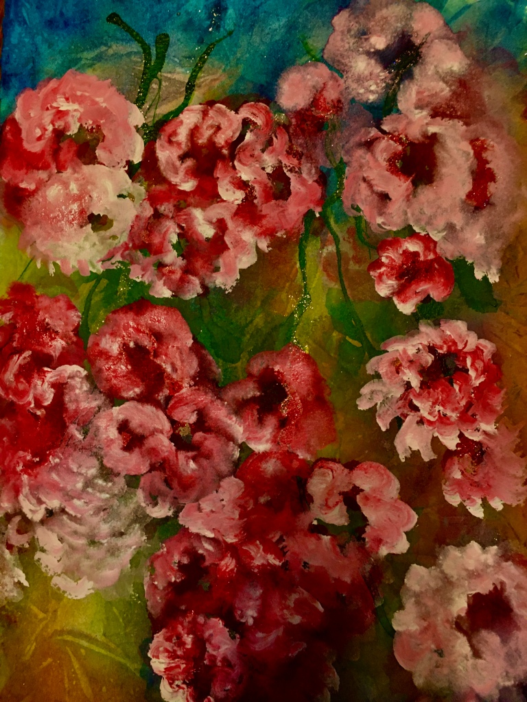
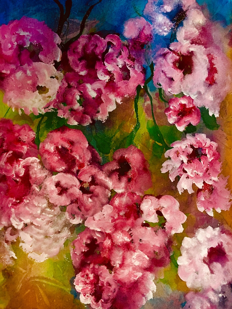
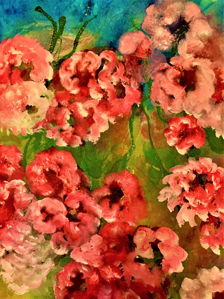
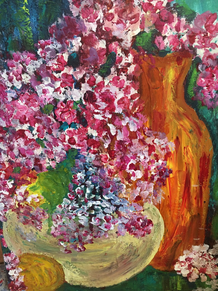
If these pics look similar, they are! Although cropped a bit on the bottom in the editing page, the top one is actually a print of the original watercolor/goauche painting. The next three are called, “Fun with the I-phone editing function.”

The phone IS fun! Whereas I used to have to scan the art into the computer, and could scan no more than computer paper-sized work, now I can photograph anything, any size—and just email it to myself, and voila! Into the computer art file.

And then to YOU! HAPPY EASTER!

Margaret L. Been — April 2nd, 2021

Read Full Post »

When I began my art journey 15 years ago, I ordered art books and researched everything I could about water mediums. Instinctively I knew that oils—perhaps the most classic of all paints—were off limits to me, given my asthma and some nebulous irreversible lung disease which is currently non-threatening.

Although I love the transparent quality of watercolor paint, I have always been inspired to add dimension and texture to my work. From the start, I attempted to build texture with watercolors, achieving some vibrant depths of color. But the rough and rugged visuals I was after were beyond my reach until, via the art books, I discovered gouache.

Gouache can be thinned with water to achieve some degree of transparency. But straight from the tube, gouache quickly provides layers of impasto—almost simulating the appearance of oils. Unlike watercolors, gouache can be layered light over dark. In the above painting done with gouache on a gallery wrap canvas panel, you can see that I started with a heavy layer of blues and greens, and then painted the vase, flowers, etc.

Like watercolors (but unlike acrylics) gouache can be scrubbed away. So I always spray the canvas renderings with an acrylic fixative. The fixative is available in matt and gloss; I prefer the less popular but more glitzy look of gloss. Of course no fixative is needed for paintings on watercolor paper (I use 140# or heavier) framed behind glass.

In the early years of artmaking, I used gouache sparingly—mainly to add touches of white or to camouflage a boo-boo. Then gradually I began to use more and more blotches of color, until now when I have a drawer packed with every possible color of Da Vinci’s 37ml professional gouache. On some occasions, as in the above painting, I use gouache exclusively.

Unlike acrylics which are death to brushes, gouache is kind to the watercolor brushes. When well care for, washed after every using and always positioned to dry “brush up”, the brushes may last forever. I have had most of my brushes for years, starting with a few excellent ones and building a collection.

And, gouache paint is amazingly inexpensive. It’s a win/win deal. 🙂 Gouache is good!

Margaret L. Been — February 4th, 2021

Read Full Post »

Waiting for spring. Meanwhile, ideas keep surging through my head. Art concepts are ever stretching.

Since Joe and I no longer need a vehicle, we gave our well-used Honda van to a grandson who is a seminarian at a local theological center, and his wife and two year old daughter—whose name happens to be, believe it or not, Margaret Been.

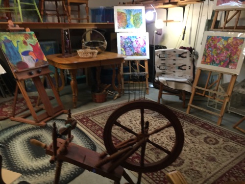
A garage only has to sit empty (except for all the garden and home maintenance junk lining the walls) for a couple of days before brain seeds sprout. An outdoor room! An outdoor studio for art making and spinning gorgeous fibers into yarn. A place where kindred souls can visit, and neighbors can pause. Ever stretching!

This IS Wisconsin, which means the feasibility of enjoying a garage room is limited to the three summer months (given reasonable summer weather) and a few days at each end of the spectrum (given some surprise weather in spring and fall).

We put a small mock fireplace in the room. The decorative fireplace uses one light bulb to simulate burning logs, and a fan to blow a bit of hot air when desired—mainly for ambience, and not sufficient to handle our weather in a garage. (Indoors maybe!)

But dreams persist. Every day I linger for a few moments in this bit of summer heaven, just dreaming and thinking about family members and friends whom I will invite for art and fiber days.

I have two permanent art-making corners indoors, and I produce in these studios non-stop. Two spinning wheels, plus baskets of merino and silk in a riot of colors whirl constantly in our living room where the resulting skeins of yarn dangle from hooks and surfaces.

Art displays, a table on which to work, an area for storing brushes, paints, papers and additional art tools, another spinning wheel, and a (possible) lifetime supply of additional fibers join me in anticipating warm weather in the garage room.

My art goals are ever stretching as well—including a return to collage art between actual paintings. A few years back, I did a lot of collages from random materials and whatever abstract inspiration blossomed moment by moment.

Collages differ just as every artist is unique. Some are decidedly geometric; some feature words, photos, images of people and buildings, or symbols such as numbers. Others are more organic, kind of like an unkempt garden of color and flowing shapes. Or a messy landscape with tangled trees or turbulent seas. And mountains, plenty of mountains.

The materials are legion: gorgeous Oriental papers—Kozo, Mulberry and Rice Papers, and Japanese Lace; common old cheesecloth, tissue paper, and gauze; aluminum foil; ribbons, greeting cards, pieces of musical scores, and decorative gift wraps; wool fleece, yarn, string, and bits of fabric; seasonal and party napkins—with the backing papers torn off so the napkin design is translucent and delicate; acrylic and gouache paints—metallic and otherwise; dried leaves, flowers, twigs, and herbs; templates and stencils; poems; torn up bits of my paintings that didn’t impress me very much—-yet didn’t warrant the trash bin. Some of my kitty Louie’s fur from his grooming brush—with Louie’s permission of course!

And mediums: molding paste, gloss, matt, sand, glitter gel, gesso, bead gel, crackle gel, YES paste (although anything acrylic such as the above listed mediums plus acrylic paint acts as a glue).

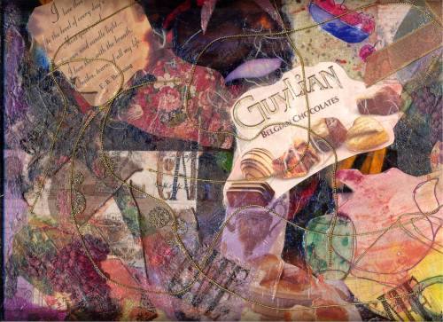
Above is a sample of my collage art from a few years ago. It reminds me of some favorite things, and still hangs in our living room.

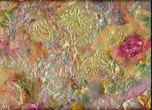
And finally, a collage of various paints and textured mediums.

Maybe our new summer garage room will facilitate the creation of more way out art! Meanwhile, Happy Stretching

Margaret L. Been — April 3rd, 2020

Read Full Post »

Memories of Manitou Springs, Colorado

We have nearly made it through another Wisconsin winter. Not a rough one, simply a bit long!

I began the new year with a passion for creating texture in my art. The above was one of the first renderings of 2020. It hangs over our piano, beneath a huge painting of rugged cowboys rescuing cattle in a crevasse—a treasure which I found at a thrift store years ago for little more than the proverbial song.

The mountains in my (16″ x 20″) “Memories . . . .” were formed with heavy modeling paste on YUPO paper which is not really paper; it is a kind of plastic with a slick, shiny surface.*

Then I added—almost dripped—the paints in various spots, jiggled the YUPO around, made a “cuppa Joe” in our beloved Keurig, and sat down to spin beautiful silk and merino yarn on one of my two Jensen spinning wheels. (Fibers—as in spinning and knitting—are another of my many passions.)

I love just letting the surface and paint do the work, with very little interference from “moi”. The results are frequently more delightful than products of obsessive meddling with brushes.

But I do use brushes also, and they can do wonderful things, especially with florals. I begin with watercolor, paint the flowers, and then add the background.** When this dries, I go back in with GOUACHE.

The gouache builds texture and dimension similar to the effect of oil paints. Sometimes I get carried away and the textures are layered so deeply that I spray the finished painting with an acrylic fixative, as the chalky gouache is otherwise apt to crack and flake away over the years.

Probably that would not happen to paintings immediately secured under glass, but the majority of my renderings live in protective plastc sleeves until switched around with framed works, given away as a gift, or (once in awhile) sold. When I paint on gallerywrap canvas panels, I always spray with a fixative because these are never framed.

Below is an example of a floral done with watercolor and many layered gouache accents.

Again and again, I paint flowers. I think of flowers day and night. Soon we will actually see them, springing from the ground! 🙂

Margaret L. Been — March 19, 2020

* Artists either love or hate YUPO. Often the “haters” are the purists who seek detailed perfection. I do not care for detailed perfection, so I am in the group that LOVES YUPO. Good thing I don’t hanker after perfection; I am incapable of achieving it !!!

**Watercolor rules (which I am very fond of breaking) dictate BACKGROUND FIRST. I normally do BACKGROUND LAST, having been greatly inspired and influenced by fine artist Barbara Nechis who usually paints the background last, because until her piece is finished she doesn’t know what kind of a background she wants.

Good reasoning! The color of the background is most compelling when chosen from colors in the completed subject. Seeing is deciding! Plus, it is so beautiful when damp background colors subtly phase into the body of the painting—either a still life or landscape.

Read Full Post »

There is no way I will spend much time indoors when summer is fleeting. Rain or shine I can be outdoors either on our roofed-and-sheltered-on-three-sides patio, or out in the gardens. Every possible ounce of soul food (plus actual vitamin D) is in the process of being stashed

Like our resident chipmunks scurrying hither and thither with their cheek pouches loaded, I am hoarding a storehouse of images with camera and paints. But rather than scurry hither and thither, I move as slowly and deliberately as possible—unwilling to miss any of the fragrance, sights, or sounds of summer’s demise.

This laidback mentality is something I desire to maintain year around, and often succeed—especially at my vintage age when life is carefree and just plain fun! But during summer’s demise, lazing around is no trick. It just comes naturally!

Even my paint brushes are relaxed. They scarcely move—letting the paint do most of the work with a bit of help from me tipping and bending the paper. With lots of juicy watercolor and gouache, the artist is simply a behind-the-curtains director—welcoming the ad-libbing and improvising that occurs on stage.

Such are the lazy days of summer’s demise. ENJOY!

Margaret L. Been — 9/4/19

Read Full Post »

Last week I created the above atmospheric scene and was quite happy with it. So, in the above position I initialed the painting and then realized I had signed it upside down after matting. Not to be discouraged by anything, I covered the initials with my trusty friend, gouache. Then I accidentally dropped a bloop of gouache on the mat.

Next, I decided to simply paint the mat—rather than waste it by removing it, or adding another mat on the top. Also, I added a bit of mystery by gouaching over some of the color with white.

Above is the finale. This may not be a huge hit, but I had a lot of fun messing it up and making a funky rendering. Later in the week I received the following photo from my Granddaughter, Nicole, in Florida, of her daughter—my Great Granddaughter Josephine, using the same technique on a family photo. I decided that great minds think alike. And funky is cool! 🙂

Margaret L. Been — July 23. 2019

Read Full Post »

Regardless of the lure of my gardens, and the joy of spinning Merino wool mixed with gorgeous silk, I am making art. Trees seem to be stuck in my head. Oh well—Monet and haystacks, Been and trees. Not that the comparison goes beyond the fact of repeating subject matter.

In fact, I have a hilarious protection against the plight of the over-padded ego; and I have shared this with countless friends who, like me, are attached to their I-pads. Or phones. Or laptops.

Here is my protection. Just GOOGLE: “Pig Who Paints” or “Pigcasso”. This character never fails to make me smile. And she also appears to be smiling on the several U-tubes that feature her producing art. Which proves that art makes us happy whether we are a person or a porker! 🙂

Margaret L. Been — July 16, 2019

Read Full Post »

It’s that time again—when it’s all about flowers and most anything green. Spinach salads, trips to the local garden center to find more INDOOR PLANTS, dreaming of the outdoor gardens while the temperature beyond our doors and windows hovers below freezing, and frequently below zero.

The end of our lane contains a pristine white mountain, where the plow has heaped snowfall after snowfall so that we in our condo community can get out of our garages. This is Wisconsin, USA, and that snow mountain may be with us for several more weeks. But all I can think is FLOWERS.

The above allusion to flowers has seen many mutations since its beginning in late January. Several times it almost got pitched in the recycle bin, but with each frustrating session I came back with renewed vigor and determination. I simply had to have something to show for the New Year!

This painting is 16″ x 20″, and is now framed in a lovely antique wood frame, on the wall beside my piano. I like the rendering, but up until a couple of days ago I definitely did not! Here is why: It started out with a photo realism approach—something that normally doesn’t work for me! The flowers were a dark magenta, with blobs of yellow here and there and something that was supposed to represent sky—in overly predictable blue.

The magenta was overpowering. My well educated husband walked by my art table and preempted my thoughts by commenting, “It needs some white.”

So I attacked the magenta flowers with white gouache (always my friend in coverups.) But somehow the white took over. More yellow. More magenta. Then some alizarin crimson to deflect the winey magenta.

Then more yellow to light it up even more, more blue to anchor the piece to the table—but this time aqua blue, always a winner. This all sounds fast and frenzied, but it took weeks punctuated with days for drying (I tend to gob the paint on thickly), excursions to our local medical clinic where our body parts are kept in running order, and time out to eat and be sociable. And sometimes I slept.

Finally the paper was so clotted with layers of watercolor and gouache IMPASTO style, that I had a fleeting sense of nausea. “You are going to have a bath,” I almost shouted at the paper which was actually curling up on its edges from the barrage of paint.

A bath indeed. Not a shower, but a soaking in our kitchen sink. I brought the dripping mess back to my table and plunked it down thinking I would attack it once again, as it began to dry. But then the magic appeared.

The gross top layers of paint were gone. Somehow much of the yellow had turned to a soft green when blending into the aqua. The magenta/crimson combo had turned a light lavender when confronted with shades of blue. While the paper was still damp, I covered it with plastic food wrap and squished the wrap with my fingers to create creases.

When I removed the plastic the next day, I felt like apologizing to what I found—a lovely bit of art for which I could hardly take credit. As is so often the case, the paint knows best! 🙂

Margaret L. Been — March 2nd, 2019

Read Full Post »

An inventory of what I have done in my studio over the last year has proved a bit surprising—or maybe not!  For 8 months out of the 12, I have been gimped with ortho issues. A shoulder replacement in late 2017 had only just begun to heal when a hip kicked in saying, “Hey, it’s not fair. I want some of this attention.”

Two major hip surgeries later (the 1st, a total hip replacement and the 2nd, to repair a severely fractured femur with screws, metal hooks, and wires that make me think of civil engineered bridge construction) I am still hobbling and spending much of the time off my feet.

For several weeks it was 1 leg only, to navigate this “kid in an old body” to and from a cozy living room couch (my 24/7 hangout) to a bathroom (about 5 yards away), my piano right behind my couch, and an extra art studio which my wonderful husband set up for me at the nearby end of our dining room table.

Books, limited piano practice which—although done sitting down—wore me out, my French tutorial apps and a Public Television app on my I-pad (I re-watched the entire DOWNTON ABBEY), serial-shopping on Amazon (FUN/FUN/FUN!), Van Cliburn and other geniuses streaming through my devices into our fine speakers day and night (1 of which speakers was conveniently located beside my ear on my 24/7 couch), my knitting (how many cowls does anyone need?), and ART made up my life for much of 2018.

Who needs to cook, scrub floors, vacuum, and dust anyway?

I normally avoid medical discussions except with those professionals to whom Medicare is paying me to complain, but the above diatribe is to demonstrate how life can be a lot of fun under rather strange circumstances! And how art can thrive, when pain and disability prevail. One’s pain can literally be “drowned” in paint, especially the wet into wet method of working which I prefer.

Anyway, my inventory yielded a surprising 35 paintings that I actually like. (There are always the “duds” which get stashed on a shelf for possible reworking or salvaging parts; or sometimes they are so outrageous that I trash them.)

The keepers range from (3) 20″ x 24″ biggies, a 16″ x 20″, a handful of 11″ x 14″ renderings, and a preponderance of 12″ x 16″ paintings—obviously my favorite size. The paintings are predominately woodland scenes and funky individual trees—with a smattering of flowers, a sailboat in trouble, some landscapes with distant castles, a still life (my least favorite), and a huge, totally abstract on Yupo Paper which I LOVE most of all.

Although my inventory preferences are not exactly written in the proverbial stone, they are indicative—and it was fun reviewing a year of art making, body disability notwithstanding.

The year’s earnings amounted to $700.00 which constituted a donation to, and sale at, our local art group’s annual fundraiser. My dislike of office type stuff is such that I can find no record of which paintings I donated. I believe they were “masterpieces” from former years.

Also, I give paintings to interested friends and family members. As with club donations, my right hand (very happily) does not know what my left hand is doing.

I share many of my favorites via prints glued to notecards, thus bragging about my art while facilitating my passion for writing actual letters as opposed to emails.

Above are the end of 2018 renderings, hardly even dry when I photographed them with my I-phone camera. They tend to make me think of Spring, and they are my HAPPY NEW YEAR to you!

Margaret L. Been, December 31st, 2018

Read Full Post »

Acrylic2

Back after a long hiatus—time enough for a new hip, a lazy summer, and plenty of physical therapy.  But artmaking was a huge part of the therapy.  Standing is easier for me than sitting, no matter what.  And regardless of whatever this body is up to, if I can create something I am a happy woman!

Above is a 20″ x 24″ painting that should be titled, “Love/Hate”.  Being a bit vociferous about opinions, I have long claimed that I hate acrylics.  They have seemed so fake appearing and stupid to me—stubborn, inflexible, hard to shove around, incapable of producing those wonderful watercolor “cauliflowers”, and totally lacking in subtlety.  Especially when gouache can do the job of building depth and texture, although gouache needs to be preserved with glass or an acrylic (there is that word!) fixative–and acrylic paint needs only itself for permanence.

Then, amazingly, I came across books and a DVD by a new-to-me British artist:  Soraya French who has painted in most all media, but absolutely LOVES acrylics.  The material struck me as somewhere out there, to begin with.  But after reading, re-reading, viewing, and reviewing, “somewhere out there” closed in on me.  Soraya French has pried open my closed mind.

I recently completed “Love/Hate” and still was not sure which it was:  love or hate.  The piece went through many mutations, layer upon layer, changes of theme and subject matter, as well as variations of color dominance.  But hey, that’s acrylics:  layer upon layer.

While the painting was at its final stage of dampness, I truly thought it was tacky—like something one might win at the county fair for knocking off a row of mechanical ducks.  But suddenly the piece was dry and it took on a whole new life.  I kept staring at it, as it penetrated my psyche.  Hate disappeared, and Love became at least a “Like”.  The painting is now hanging in our dining room.

Love/Hate has a new name.  My original idea was to suggest autumn foliage.  The foliage changed to bare branches for winter, sailboat masts on a stormy sea, finally returning to the tree motif—but with an attitude more like spring than autumn.  So the new title is “An Autumn That Looks Like Spring”.  Fitting, as we have had a gloriously warm/hot September, and today is once again in the high 70s.

For me, trees are like lilies and haystacks to Monet—although repetition is where the comparison ends between Claude and me.  Rather ridiculous to mention the two of us in the same sentence.  But I am as genuinely obsessed with trees, as Monet was smitten with his favorite subjects.

Over the summer and my surgery-recovery-period I did some more trees, with a focus on texture and application of mixed media along with watercolors and gouache:  soft pastels, hard pastels, oil pastels, India ink, Derwent Inktense Sticks, and water soluble crayons (all of artist quality as anything less would prove disappointing).  Here is some of that harvest of trees:

TT2.jpg

More Tree Textures 2

Oil Pastels.JPG 2.JPG

In closing, I urge you to check out Soraya French’s website.  Another inspiring British lady—who has re-opened the doors to individuality, personality, and freedom in art.

Whereas from around the turn of the 19th/20th century right up to a couple of decades ago, freedom of expression in art was “trendy” (almost a given), in recent years there has been a definite swing back to photo-realism:  creating recognizable art such as “The Old Village Bridge”, “Apple Farm”,  “Country Church”, or realistic city scenes.

In our Wisconsin neighborhood, a familiar scene is the church with three spires high on a rural hill.  The site is called, “Holy Hill”.  It has been painted realistically more times than I can imagine, and a rendering of Holy Hill is recognized by anyone who has been around here for any time at all.

Beautiful!  Such art requires great skill, and deserves its place of respect.  But it is not, generally speaking, the art I desire to have much of on my walls.  More and more, I am drawn to mystery, unanswered questions, and the energy of abstraction–or semi-abstraction with a touch of realism, all with a focus on being as beautiful as possible.

In the arts, I see no value in trying to reproduce the ugliness of much of the world.  Art is a precious commodity, a timeless gift in keeping with great music and poetry—bestowed upon us to lift our souls.  Yes, we can and should portray all of life in terms of great sadness and poignancy as well as great joy; but the means of portrayal can be beautiful and the message behind the means, one of hope and anticipation of a better world.

Isn’t that why our Creator God has allowed us to reflect a token of His creativity, by making things with the gifts and resources He has provided for us—that we might in some tiny way attempt to fashion a better world?

Margaret L. Been  —  October 3, 2018

Read Full Post »

Older Posts »