Feeds:
Posts
Comments

Archive for the ‘Funk and Funky’ Category

Last week I created the above atmospheric scene and was quite happy with it. So, in the above position I initialed the painting and then realized I had signed it upside down after matting. Not to be discouraged by anything, I covered the initials with my trusty friend, gouache. Then I accidentally dropped a bloop of gouache on the mat.

Next, I decided to simply paint the mat—rather than waste it by removing it, or adding another mat on the top. Also, I added a bit of mystery by gouaching over some of the color with white.

Above is the finale. This may not be a huge hit, but I had a lot of fun messing it up and making a funky rendering. Later in the week I received the following photo from my Granddaughter, Nicole, in Florida, of her daughter—my Great Granddaughter Josephine, using the same technique on a family photo. I decided that great minds think alike. And funky is cool! 🙂

Margaret L. Been — July 23. 2019

Read Full Post »

Growing more and more enamored with abstraction, especially that which is soft-edged, flowing, and organic as opposed to geometric, hard-edged, and harsh, I was tremendously pleased with the above 24″ x 20″ rendering—so pleased that I framed it and the mysterious painting is hanging high in our living room, brightening up the entire wall.

When I study the painting, I imagine different scenarios:  a moonlit swamp; a campfire; the triumph of light over darkness and joy over sorrow; the vicissitudes of a long life on earth.  The print which you see does not do justice to the colors therein; they vibrate and rock.  Recently, the “vibrate and rock” appealed to a seven year old great-grandson/friend who came for a visit and art making.

“I want to do one like that,” Deacon decided after studying my various paintings on our walls.  Then he excited me up to my earlobes by saying, “I like the way the colors run together.”  Do I have a kindred soul here, or what?

Deacon proceeded to create his own mystery painting.  He learned that simply painting color over color with a loaded brush creates blackish-brownish mud, which I praised and applauded because children’s art is ALWAYS wonderful.  Then I showed him how gently introducing colors to different areas of wet paper, while jiggling the paper to let the wet colors mingle, causes mysterious marks never to be reproduced in the exact same way.

There wasn’t time to introduce salt and plastic wrap which add texture to a painting, but hey—we quit art making in order to fly kites with Deacon’s great-grandfather (my Joe) in the park outside our front door.  Kites are important, and highly symbolic of our free and funky Boho lifestyle.

My, aren’t we full of metaphors and similes today!?!  Having written poetry most of my life (since I could first wield a pencil or pen), I tend to think in metaphors and similes.  They are everywhere and—like paintings and kites—the colorful ones are the most fun! 🙂

Margaret L. Been  —  May 2nd, 2018

Read Full Post »

Art Tools

Here are some more items in my bag of tricks.  Working down through the horizontals:  a large comb for making streaky marks*.  I also use a small, rat tail comb; a tooth brush for spattering wet paint; tongue compressors—I can’t recall where in the world I got those things but they are great for measuring and marking on those rare occasions when I use a pencil; a candle for creating areas of wax resist; a defunct credit card for scratching lines—making streaky grasses, etc; a knitting needle for making branches; and a jar lid mainly for making moons.  I have several different size jar lids.

The verticals are craft Q tips of which I found hundreds—I think a lifetime supply—at a church rummage sale years ago, and a Mr. Clean Magic Eraser which rubs out areas of paint for various effects.

Not pictured are masking tape for masking out trees or buildings in order to preserve the white paper while painting a background, facial tissue for dabbing out clouds in a wet sky wash, and probably some other odds and ends which momentarily escape me.

I have always been a pack rat (albeit a very well organized one) and it’s so much fun to have an ongoing excuse for packing stuff in!  Fortunately, I grew up with parents who let me have my own bit of Heaven in my childhood bedroom (probably because I was compulsively tidy); and for nearly 64 years I’ve been blessed with a husband who also enjoys being a pack rat.  It could be disastrous if we disagreed on what is important in life! 🙂  MLB

*One of my favorite artists whose books and DVDs I treasure, British artist Shirley Trevena, introduced me to the comb streaking trick.  Shirley’s still life watercolors are intriguing.  Shirley says what she aims for is “an incredibly messy painting with lots of drips and blobs”, and she demonstrates how she “destroys” a painting—often with a comb streaked through wet paint, blurring the colors.  Shirley’s “incredibly messy”, “destroyed” paintings are gorgeous—whereas when I try her tricks the results are often simply incredibly messy and destroyed.  Good grief!!!

Anyway, for a treat you can GOOGLE “Shirley Trevena, artist”.  You won’t be disappointed!  🙂

Read Full Post »

winter-sunrise-4-1

I often giggle when I think of what comes out of my studio in contrast to the work of gifted, well-schooled artists!  Highly skilled artists may be among the most generously-encouraging-to-beginners group of professionals on earth.  We all are included in a vastly diverse culture where there is a place for most anyone at any level and inclination.

But I have a library of art books—both “how to” tutorials by well-known artists, and tomes of art history and criticism.  I love to study these books, and I do know the difference between classic art and smoke and mirrors—my off-the-cuff “hashtag” for a bag of tricks which I am delighted to share with any beginner who is eager to paint and willing to spend hours each week, building an inventory of paintings in his or her studio.

My 12″ x 16″ rendering below is titled “Between a Rock and a Hard Place”, and it is composed of tricks that my seven-year-old great-grandsons could perform if they decided to sit or stand still long enough,  I began by slathering gesso on the 140# cold press paper to create rocky slopes.  After the gesso dried, I sprayed the surface with water and applied different watercolors—jiggling the paper so the paints could blend and do their own thing,  When those paints dried, I streaked a thinned application of white gouache here and there to add mystery and a sense of age to the rocks.  Voilà.  Smoke and mirrors.

A Rock and a Hard Place

The next example displays a couple of favorite tricks:  plastic wrap and salt.  (I use Kosher salt, but any will do—creating slightly varying effects).  The paper used here is Yupo, that glass-like surface which is not really paper, but rather an amalgamation of chemicals.  (There is no middle ground with Yupo.  Artists either love it or hate it.  The lovers are the “let it all hang out” group of which I am one, and the haters are the perfectionists who do well with lots of control.)

Where you see crinkles and wrinkles, that is where the plastic wrap was applied.  It takes a long time for the paint to dry under plastic wrap on Yupo, and less time on a rag surface which is absorbent.  The spots and phased-out parts were done with salt.  The salt technique is far more spectacular on rag paper than on Yupo.  The painting at the top of this page shows the result of salting the wet paint on rag paper.  Salt can make snowflakes, clouds, stars, dandelion fluff, and many additional effects,

Thus you can see that whenever art making is a person’s dream, it can be done.  And every dream will materialize differently—as each of us is unique.  What fun we can have, sharing our ways to implement the smoke and mirrors!  🙂

Smoke and Mirrors.JPG

Read Full Post »

Heading Home for Good.jpg

I doubt there is any middle ground with Yupo paper.  One either loves it or hates it.  The “haters” are those artists who demand control of their paints, and always work with an unflappable agenda in mind.  These folks create beautiful works of abject realism, and often artists of palpable realism are highly trained and amazingly gifted—especially if they achieve high end realism in watercolors.  Everyone knows that chasing watercolors is a bit like herding cats.

I am neither highly trained nor amazingly gifted, and fortunately the art I love the most does not fall in the category of abject realism.  My favorite artists, the French Impressionists, Post Impressionists, Les Fauves, etc. who worked largely in oils were realistic to a degree, but always with an intensely personal voice.  For anything other than “personal voice” I would use a camera—and for me, that wouldn’t be half as much fun as getting out the Yupo and letting the paints fly hither and thither.

Last week my good friend and fellow artist, Vikki, and I shared an art day at our dining room table.  We began on Yupo.  My rendering was, for starters, terribly generic and dreadfully similar to stacks of other paintings I’ve done:  tree – space – tree – space;  leaves and blossoms on tree – space – etc; and plomp – plomp – plomp – ad nauseum.

Now I detest—and desire to always eschew—the plagiarizing of any thing or any person, including myself.  So that night I looked over this Yupo thingy, almost upchucked, sprayed it with my trusty water bottle, pressed plastic clingy food wrap onto the entire surface, and went to bed.

The next day I removed the cling film and VOILÀ!  Something I could further develop and live with:  the suggestion of a Viking ship* with sails, and lots of turbulence all over the place.  So much better than plomp – plomp – plomp!

I added delineation and definition via gouache to the vessel and its surrounding sky and water—leaving a plethora of confusion, color, and turbulence in the sails as if the depicted journey was, like many of life’s journeys, fraught with distractions, dead-ends, and disasters.

However I am always a positive-note person, so then I named the piece:  “Heading for Home the Last Time”—reflecting my blessed assurance in a glorious destination through it all, and eternal joy in the presence of my Lord Jesus.

Margaret L. Been, May 2017

*Because this painting is matted and framed to 12″ x 16″, it was too large to entirely fit in my scanner.  Thus the ends of the ship do not completely show on the print.  The original in its full size is more representative of an actual Viking ship.  Since my husband is descended from Vikings, and loves ships, I wanted to be somewhat realistic.  🙂

Read Full Post »

Ex 4

Ex 2

Ex 3

EX 1.jpg

Years ago I giggled when I heard of art instructors telling workshop participants:  “The paper is talking.  Listen to the paper!”  But now, in my eleventh year of art-making and experimenting with different watercolor grounds, I no longer giggle.  Paper talks!  Paper says different things about the paints and techniques applied.  For a fun demonstration of this fact, I did an almost identical landscape on the above four papers using identical techniques, with a slight variation in my DaVinci artist grade* colors.

First, I applied clear water to a wide horizontal strip at the top, and a smaller swath on the bottom—leaving a dry streak between the wetted areas.  Then the top wetted strips were washed with blends of phalo and French ultramarine blues—and the sky areas were sprinkled with Kosher salt.  Avoiding the dry parts, I added color to the dampened below sections:  red, green, gold, and a bit of blue—while, as always, letting the paints mingle on the papers rather than on my palette.  On each piece, I pressed plastic food wrap onto the bottom area while the paint was still wet.

The papers represented are, from top to bottom:  1) Yupo paper with its especially unique voice, particularly in the way it talks back to applications of plastic wrap; Numbers 2) and 3) 140lb sketching pad paper—American Journey available online at CHEAP JOE’S, and Canson available at many chain craft stores; and 4) Arches 140lb cold press paper by the sheet, available at online art stores (and neighborhood fine art stores, if you have one.)  (Arches is pronounced “Arshe”.  Remember it’s French, and I may scream if you pronounce it like those golden thing-a-ma-jiggies on the MacDonald’s fast food signs!)

Yupo has no tooth whatsoever; rather it has a shiny, slippery surface so it will always make it’s own statement, without even trying to imitate.  You may notice a smoothness because of a lack of tooth on the 2 middle papers as well:  the sketch pad papers.  Also, note that on the 2nd of the smooth-surfaced sketch pad papers the food wrap film caused the paint to slide up and nearly obscure the strip which I had left white and dry.

The Arches 140lb cold press displays more texture around the salt, and somewhat more under the plastic film, due to the presence of tooth.  And on the Arches sample there is a charming bit of “cauliflowering” where wet paint has oozed into the dry area, also caused by tooth.

(Cauliflowers will normally be very prominent on paintings where wet colors collide on Arches 140lb cold press and comparable fine papers—especially when freshly painted strokes touch not-yet-dry parts.  Traditional watercolorists will practically do headstands to avoid cauliflowers, while I perform similar gymnastics just to make sure that I create and preserve them!  “Different strokes for different folks!”)

Different papers have different stories to tell.  By listening (LOOKING!) you can begin to ascertain what more you might want to add or change to complete the work, or do alternatively on another kind of paper.  In the above cases, done mainly for the purpose of illustrating variations in papers, I have done nothing more to any of the samples.

Margaret L. Been —  April, 2017

*My husband and I are blessed with many great-grandchildren.  (Dare I brag?  Well, I’m going to:  we are blessed with 18 of them—so far!)  Frequently, we have art days at our dining room table; what a delight!  Although I sometimes let the very young children slosh around on the economical sketch pad 140lb papers before launching into the high quality “Arshe” sheets which I nearly always use for my own finished work, I am terribly fussy about 2 aspects of art for all ages:  good brushes and artist grade paints.  No matter how young the beginner, good quality brushes and paints are essential.  Poor quality yields disappointing results, and the potential future joy in a pastime of art-making is not to jeopardized:  not at my table!!!

And that’s no April Fool!

Read Full Post »

Another DVD I watch and absorb again and again is Taylor Ikin’s DANCING WITH YUPO.  This Florida-based fine artist’s (1 hour, 58 minute) tutorial has probably done as much, if not more, to free me up and send me painting on my way—as any other resource in my sizeable home library of books and DVDs.

The huge secret (but not REALLY a secret!) is Taylor Ikin’s use of YUPO® paper, which is actually not paper but rather a shiny washable plastic–coupled with her method of always standing and moving around* while working, and using totally-generous, extra-humungous amounts of paint mainly applied with a 2″ or larger square brush.

In her DVD Taylor Ikin depicts a downhill stream tumbling over rocks, with a forest in the background and lots of wild growth along the banks.  Taylor begins by spritzing the sheet of YUPO with her spray bottle of water, and applying thick brush loads of rich undiluted colors for woods, water, foliage, rocks, and botanical stuff along the forest floor and riverbanks.

Taylor slosh/slosh/sloshes with brilliant, juicy straight-from-the-tube watercolors abundantly slathered on her brush which has been dipped in a commodious bucket of water.  (I normally use marinara sauce jars large enough to accommodate my 4″ wash brush, and a gallon ice cream pail for my water supply—the pail for rinsing and letting the pigments settle on the bottom, and one or two of the glass jars for fresh clean water.)

Then with her clean wet brush, Taylor begins to delineate water from land, while creating chunky textural tree shapes in the background.  Next, the forest foliage and groundcover evolve.  With YUPO, this is super easy, as any swipe of a brush or paper towel brings the wet painting surface back to its original white and ready for more action.  (When the paint is dry, a wet brush or wet paper towel will restore the white.  And if unhappy with any stage of the process on YUPO, one may hold the piece under a gushing faucet or float it in a bathtub of water.)

When Taylor feels her initial rendering is satisfactory, she recommends letting the painting dry**, perhaps even overnight.  When dry, the work is ready for tweaking and fine-tuning:  as Taylor puts it, deciding “What will make this a better painting.”  Now is the time-consuming stage of lifting, re-applying the shapes in a different way, making new shapes, removing colors, adding new colors, standing and looking at the work from a distance, holding the painting sideways/upside down/and in a large mirror, etc.  (I sometimes tweak and fine-tune for hours over a period of days, or even a couple of weeks.  My YUPO paintings usually consume more time than those on Arches 140# rag paper, because the YUPOs provide flexibility and so many more options.)

I have read books and watched tutorials by other YUPO artists, and quite frankly I have not warmed up to their work.  Excellently crafted, but simply not what I would want to hang on my walls.  But Taylor Ikin’s work has that magical quality to which I am inexorably drawn. Try GOOGLING her, and maybe you will be drawn as well.

YUPO is the perfect ground for the abstract realism style that I love.  It is perhaps the easiest surface for beginning painters to use because (unless you desire to create detailed, representational art that resembles a photograph) YUPO is encouragingly NO-FAIL  Every blob and drip of paint that blends with other drips and blobs will be beautiful.  A few quick blasts of diverse colors on wet YUPO are often “suitable for framing”.  But when more painstaking hours are invested, the rewards are even more incredibly satisfying.

One can play forever, with just one sheet of YUPO, painting and rinsing off the paint, experimenting with colors and brushstrokes.  Or finger strokes.  I have rediscovered the joy of finger painting, due to the fact that I have long hair and lots of it.  Frequently I spy a wisp of my hair in a work in progress. I dislike hair in a painting almost as much as I hate to find it in my food!  In the process of removing a hair with my pinky, gorgeous swirls will surface on YUPO.

Texture is easily achieved on YUPO—either by the application of modeling paste to make mountains, rocks, and tree trunks, or by dribbling texture medium onto the painted surface.  Salt and cling film (plastic food wrap) build texture as well.

The acrylic inks are vibrant on YUPO paper.  Another favorite technique is the slathering of gouache over water-colored areas.  The gouache may be built up impasto, to fashion floral still lifes or wild landscapes, while looking amazingly like oil paint.  I always spray my finished YUPO paintings with an acrylic fixative; this not only prevents smudging and smearing paint forever, but the fixative makes a lovely shine (although matt fixatives may be used if so desired).  Also, the acrylic spray will prevent the impasto gouache areas from flaking.

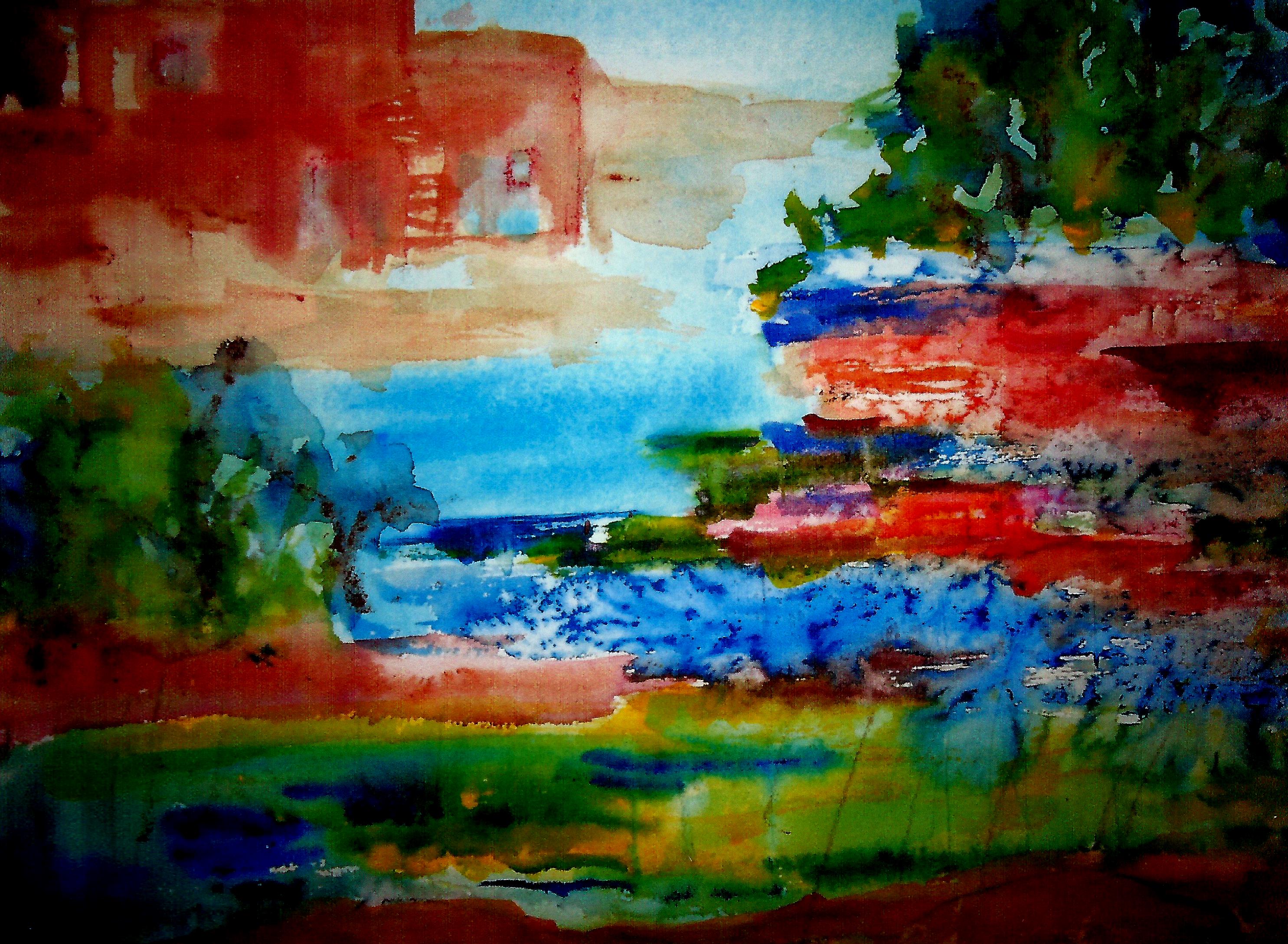
Thank you, Taylor Ikin, for your continual inspiration from DANCING WITH YUPO!  I have always loved to dance!  🙂  Here is a fresh off-the-messy-palette YUPO piece by moi.  It is titled “Irides”.  I can’t stop painting irides.  Although I’m certainly not to be compared with Monet (YIKES!) that master and I do have something in common:  repetition of a beloved subject.  Monet did haystacks and water lilies among other topics.  I do irides, along with woods, mountains, etc.  What a good life!

more-irides

Margaret L Been — February 25th, 2017

*Standing and moving around are the way to go, for me, as I have chronic orthopedic pain for which constant movement is the best medicine.  The pain ramps up greatly at night when I am lying in bed.  Rather than lie there and hurt (that would be STUPID!) I get up and move around our home—yes and sometimes dance, to the waltzes of Erik Satie as well as WITH YUPO.  🙂

**I am not a fan of drying paintings with a hair dryer, and rarely do this.  But once I tried it on a YUPO piece.  Not good!  Too much heat, too close to the painting ground and voilà—shriveled-up art.

Read Full Post »

winter-sunrise-4-1

Like many Wisconsin children in the 1930s and 40s, I loved winter.  We would race home from school, scarf down some hot cocoa and cookies, put on a few extra layers, and go outside to build snow forts or bombard each other with snowballs.  In the depths of winter, it would be almost dark by the time we quit and went inside to hang our wet wool snowsuits on a steam radiator to dry.  (Oh, the aroma of wet wool heating up!)

I recall several occasions where I realized I was getting sick and could feel a fever rising in my body.  Thinking the outdoor cold would squelch the flu bug (or whatever),  I’d avoid mentioning how I felt to my very solicitous mother, and stay outside as long as I could stand my hot cheeks and shivering self before going indoors and allowing myself to be put to bed with hot lemonade and honey.

(“Sick” was no joke in pre-penicillin days when front doors of homes frequently sprouted warning signs such as:  Scarlet Fever, Diptheria, Measles, etc.  Children were put to bed when they had a fever, no matter what!)

What in the world does all this nostalgia have to do with THE MESSY PALETTE?  Simply this:  Now I am 83 years old and I no longer LOVE winter!  I have become a WUSS!  Granted, snow is beautiful.  In fact, I actually go out and tramp around in the first couple of snowfalls.  But in recent years winter has gotten old very fast.  By March, when I’ve wanted to peel off layers of clothing and renew my store of solar energy, I have found the snowy cold weather to be absolutely annoying.

Now, suddenly, I am tired of being such a WUSS!  I have some really fun and funky leggings and tights, and a drawer full of lovely, colorful sweaters.  I can dress like a clown.  And I’m psyching myself up for winter with my paints.  Case in point is the above sample titled “Winter Sunrise.” 

Determined to put a positive spin on the days ahead, I have created a Three Pronged Plan:  1) putting on another sweater when the indoor temperature drops to 70 or 68 degrees, rather than bumping the thermostat to 75;  2) staying outdoors longer each time I need to take my beloved corgi out to do his jobs; and 3) the aforementioned—celebrating winter with my paints.

Sometimes old geezers* go into a second childhood mode.  Since our corgi Dylan LOVES to roll in the snow, maybe I’ll start rolling with him.  🙂

Margaret L. Been – 10/1/16 

*Yes, I know.  The expression “old geezers” is certainly not politically correct.  Yikes!  Who cares?  Anyway, I can use the label because I am one!  And proud of it!

art-statement-photo

Read Full Post »

rollicking-autumn

At one point the above rendering looked exceedingly dark and dreary:  blues, greens, and browns—nice colors but in need of some life.  As I often do, I thought of the late artist, Thomas Kincade.*  In one of his books, he shared that his favorite part of every painting was at the very end, when he added the light.

Now recalling Kincade’s work, I think what he had in mind was a subtle, airbrushed glow of light and not the Van Gogh-ish streaks you see here.  But light is light.  With all due respect to Kincade who obviously was extremely gifted, I really love Van Gogh—and inexperienced as I am, it shows.  So streaks of light transformed this work from a dreary rainy day in late summer to rollicking autumn.  And that’s what I’ve named the piece:  Rollicking Autumn.

Margaret L. Been — 9/14/16

*I believe that Thomas Kincade was a tremendously sensitive man with a huge soul.  His tragic end stands in contrast to the content of his art—which, although not the kind of thing I like to hang on my walls, is quietly soothing and nostalgic.  His life was a sobering testimony to the travesty of fame and success á là Hollywood with all its phony glitz and deceptive glamour.

Read Full Post »

Older Posts »