Feeds:
Posts
Comments

Posts Tagged ‘Watercolor painting’

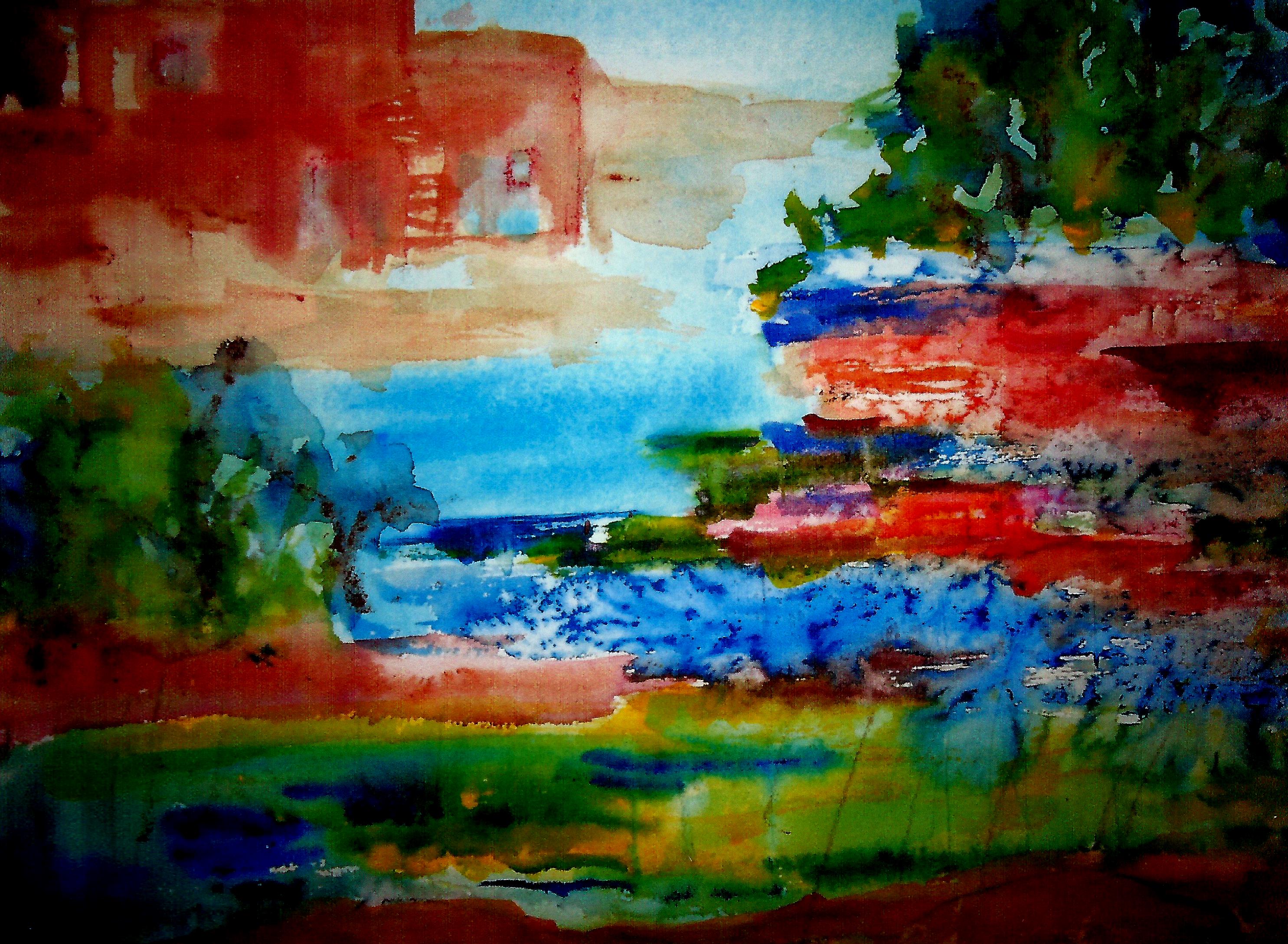
Memories of Manitou Springs, Colorado

We have nearly made it through another Wisconsin winter. Not a rough one, simply a bit long!

I began the new year with a passion for creating texture in my art. The above was one of the first renderings of 2020. It hangs over our piano, beneath a huge painting of rugged cowboys rescuing cattle in a crevasse—a treasure which I found at a thrift store years ago for little more than the proverbial song.

The mountains in my (16″ x 20″) “Memories . . . .” were formed with heavy modeling paste on YUPO paper which is not really paper; it is a kind of plastic with a slick, shiny surface.*

Then I added—almost dripped—the paints in various spots, jiggled the YUPO around, made a “cuppa Joe” in our beloved Keurig, and sat down to spin beautiful silk and merino yarn on one of my two Jensen spinning wheels. (Fibers—as in spinning and knitting—are another of my many passions.)

I love just letting the surface and paint do the work, with very little interference from “moi”. The results are frequently more delightful than products of obsessive meddling with brushes.

But I do use brushes also, and they can do wonderful things, especially with florals. I begin with watercolor, paint the flowers, and then add the background.** When this dries, I go back in with GOUACHE.

The gouache builds texture and dimension similar to the effect of oil paints. Sometimes I get carried away and the textures are layered so deeply that I spray the finished painting with an acrylic fixative, as the chalky gouache is otherwise apt to crack and flake away over the years.

Probably that would not happen to paintings immediately secured under glass, but the majority of my renderings live in protective plastc sleeves until switched around with framed works, given away as a gift, or (once in awhile) sold. When I paint on gallerywrap canvas panels, I always spray with a fixative because these are never framed.

Below is an example of a floral done with watercolor and many layered gouache accents.

Again and again, I paint flowers. I think of flowers day and night. Soon we will actually see them, springing from the ground! 🙂

Margaret L. Been — March 19, 2020

* Artists either love or hate YUPO. Often the “haters” are the purists who seek detailed perfection. I do not care for detailed perfection, so I am in the group that LOVES YUPO. Good thing I don’t hanker after perfection; I am incapable of achieving it !!!

**Watercolor rules (which I am very fond of breaking) dictate BACKGROUND FIRST. I normally do BACKGROUND LAST, having been greatly inspired and influenced by fine artist Barbara Nechis who usually paints the background last, because until her piece is finished she doesn’t know what kind of a background she wants.

Good reasoning! The color of the background is most compelling when chosen from colors in the completed subject. Seeing is deciding! Plus, it is so beautiful when damp background colors subtly phase into the body of the painting—either a still life or landscape.

Read Full Post »

It’s that time again—when it’s all about flowers and most anything green. Spinach salads, trips to the local garden center to find more INDOOR PLANTS, dreaming of the outdoor gardens while the temperature beyond our doors and windows hovers below freezing, and frequently below zero.

The end of our lane contains a pristine white mountain, where the plow has heaped snowfall after snowfall so that we in our condo community can get out of our garages. This is Wisconsin, USA, and that snow mountain may be with us for several more weeks. But all I can think is FLOWERS.

The above allusion to flowers has seen many mutations since its beginning in late January. Several times it almost got pitched in the recycle bin, but with each frustrating session I came back with renewed vigor and determination. I simply had to have something to show for the New Year!

This painting is 16″ x 20″, and is now framed in a lovely antique wood frame, on the wall beside my piano. I like the rendering, but up until a couple of days ago I definitely did not! Here is why: It started out with a photo realism approach—something that normally doesn’t work for me! The flowers were a dark magenta, with blobs of yellow here and there and something that was supposed to represent sky—in overly predictable blue.

The magenta was overpowering. My well educated husband walked by my art table and preempted my thoughts by commenting, “It needs some white.”

So I attacked the magenta flowers with white gouache (always my friend in coverups.) But somehow the white took over. More yellow. More magenta. Then some alizarin crimson to deflect the winey magenta.

Then more yellow to light it up even more, more blue to anchor the piece to the table—but this time aqua blue, always a winner. This all sounds fast and frenzied, but it took weeks punctuated with days for drying (I tend to gob the paint on thickly), excursions to our local medical clinic where our body parts are kept in running order, and time out to eat and be sociable. And sometimes I slept.

Finally the paper was so clotted with layers of watercolor and gouache IMPASTO style, that I had a fleeting sense of nausea. “You are going to have a bath,” I almost shouted at the paper which was actually curling up on its edges from the barrage of paint.

A bath indeed. Not a shower, but a soaking in our kitchen sink. I brought the dripping mess back to my table and plunked it down thinking I would attack it once again, as it began to dry. But then the magic appeared.

The gross top layers of paint were gone. Somehow much of the yellow had turned to a soft green when blending into the aqua. The magenta/crimson combo had turned a light lavender when confronted with shades of blue. While the paper was still damp, I covered it with plastic food wrap and squished the wrap with my fingers to create creases.

When I removed the plastic the next day, I felt like apologizing to what I found—a lovely bit of art for which I could hardly take credit. As is so often the case, the paint knows best! 🙂

Margaret L. Been — March 2nd, 2019

Read Full Post »

Growing more and more enamored with abstraction, especially that which is soft-edged, flowing, and organic as opposed to geometric, hard-edged, and harsh, I was tremendously pleased with the above 24″ x 20″ rendering—so pleased that I framed it and the mysterious painting is hanging high in our living room, brightening up the entire wall.

When I study the painting, I imagine different scenarios:  a moonlit swamp; a campfire; the triumph of light over darkness and joy over sorrow; the vicissitudes of a long life on earth.  The print which you see does not do justice to the colors therein; they vibrate and rock.  Recently, the “vibrate and rock” appealed to a seven year old great-grandson/friend who came for a visit and art making.

“I want to do one like that,” Deacon decided after studying my various paintings on our walls.  Then he excited me up to my earlobes by saying, “I like the way the colors run together.”  Do I have a kindred soul here, or what?

Deacon proceeded to create his own mystery painting.  He learned that simply painting color over color with a loaded brush creates blackish-brownish mud, which I praised and applauded because children’s art is ALWAYS wonderful.  Then I showed him how gently introducing colors to different areas of wet paper, while jiggling the paper to let the wet colors mingle, causes mysterious marks never to be reproduced in the exact same way.

There wasn’t time to introduce salt and plastic wrap which add texture to a painting, but hey—we quit art making in order to fly kites with Deacon’s great-grandfather (my Joe) in the park outside our front door.  Kites are important, and highly symbolic of our free and funky Boho lifestyle.

My, aren’t we full of metaphors and similes today!?!  Having written poetry most of my life (since I could first wield a pencil or pen), I tend to think in metaphors and similes.  They are everywhere and—like paintings and kites—the colorful ones are the most fun! 🙂

Margaret L. Been  —  May 2nd, 2018

Read Full Post »

Ice Tea again

It is often said that artists can create the world the way they wish it would be!  This may be true of most of the arts, and many crafts as well—where one is fashioning beauty from ashes—or victory in the midst of something that seems like defeat.  In my poetry, I have often featured the presence of light in apparently dark circumstances.

Without getting more ponderous, when indeed my mood is upbeat as I share with you, the above painting is the world the way I’m eager to experience it—and will in a few weeks.  Having lived in Wisconsin for all but three of my eighty-four years, I should know (and do!) that April in my home state is not like “April in Paris”.

Sometimes we get teased a bit with warm splashes, and these are meant to be savored but not viewed as the permanent seasonal weather change.  Meanwhile, we can paint (sing, write, dance) whatever weather we want—thereby creating our own reality:  our own private world.  A case in point is this painting, titled “Ice Tea Again”, reflecting a pastime which is HUGE in my estimation:  drinking ice tea on our patio beside our pretty little patio garden, while watching the birds and chipmunks that enjoy the hospitality of our feeders.

I have done many ice tea type paintings, but this one is unique.  Were you to actually see the painting, now framed in a 16″ by 20″ softly gilded frame, you would probably observe that something new has been added:  touches of mixed medium accents which add texture and individuality to the piece.

At this moment two amazing British artists—Ann Blockley and Soraya French—are vitalizing, coaching, and inspiring me via books and (in Ann’s case) DVDs to experiment with mixed media.  So “extras” have been added to this watercolor and gouache rendering, including areas of enhanced color on and around the flower shapes made with hard pastel pencils and Derwent Inktense sticks.  The winding vines were formed by streaking India ink from a pipette and letting it ooze around on the damp paper.  You may notice the sketchy lines drawn by oil pastels* in areas alongside the vines.  And, as always, thick applications of gouache have covered a plethora of boo-boos.

The above-mentioned artists, and many others, stress the importance of playing with the mediums, learning what they can do and not worrying about the outcome.  JUST PLAY!  This really appeals to me after a rather dragged out autumn and winter beginning with the loss of my beloved corgi in October and adding a challenging shoulder replacement to the mix.  I intend to play, while drinking volumes of ice tea!

Included in the “play”, is the fact that I am diving into water soluble oils.  This is happening at my newly acquired hardwood easel.  The easel doesn’t work for watercolor painting, as there is not room enough in the bedroom studio to flatten out the surface.  But oils can be done on a tilt.  While watercolors, gouache, and mixed medium play happens at my dining room studio, oils are slowly drying and developing on the easel.

Margaret L Been — April 14th, 2008

*When I received my order from DICK BLICK of a beautiful, magenta colored wood box of 60 oil pastels (Van Gogh brand) I reverted to childhood.  I can’t express the wonder and joy of running my fingers over the surface of these sticks, marveling at the gorgeous color gradations.

Read Full Post »

Bottle Fantasy--6Condo at Santa Fe--1WindowsWindows Series 2.jpgwindow scene made strange abd strangerMilwaukee South SideJars in a WindowDans la Fenetre 2.JPGBottles and Jars.jpg

When I began art making in in 2006, I entertained a short period of thinking each rendering had to be of a different subject.  But I quickly realized how silly that was, having had some exposure to art history in college.  Didn’t Monet do a lot of haystacks?  And lilies?

And how about Degas with his ballerinas?  Winslow Homer at sea?  Not to mention (but I will) Georgia O’Keeffe with her massive flowers and striking New Mexico scenes.  Not that I am placing myself on a level with the above, but rather to simply say it is good to paint favorite subjects again and again.  Each work will differ from its predecessor, and there is infinite variety possible via palette, season, details, mood, and the list goes on.  Again and again.

I like to do waterfalls, ships in peril (I don’t want to BE on one, just to paint it), trees waving in the wind, adobe structures, gardens, bowls of fruit—and pots, pitchers, bottles, and jars often in the setting of a windowsill.  There is something about the bones of structure, even in the evanescent ideas I like to present.

At the top of the page you see what is one of my very first attempts at watercolor.  In a book, I’d found a repro of a painting by Fine Artist Jeanne Dobie, where she portrayed bottles in a window not by painting the bottles themselves but rather through showing the liquid color contents of the bottles surrounded by white paper representing light.  Pretty leaky bottles (mine—Jeanne’s were stunning).  But that was 2006 and it was what it was.

The next one down is a quick colored pencil sketch through the window of a rented condo in Santa Fe NM, where we spent a wonderful Easter week with our son, Karl, and his family in 2008.  The NM scene is followed by three more window bits with stuff in the windows, then followed by an albeit primitive and super child-like rendering of Milwaukee’s South Side as viewed through a lobby window at St Luke’s Hospital where my husband was undergoing cardiac care.  That painting, as odd as it is, is close to my heart because of the stressful time it represents in our family.  Painting IS therapeutic!

The domes of Milwaukee’s South Side, historically Polish and Serbian, are followed by a 2013 window scene—getting just a little bit more presentable.  Then comes a 2016 scene which I like a lot.  The print doesn’t do the painting justice, as in real life the colors and shine are noteworthy—and so is the real life size, which is 20″ x 24″.  I like wet, blurry effect, which was achieved with Gum Arabic.  (I tend to get that name mixed up with what I put in my gluten-free baking:  Xanthum Gum.  I hope I don’t get the gums mixed up in the cookies!))

One more of blurry bottles.  I like the frayed and fringy effect in the yellow/purple on the right side—produced by wet color introduced alongside another, slightly drying paint.  This works best on wet paper, and I love it even though it drives some watercolorists crazy.

And finally, the 12″ x 16″ pictured below is my very latest studio creation.  The wood on the window was textured by dropping Winsor & Newton Texture Medium onto the wet paint with a pipette or medicine dropper—one more tool of the trade available with acrylic ink bottles, or from your local pharmacist.

Since I will probably go on doing window scenes, along with Peril at Sea, etc., I am covering the latest in this series with one name, “Dans la Fenêtre”—because I am besotted with the FRENCH LANGUAGE (in which my proficiency is nearly zero on a scale from one to ten.  🙂

Margaret L. Been — March 18, 2018

Read Full Post »

Here is a bold venture:  a painting which turned out to be too large for the ready-made frames at our local craft stores.  I had grabbed an entire sheet of Yupo® and had a blast, painting and thinking I would crop the finished work to fit a 24″ x 20″ frame which I had on hand.  But I was pleased with the entire piece, and couldn’t figure out where, if any, I wanted to sacrifice part of it.

A brainy idea:  custom framing.  This is pricey indeed, and I will not do it very often.  But the result is satisfying.  Below you can see The Big One on a living room wall:

Wall 2

AW.JPG

Many layers of gouache were piled onto this painting, over washes of watercolor.  Actually called “Waterfall”, this rendering evokes memories of a real waterfall we had on our 14 plus acres up north, where we lived full time for eight years.

Our land bordered on two roads, one up and one down a hill.  Our home was on the downhill road, next to a lake.  In the spring, snow and ice melted from the above road and roared downhill to our back yard, over boulders and brush.  The sound was stirring, and so loud that it resonated through closed windows.  In the summer, the waterfall morphed into a trickling downhill creek—always refreshing to sit beside on one of the big boulders.

How beautiful to have mellow memories, and then to paint them (and have them framed)!

Margaret L. Been — April, 2017

NOTE:  Obviously I couldn’t scan this painting on my home scanner, so I photographed it with my cell phone.  Because the piece was framed with non-glare glass I could do that.  But I failed to get the entire bit into the top photo.  In the shot of the painting on the wall with its surrounding environment, you get a better idea of how the waterfall fans out at its base.

Read Full Post »

Ex 4

Ex 2

Ex 3

EX 1.jpg

Years ago I giggled when I heard of art instructors telling workshop participants:  “The paper is talking.  Listen to the paper!”  But now, in my eleventh year of art-making and experimenting with different watercolor grounds, I no longer giggle.  Paper talks!  Paper says different things about the paints and techniques applied.  For a fun demonstration of this fact, I did an almost identical landscape on the above four papers using identical techniques, with a slight variation in my DaVinci artist grade* colors.

First, I applied clear water to a wide horizontal strip at the top, and a smaller swath on the bottom—leaving a dry streak between the wetted areas.  Then the top wetted strips were washed with blends of phalo and French ultramarine blues—and the sky areas were sprinkled with Kosher salt.  Avoiding the dry parts, I added color to the dampened below sections:  red, green, gold, and a bit of blue—while, as always, letting the paints mingle on the papers rather than on my palette.  On each piece, I pressed plastic food wrap onto the bottom area while the paint was still wet.

The papers represented are, from top to bottom:  1) Yupo paper with its especially unique voice, particularly in the way it talks back to applications of plastic wrap; Numbers 2) and 3) 140lb sketching pad paper—American Journey available online at CHEAP JOE’S, and Canson available at many chain craft stores; and 4) Arches 140lb cold press paper by the sheet, available at online art stores (and neighborhood fine art stores, if you have one.)  (Arches is pronounced “Arshe”.  Remember it’s French, and I may scream if you pronounce it like those golden thing-a-ma-jiggies on the MacDonald’s fast food signs!)

Yupo has no tooth whatsoever; rather it has a shiny, slippery surface so it will always make it’s own statement, without even trying to imitate.  You may notice a smoothness because of a lack of tooth on the 2 middle papers as well:  the sketch pad papers.  Also, note that on the 2nd of the smooth-surfaced sketch pad papers the food wrap film caused the paint to slide up and nearly obscure the strip which I had left white and dry.

The Arches 140lb cold press displays more texture around the salt, and somewhat more under the plastic film, due to the presence of tooth.  And on the Arches sample there is a charming bit of “cauliflowering” where wet paint has oozed into the dry area, also caused by tooth.

(Cauliflowers will normally be very prominent on paintings where wet colors collide on Arches 140lb cold press and comparable fine papers—especially when freshly painted strokes touch not-yet-dry parts.  Traditional watercolorists will practically do headstands to avoid cauliflowers, while I perform similar gymnastics just to make sure that I create and preserve them!  “Different strokes for different folks!”)

Different papers have different stories to tell.  By listening (LOOKING!) you can begin to ascertain what more you might want to add or change to complete the work, or do alternatively on another kind of paper.  In the above cases, done mainly for the purpose of illustrating variations in papers, I have done nothing more to any of the samples.

Margaret L. Been —  April, 2017

*My husband and I are blessed with many great-grandchildren.  (Dare I brag?  Well, I’m going to:  we are blessed with 18 of them—so far!)  Frequently, we have art days at our dining room table; what a delight!  Although I sometimes let the very young children slosh around on the economical sketch pad 140lb papers before launching into the high quality “Arshe” sheets which I nearly always use for my own finished work, I am terribly fussy about 2 aspects of art for all ages:  good brushes and artist grade paints.  No matter how young the beginner, good quality brushes and paints are essential.  Poor quality yields disappointing results, and the potential future joy in a pastime of art-making is not to jeopardized:  not at my table!!!

And that’s no April Fool!

Read Full Post »

Here is another British watercolorist who inspires me again and again through her books and DVDs.  Ann Blockley creates unforgettable, unique scenes which are, in her words unlike the “candy box scenes” we are accustomed to seeing.  Rather they are imaginative, and deeply personal—inspired by sights, sounds, and fragrances of familiar places around Ann’s home in the Cotswolds.

While demonstrating techniques for using watercolor in tandem with India ink, water soluble crayons and ink sticks, salt, plastic wrap, texture and granulating mediums (employed with a relaxed realization that the tools and techniques may decide their own path on paper, different from that which the artist has foreseen) Ann has challenged me not only to experience nature with all my senses, but also to take a deeper look at my photo books and computer files of favorite places I have lived:  to let the essence of these scenes penetrate my mind and heart, with the goal of more effectively expressing beloved places in my art.

The photos recall a lifetime of favorite places including:  my small-town Wisconsin  childhood home with a quiet stream at the base of our apple orchard; the Wisconsin Northwoods and waters where we vacationed when our children were young and where Joe and I lived full time for eight years beginning in 2001; my “home away from home”, Colorado where I spent a year at school, where Joe and I lived during his stint at Ft. Carson, and where we have visited many times since; more western vacation areas—Northern New Mexico and the farthest NW corner of Washington State; and our present home in Wisconsin’s Southeastern  Lake District:  a pleasant blend of small communities northwest of Milwaukee with lakes, rivers, woods, and a few remaining farms.

I will never live long enough to even begin capturing on paper the abundance of beauty which has underscored and punctuated my 83 years.  But I’m making a start, greatly motivated by the work and encouragement of UK artist Ann Blockley.  Here are a few of many scenes which I’m studying with a mind to painting—not with photographic accuracy but rather in response to their essence, in the coming year:

my-childhood-river

my-prairie

goldenrod

autumn-bog

DIGITAL CAMERA

under-our-windows

river-bank

gorgeous-clouds

Margaret L. Been — 1/22/17

NOTE:  If you GOOGLE Ann Blockley’s website, you are in for a TREAT!  MLB

Read Full Post »

quarry-and-mossflower

In recent months I have read mainly documentaries, political commentary, and eschatological tomes.  Very riveting and educational.  But I’d all but forgotten how much fun it is to read for FUN!  One should never forget that!

A deal via Amazon set me back on track:  The first 20 novels of Brian Jacques’ REDWALL series.  There are 2 more, which I hope to find another time.  I had read 4 or 5 of these years ago, and never realized there were 22 in the entire series.

I began by re-reading the first book, REDWALL.  Again I was captivated, enthralled, and totally charmed.  The characterizations, the cliff hanging plot which never gets boring, the hilarious satire—I love these books.  As a child, all my favorite fiction featured “talking animals”.  Some things don’t change!

What I’d forgotten about the REDWALL BOOKS, and am so delighted to recall, is Brian Jacques’ writing: packed with visual imagery.  The scenes literally come alive on the stage in my head!  The language is just plain painterly.  Maybe that has hit me more bombastically than it did when I read these books back in the 90s because then I was not yet into making my own visual art.  Playing with paints has opened the big wide world, and especially the world of the arts, to proportions of which I’d never dreamed possible.

I finished the first book late last evening, and couldn’t sleep because I was so inspired to paint what I hope will be a series of renderings to reflect the REDWALL novels.  Above is the first painting:  THE QUARRY AND MOSSFLOWER WOOD.

Margaret L. Been — November 26th, 2016

Read Full Post »

Older Posts »