Feeds:
Posts
Comments

Archive for the ‘Impressionism’ Category

Bottle Fantasy--6Condo at Santa Fe--1WindowsWindows Series 2.jpgwindow scene made strange abd strangerMilwaukee South SideJars in a WindowDans la Fenetre 2.JPGBottles and Jars.jpg

When I began art making in in 2006, I entertained a short period of thinking each rendering had to be of a different subject.  But I quickly realized how silly that was, having had some exposure to art history in college.  Didn’t Monet do a lot of haystacks?  And lilies?

And how about Degas with his ballerinas?  Winslow Homer at sea?  Not to mention (but I will) Georgia O’Keeffe with her massive flowers and striking New Mexico scenes.  Not that I am placing myself on a level with the above, but rather to simply say it is good to paint favorite subjects again and again.  Each work will differ from its predecessor, and there is infinite variety possible via palette, season, details, mood, and the list goes on.  Again and again.

I like to do waterfalls, ships in peril (I don’t want to BE on one, just to paint it), trees waving in the wind, adobe structures, gardens, bowls of fruit—and pots, pitchers, bottles, and jars often in the setting of a windowsill.  There is something about the bones of structure, even in the evanescent ideas I like to present.

At the top of the page you see what is one of my very first attempts at watercolor.  In a book, I’d found a repro of a painting by Fine Artist Jeanne Dobie, where she portrayed bottles in a window not by painting the bottles themselves but rather through showing the liquid color contents of the bottles surrounded by white paper representing light.  Pretty leaky bottles (mine—Jeanne’s were stunning).  But that was 2006 and it was what it was.

The next one down is a quick colored pencil sketch through the window of a rented condo in Santa Fe NM, where we spent a wonderful Easter week with our son, Karl, and his family in 2008.  The NM scene is followed by three more window bits with stuff in the windows, then followed by an albeit primitive and super child-like rendering of Milwaukee’s South Side as viewed through a lobby window at St Luke’s Hospital where my husband was undergoing cardiac care.  That painting, as odd as it is, is close to my heart because of the stressful time it represents in our family.  Painting IS therapeutic!

The domes of Milwaukee’s South Side, historically Polish and Serbian, are followed by a 2013 window scene—getting just a little bit more presentable.  Then comes a 2016 scene which I like a lot.  The print doesn’t do the painting justice, as in real life the colors and shine are noteworthy—and so is the real life size, which is 20″ x 24″.  I like wet, blurry effect, which was achieved with Gum Arabic.  (I tend to get that name mixed up with what I put in my gluten-free baking:  Xanthum Gum.  I hope I don’t get the gums mixed up in the cookies!))

One more of blurry bottles.  I like the frayed and fringy effect in the yellow/purple on the right side—produced by wet color introduced alongside another, slightly drying paint.  This works best on wet paper, and I love it even though it drives some watercolorists crazy.

And finally, the 12″ x 16″ pictured below is my very latest studio creation.  The wood on the window was textured by dropping Winsor & Newton Texture Medium onto the wet paint with a pipette or medicine dropper—one more tool of the trade available with acrylic ink bottles, or from your local pharmacist.

Since I will probably go on doing window scenes, along with Peril at Sea, etc., I am covering the latest in this series with one name, “Dans la Fenêtre”—because I am besotted with the FRENCH LANGUAGE (in which my proficiency is nearly zero on a scale from one to ten.  🙂

Margaret L. Been — March 18, 2018

Read Full Post »

Another DVD I watch and absorb again and again is Taylor Ikin’s DANCING WITH YUPO.  This Florida-based fine artist’s (1 hour, 58 minute) tutorial has probably done as much, if not more, to free me up and send me painting on my way—as any other resource in my sizeable home library of books and DVDs.

The huge secret (but not REALLY a secret!) is Taylor Ikin’s use of YUPO® paper, which is actually not paper but rather a shiny washable plastic–coupled with her method of always standing and moving around* while working, and using totally-generous, extra-humungous amounts of paint mainly applied with a 2″ or larger square brush.

In her DVD Taylor Ikin depicts a downhill stream tumbling over rocks, with a forest in the background and lots of wild growth along the banks.  Taylor begins by spritzing the sheet of YUPO with her spray bottle of water, and applying thick brush loads of rich undiluted colors for woods, water, foliage, rocks, and botanical stuff along the forest floor and riverbanks.

Taylor slosh/slosh/sloshes with brilliant, juicy straight-from-the-tube watercolors abundantly slathered on her brush which has been dipped in a commodious bucket of water.  (I normally use marinara sauce jars large enough to accommodate my 4″ wash brush, and a gallon ice cream pail for my water supply—the pail for rinsing and letting the pigments settle on the bottom, and one or two of the glass jars for fresh clean water.)

Then with her clean wet brush, Taylor begins to delineate water from land, while creating chunky textural tree shapes in the background.  Next, the forest foliage and groundcover evolve.  With YUPO, this is super easy, as any swipe of a brush or paper towel brings the wet painting surface back to its original white and ready for more action.  (When the paint is dry, a wet brush or wet paper towel will restore the white.  And if unhappy with any stage of the process on YUPO, one may hold the piece under a gushing faucet or float it in a bathtub of water.)

When Taylor feels her initial rendering is satisfactory, she recommends letting the painting dry**, perhaps even overnight.  When dry, the work is ready for tweaking and fine-tuning:  as Taylor puts it, deciding “What will make this a better painting.”  Now is the time-consuming stage of lifting, re-applying the shapes in a different way, making new shapes, removing colors, adding new colors, standing and looking at the work from a distance, holding the painting sideways/upside down/and in a large mirror, etc.  (I sometimes tweak and fine-tune for hours over a period of days, or even a couple of weeks.  My YUPO paintings usually consume more time than those on Arches 140# rag paper, because the YUPOs provide flexibility and so many more options.)

I have read books and watched tutorials by other YUPO artists, and quite frankly I have not warmed up to their work.  Excellently crafted, but simply not what I would want to hang on my walls.  But Taylor Ikin’s work has that magical quality to which I am inexorably drawn. Try GOOGLING her, and maybe you will be drawn as well.

YUPO is the perfect ground for the abstract realism style that I love.  It is perhaps the easiest surface for beginning painters to use because (unless you desire to create detailed, representational art that resembles a photograph) YUPO is encouragingly NO-FAIL  Every blob and drip of paint that blends with other drips and blobs will be beautiful.  A few quick blasts of diverse colors on wet YUPO are often “suitable for framing”.  But when more painstaking hours are invested, the rewards are even more incredibly satisfying.

One can play forever, with just one sheet of YUPO, painting and rinsing off the paint, experimenting with colors and brushstrokes.  Or finger strokes.  I have rediscovered the joy of finger painting, due to the fact that I have long hair and lots of it.  Frequently I spy a wisp of my hair in a work in progress. I dislike hair in a painting almost as much as I hate to find it in my food!  In the process of removing a hair with my pinky, gorgeous swirls will surface on YUPO.

Texture is easily achieved on YUPO—either by the application of modeling paste to make mountains, rocks, and tree trunks, or by dribbling texture medium onto the painted surface.  Salt and cling film (plastic food wrap) build texture as well.

The acrylic inks are vibrant on YUPO paper.  Another favorite technique is the slathering of gouache over water-colored areas.  The gouache may be built up impasto, to fashion floral still lifes or wild landscapes, while looking amazingly like oil paint.  I always spray my finished YUPO paintings with an acrylic fixative; this not only prevents smudging and smearing paint forever, but the fixative makes a lovely shine (although matt fixatives may be used if so desired).  Also, the acrylic spray will prevent the impasto gouache areas from flaking.

Thank you, Taylor Ikin, for your continual inspiration from DANCING WITH YUPO!  I have always loved to dance!  🙂  Here is a fresh off-the-messy-palette YUPO piece by moi.  It is titled “Irides”.  I can’t stop painting irides.  Although I’m certainly not to be compared with Monet (YIKES!) that master and I do have something in common:  repetition of a beloved subject.  Monet did haystacks and water lilies among other topics.  I do irides, along with woods, mountains, etc.  What a good life!

more-irides

Margaret L Been — February 25th, 2017

*Standing and moving around are the way to go, for me, as I have chronic orthopedic pain for which constant movement is the best medicine.  The pain ramps up greatly at night when I am lying in bed.  Rather than lie there and hurt (that would be STUPID!) I get up and move around our home—yes and sometimes dance, to the waltzes of Erik Satie as well as WITH YUPO.  🙂

**I am not a fan of drying paintings with a hair dryer, and rarely do this.  But once I tried it on a YUPO piece.  Not good!  Too much heat, too close to the painting ground and voilà—shriveled-up art.

Read Full Post »

More Rose up a FountainGarden in GouacheOn the Edgeblue and old pottery 2Out Back

These a only a few of my watercolor paintings which have been enhanced with gouache, a water soluble medium which is opaque unless greatly thinned with water.  Gouache does not dry permanently, as does acrylic paint; thus it really is a watercolor and it needs to be preserved behind glass.  But gouache adds heft and body, when desired.  In fact, gouache is also called “body color”.

More and more, I am adding some gouache to my foundation of transparent watercolors:  either a touch here and there, or larger areas built up to accentuate texture and brushstrokes.  My goal is to achieve a resemblance to the richness of oils.

I do have water-soluble oil paints, and have used them on occasion.  But the lengthy drying time puts me off, as I don’t have a lot of excess space in which to store works in progress.  Also, I don’t want to completely abandon transparency.  So transparent watercolors and gouache are the perfect combination for me.  And I think I have fallen in love with gouache!

Margaret L. Been — January 26, 2016

Red Cabin in Winter

Old Town

Proud

Read Full Post »

:The Preserve

Normally I am not a fan of long phone conversations—except with our out-of-state family members.  But now and then I bend an ear with local good friends.  Although an in-person chat is preferred, there are times when we can only meet on the phone.

Speaker phone may be one of the 20th century’s greatest inventions.  I use it to keep my hands busy and my brain from going nuts while stuck on the phone.  Recently I banged off the above rendering, in the process of listening and also doing a significant share of the talking.

Three things can be noted:  1) The fact that the days are lengthening is evident in this little piece.  Gone is the snow (in my head; we still have snow on the ground).  From now on it will be flowers, land and waterscapes, or far out abstracts in COLOR minus snow.

2) The above painting was done primarily with a wooden knitting needle.  I picked up the idea of a stick from DVDs by British artist, Shirley Trevena.  She frequently uses a stick, culled from outdoors, to add detail to a painting—squiggly lines, dots, whatever.  Watching Shirley work with a stick gave me the knitting needle clue; knitting is another one of my passions, and I knit exclusively with wooden needles.  So I used the telephone time to dab away with a needle—and blotched a wet paintbrush over the tree top and background to finish off the job.

3)  In the world of “real art”, this painting would be considered a “sketch”—simply a precursor to a finished work which would take far more time than a phone conversation.

I spend a lot of time gazing at the work of well known artists in books that we have at home, plus library books.  I love the late 19th century and early twentieth eras of Impressionism, Post-Impressionism, and Les Fauves (The Wild Beasts) who were considered revolutionary because they took wonderful liberties with color.  From my studying and reading, a favorite artist has emerged.  I am fascinated by and thoroughly enamored with the life and work of Camille Pissaro—a Danish citizen of Jewish Portuguese descent who was raised in the West Indies and settled in France.

Before reading about the life of this artist, I was wiped away by his work which largely portrays French country landscapes and scenes of country people—their life and labors—in a warm Impressionist vein.*  Actually learning about the man has made me love him.  His personality was one of stability and a love for family and friends.  A bit older than Monet, Degas, and other artists of his period, Pissaro was looked up to as a leader.  He was instrumental in organizing the shows of Les Refusées—those avant garde painters defying the traditional Paris art establishment which dictated standard themes:  Biblical, historical, or mythological accounts rendered in precise detail.  Many of the new artists were refused entrance in the annual exhibition of the Paris Salon—or Académie des Beaux-Arts—hence the name, “Les Refusées”.

The Impressionists broke with tradition not only by focusing on the subtle nuances of color, atmosphere, and the effects of light, but also by depicting scenes of everyday life rather than classic themes.  Whereas many of these artists painted gatherings in cafés or gardens, public events, boating parties, etc., Pissaro painted peasants at work planting, harvesting, carding wool, washing clothes in a stream, whatever.  Many of his paintings feature roads and undulating trees, and there is a gentle, graceful rhythm to his work.

His renderings are not idealized; there is no glossing over the reality of hard work.  Pissaro’s paintings display his compassion for working people, plus his belief in the dignity of time-honored rural life.  He realized that the countryside was on the cusp of change, that machinery would soon alter the French landscape, and he wanted to capture those vanishing moments of the 19th century.

Pissaro was a socialist at heart, in the best sense of the word, at a time and in a society where working people did not receive fair recompense for their labors.  But his political sentiments never spoiled the freshness and honesty of his paintings.  Perhaps there is nothing more potentially destructive to fine art than the blatant parading of a social or political agenda.  Pissaro was never guilty of that; he simply painted country landscapes and the people who lived and worked therein.

I cannot post a Pissaro print on this blog due to copyright restrictions, but do encourage anyone interested to GOOGLE “Camille Pissaro” and bask in the beauty of this artist’s work.  For fascinating insights into art and artists in late 19th century France, you can read Irving Stone’s biographical novel of Pissaro, THE DEPTHS OF GLORY.

Meanwhile as I wield a paintbrush or knitting needle, whether on speaker phone or in some quite corner, I know that my renderings are really “sketches”—and very “sketchy” at that.  But what a joy!

Margaret L. Been, January 2015

*Absorbed by the novelty of “Pontillism”—a kind of scientific theory of the breaking up of objects into colored dots which the eye then sees as a shaded whole—Pissaro painted in this style for a few years of his career, only to realize that the structure was confining and, for him, stylized.  Happily, he returned to the freedom and spontaneity of his former works.

Read Full Post »

.Beautiful Bouquet for Jamie

Recently our Denver son, Karl, visited us “back East”—in Wisconsin.  He spotted a painting I’d done for his sister, our daughter Debbie,  Rather than continuing to lose you readers in a string of our family connections, I’ll simply state that after seeing the painting, Karl said, “I’d like one like THAT.”

Wonderful!  So satisfying when someone likes your art, right?  But “one like THAT”—similar to, and in the time frame of, the above-pictured rendering–was done three years ago.  Now I’m trying to paint “one like THAT”, but I always come up with something different.

Maybe because of writing articles and stories for magazines and newspapers for decades, I’m sensitive to the ominous significance of plagiarism.  I have always been super cautious not to plagiarize someone else in my work.  Now that visual art has pushed my writing career to the background, I cannot even pick up a paintbrush and plagiarize myself!

Every individual who devotes huge chunks of time to art will attest to the fact that we change and grow.  I’m constantly exposing myself to different and new techniques and styles through books and DVDs.  When too weary at the end of a day to actually work in my studio (a card table in a corner of our bedroom), I immerse myself either in volumes of my beloved mid-to-late 19th century French artists or in the theories and works of present day water-media artists whom I find greatly inspiring:  Cheng-Khee Chee, Charles Reid, Barbara Nechis, Jean Haines, Shirley Trevena, Taylor Ikin, Clare Harrigan, and Karlyn Holman*, to name a few.

Although I never sit down at my art table with an open book or a DVD screen before me, I know that ideas for different approaches seep in through a kind of soul osmosis.  Constantly I enjoy delving and exploring fresh possibilities—even some that I’ve discovered on my own, such as mounding gouache on top of watercolors to achieve a textural effect resembling that of oil on canvas.

Hence I may never able to reproduce “one like THAT”.  But I’ll continue trying, and something will connect!  Scanned and emailed images of various new paintings are bombarding Karl, and when the right one appears on his computer screen he will reply, “Stop!  That’s it!”

One like THAT!

blue and old pottery 2


More Equinox

©Margaret L. Been, September 2014

*Many water-media artists tape their paper to a board before beginning to paint.  I prefer not to do this, as I enjoy tipping and wiggling my paper so that colors will run and form beautiful “cauliflowers”.  Some of the paper taping is done simply to prevent 140# cold press watercolor paper from buckling when wet.  Through her teaching, Karlyn Holman demonstrates the perfect solution for that—forever freeing artists for the need to tape their watercolor paper to a board.  Here is Karlyn’s wonderful trick.

Thoroughly wet the back of your finished painting.  Then make a sandwich:  a plastic placemat on a table or counter; clean paper toweling over the placemat; the painting face down on the paper toweling; another layer of paper toweling on top of the painting’s wet back; another layer of plastic placemat or whatever; and a large book, or several books, to weight down the sandwich.

Leave the sandwich overnight, and voila.  A perfectly flat painting.  If the watercolor paper is still damp, I repeat the sandwich process (omitting the wetting stage of course) until the painting is dry enough to mat.  COOL!  Thank you, Karlyn.  Wisconsin people are indeed brilliant!!!  🙂 )

Read Full Post »

Boreal Twilight

It is the night before the night before Christmas—a time of great joy for our family (50 immediate family members counting children, grandchildren, great-grandchildren, husbands, wives, and significant others).  There are also friends whom we consider to be family—some who have been an integral part of our lives for decades, our children’s close friends among them.

Meanwhile, this is an art blog.  How I love sharing art talk with kindred readers!  I’ve been thinking big time about the people who have encouraged and instructed me in this late-in-life experience which has become an absolute passion and joy!

My family has been an incredible support, and they like to have some of “me” on their walls.  Joe smiles when the UPS drops packages at our patio door—brown boxes loaded with brushes, tubes of paint, and huge increments of paper.  At one time he said, “Don’t artists use the 3 primaries to get all their colors?”  My answer was “Yes, that can be done, but just look at what manufacturers have produced in recent decades.”  Joe got the point, which is pretty obvious when one views the two generous containers in my studio:  one overflowing with partially squeezed tubes, and the other abounding in delicious brand new tubes waiting their turn to get squeezed.

The support of those whom I consider to be “real artists”, has been an amazing surprise and blessing at every turn.  By real artists I mean exactly that.  These are the individuals who were often drawing and painting as children—just as I was always writing a poem or an essay.  They are professional in every sense of the world—whether in teaching or selling (and frequently they are doing both).

As a fumbling, embarrassed beginner (not that long ago—it was 2006) I never dreamed of getting encouragement from artists who know what they are doing.  But I soon discovered that collectively artists are actually the most out-going, supportive people on earth—creative souls who love nothing more than to share their passion while inspiring others to experiment and grow.

Most painters (and this is probably true in other visual art disciplines) realize that each of us is one of a kind.  We learn from each other, however each person’s work will have a signature which is unique.  There is art for all people, at all levels.  I certainly know the difference between the four to six digit paintings which hang in the most discerning of galleries, and my own art which may be displayed and very occasionally sold at an Art Walk on the sidewalks of our small neighborhood community.  I am contented, and tremendously happy to be a part of the entire scene!

I owe more than words can say to a friend, fine artist in pastels, and encouraging teacher in the gorgeous Wisconsin Northwoods—Diana Randolph.  I attended two of Diana’s workshops held at a school a couple of hours from our Northern home—one a drawing class and the other an introduction to those beautiful buttery, silky pastels.

Drawing was (and I admit still is) my very weakest thing (I can’t call it a skill)!  This is a sobering admission since the reading of Art History reveals that down through the ages drawing has been the very basis of art.  Years were spent, simply drawing.  Pre-Raphaelite English fine artist and critic John Ruskin believed that color should only be introduced after an intense discipline of drawing-drawing-drawing.  Sorry, John.  I simply couldn’t go there, and my heart does not leap at the sight of a pencil or charcoal stick.

But COLOR!  There I was immediately hooked/grabbed/enamored/and fulfilled—body and soul.  To add color!  Well I had been doing that in decorating my home and body nearly forever.  Why not add color to paper or canvas?  Diana’s pastels got me so excited that I ordered high quality soft and hard sticks, the right surface, the sandpaper, the solvent to smear in strategic spots, the whole bit—only to discover that pastel dust did nothing worthwhile for my tetchy breathing apparatus.

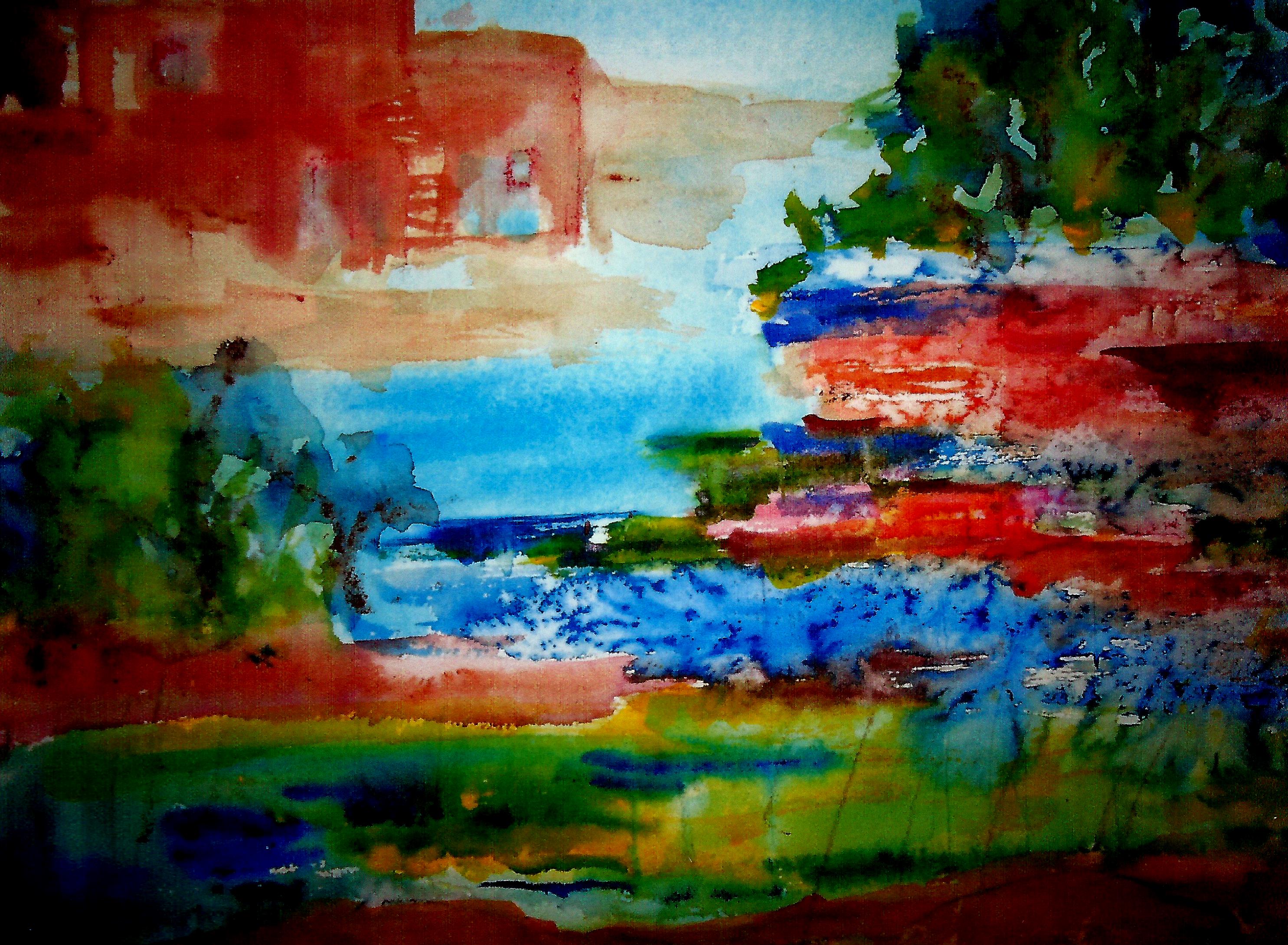
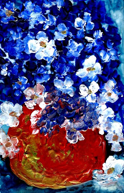
Realizing that pastels were out, I deduced that oils would also be a problem for this confirmed asthmatic.  So what was my logical medium for COLOR?  Water/water/water and wonderful 37ml tubes of watercolor.  (Winsor & Newton, Da Vinci, and American Journey all come in these large tubes.  I also love some Daniel Smith colors which are available in smaller sizes.)

Diana Randolph is the only “real life” teacher I’ve worked with.  But a long time friend, fine artist Jan Roberts, has also been a constant source of inspiration.  Jan works in most every medium, and I have three of her magnificent oils hanging in our home.

My bookshelves groan with contemporary watercolorists who have shared through their books.  I have studied via books and DVDs—reading and viewing over and over and then some.  Each of these artists is unique, and they have varying views on many aspects of what to do, and how.  All of them encourage beginners, and acknowledge that they once were novices as well.  (Maybe when they were three years old! )

Book and DVD studies are also refreshing and freeing!  I respond to some techniques and am not so crazy about others.  This, perhaps, is the birth of an artist’s voice—compounded from much exposure from books, films, and actual galleries whenever possible!  A person can never learn it all, and knowing that I am a student, forever growing, thrills me right down to my toes!

Here is my list of surrogate teachers in watercolor painting:  Americans—Charles Reid, Cheng-Khee CHEE, Barbara Nechis, Karlyn Holman (Wisconsin proudly claims Karlyn!), and Taylor Ikin (the “YUPO Queen”); Canadians—Karin Huehold and Linda Kemp; and British—Shirley Trevena and Jean Haines.  These are amazing teachers who differ in many ways—their main similarity being the creation of fantastically beautiful work.  Due to the marvels of technology, I have received email encouragement from some of these artists.  The profusion of encouragement never fails to remind me of Hans Christian Andersen’s THE UGLY DUCKLING.  I realize that I’m not quite a “swan”, but the swans have really made me feel like I belong—and this is a beautiful feeling!

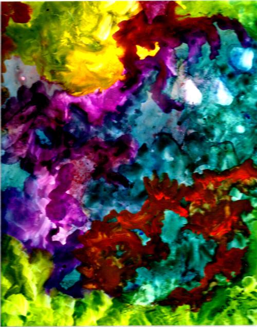
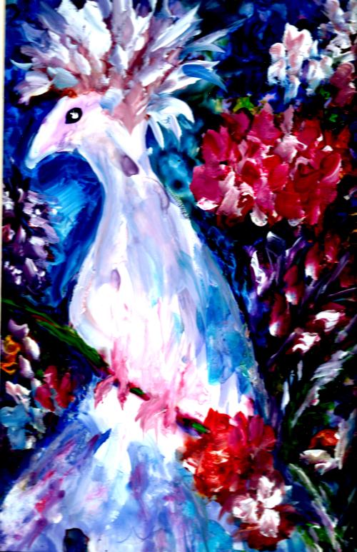
Currently, I’m enjoying practicing a method from UK fine artist Jean Haines’ DVD, AMAZING WAYS WITH WATERCOLOR.  Jean begins some of her paintings with a single spot on the paper, and letting the subject reveal itself from that spot by streaking lots of color and water in a diagonal.  Jean stresses the need to let each stage dry completely, and to enjoy the beauty of each stage—the color fusions and the way a subject will evolve for future development.

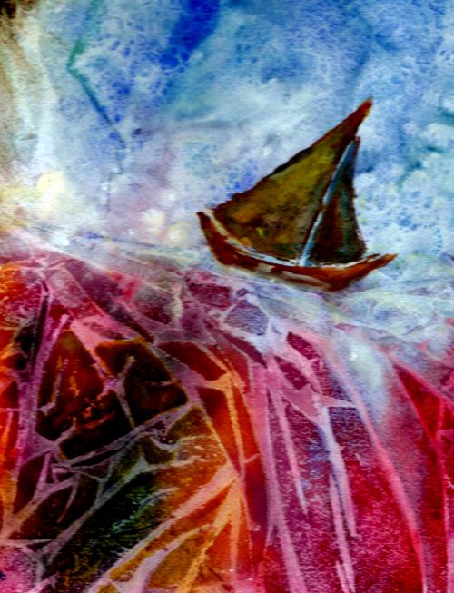
Jean demonstrates painting cockerels (of course that’s UK for roosters).  She loves cockerels and so do I having raised numerous fancy breeds of cockerels (I think I’ll call them that!), hens, and chicks for eighteen years on our little funny farm in Eagle, Wisconsin.  So I have been experimenting, and here is one of my studies—called “Overdressed for the Occasion”.

Overdressed for the Occasion 2

It will undoubtedly take many more “bloggings” to share the countless ideas I’ve incorporated from books and DVDs.  I hope to do that in 2014.  But this blog entry has grown so long, I wonder if anyone will make it to the finish.

Nevertheless, I don’t want to edit a single word of thanks to all of my teachers, and to you readers.  You mean so much to me!!!  🙂  Merry Christmas!!!

Margaret L. Been, December 2013

Read Full Post »

Windows to Beyond

Always Time for Tea 2

Art makes fascinating study.  I’m continually amazed at the varying views and disagreement between artists in every detail of painting.  Some staple or tape their paper to a board before proceding, while others (and I am one of these) just let the paper float so that they can lift and blend colors or rinse off areas which are still damp when so desired.  Many artists make value sketches before beginning to paint, and plan every brush stroke in advance, while others begin intuitively—letting the first blobs of paint on wet paper determine the subject of the work.

Some artists will say, “Never extend a shape to the edge of the paper or let part of an object disappear”, while others contend that disappearing shapes make a piece far more interesting.  (The latter suits my taste best, as you can see in my above still life titled “Always Time for Tea.”)

Both of my samples pictured here (the top one is titled “Windows to Beyond“) defy the supposedly “set in stone” art rule which insists that light comes forward and dark recedes.  Obviously the concept of advancing light and receding dark applies to the magnificent chiaroscuro (strong contrast between light and dark) works of the Old Masters which frequently featured portraits. 

Recently I was treated to a traveling exhibition of Rembrandt’s self-portraits at the Milwaukee Art Museum.  The face and form of the artist loomed prominently in lights and midtones, highlighted in subtle shadows and flanked by a definitive background of darks.  But I am not a “master” in any sense of the word.  Although I understand the chiaroscuro precept (among other art rules) I don’t consciously attempt to employ it.  Rather, I just sit down and paint—and invariably my darks come forward and my lights recede.  

Perhaps my darks are not true darks.  My handling of watercolor evokes the medium’s transparency and ability to diffuse, but I may never replicate the incredibly rich, velvet-textured darks produced by oils.  That’s okay.  I greatly appreciate the skills and materials which are way beyond my ken, and I’m thankful to have even a rudimentary degree of understanding concerning the principle of light and dark.  Also, quite possibly my darks come forth and my lights recede because my (perhaps one and only!) strength is COLOR.  As one of my favorite contemporary artists, Charles Reid explains: vibrant color always predominates.  Viva les couleurs! 

I delight in reading all and any art history I can get my hands on—and there is enough of it out there to keep me entertained for the rest of my life.  Most of the reading is enjoyable and informative, but I’m especially drawn to the artists who exploited color to the max—the Impressionists, Post Impressionists, and various other “Ists” of the 2nd half of the 19th Century into the early 20th.  Currently my most beloved painter of that era is Matisse who shocked the Parisian art world with his blatant use of color.  Matisse and his followers earned the title:  Les Fauves—meaning “Wild Beasts”.

Reading about artists and art movements is, to me, like eating chocolate or maple sugar—thrilling beyond words.  In fact, the reading is far better than candy!  I can’t get sick on reading art history!  Only more and more inspired, drawn, captivated, and excited about the entire amazing world of shape, texture, and COLOR!  🙂

Margaret L. Been ©2013

Read Full Post »

Ever beautiful in my eyes, are collages which tell a story solely through color and texture.  There is something wonderful about art that doesn’t have to hide behind glass.  I finish my collages with an acrylic gloss medium, so they will last for at least many decades—and probably centuries.

A couple of years ago, an older woman who had been painting most of her life challenged my proclivity for imaginative art.  She said, “There is so much beauty out there.  Why would you want to paint anything other than a scene as it really is?”

I could have answered, “How wonderful that you can replicate nature exactly as it is.  I didn’t think even the most sophisticated cameras could do that!”  But my childhood training in graciousness would undoubtedly have stopped me.

Most of my abstractions contain enough familiar shapes to provide clues of reality.  Actually, I enjoy making some representational art as well.  On occasion I like to paint still lifes, cityscapes, or tree-lined country roads.  When I’m very tired, or when my disintegrating back rachets me out of bed late in the evening, I’ll seek refuge in painting a vase of flowers or the familiar territory of my patio garden.  There will invariably be a touch of fantasy, whimsy, or color that nature never intended—but the finished painting will clearly say “Flowers” or “Patio Garden”. 

My off-the-wall fantasy emerges on days when I’m supercharged.  Invariably, it is the off-the-wall renderings that please me the most.  They broadcast LIFE, ENERGY, COLOR, and FREEDOM—those inner qualities that keep me believing I’m young even when my family and doctors know better.

In any art conversation, we need to delineate between “art” and “ART“!  Lower case art is what I do—at entry level, of course.  Lower case art is what I see in our local galleries.  Lower case art exists at many levels—the bottom strata of beginners like I am, and the advanced layer of veterans who price their work in four digits on the left side of the period.

Then there is ART—those paintings hanging in museums which I’ll probably never visit in person.  I visit this kind of ART online, or via magazines, and I’m thrilled to shreds.  Given the size alone of much fine ART, a real life viewing might finish me off. 

Regarding upper case ART, I favor those works which somehow augment or supplement reality.  Monet was a master at turning gardens and ponds into breathtaking fragments of light and color; to me, his work is the ultimate in excellence and appeal.  But there are realists who move me to the bone as well.  Andrew Wyeth’s poignant “Christina’s World” is heartbreakingly sensitive, and I believe it ranks among the world’s greatest ART.  

We artists are known to grow, and sometimes change in the process.  We may use a brush indoors today, or pour our paint outside and spray it with a garden hose tomorrow.  We may paint barns one year, and strange creatures from the bottom of the ocean in the next.  We may paint a dog that looks like a dog, or—in my case—dogs that look more like people.  That may be because I’ve always viewed my dogs as people.  But that’s totally beside the point!  🙂

“Art” and “ART“!  There’s room enough on our planet for all of it—and for all artists, whether we are representational, moderately expressionistic, or thoroughly off-the-wall!  We should never have to defend what we like to paint, or why!

Margaret L. Been, ©2012

Read Full Post »


I wonder if there ever could be a more widely known and beloved painter than Monet!  Throughout the ages and centuries of Western Civilization art, some of the Renaissance masterpieces comprise what we could term the highest art—due to their richness, representation of genius, complexity, the variety of surfaces on which they were painted, and the Biblical themes they depict.  But when it comes to a universal love for paintings that we can live with, I believe the artist of choice would be Claude Monet.

Considered the “father” of Impressionism, that 19th century movement which revolutionized the art community in Paris and throughout Europe and America, Monet differed radically from some of his also famous contemporaries such as Manet, Renoir, and Degas in that—as he developed—Monet concentrated mainly on landscapes, water, and gardens while his fellow artists painted social gatherings at Parisian cafés, ballerinas, and nudes.

In his early years Monet traveled and painted around France, particularly to areas bordering the sea.  He evacuated for a brief period to London, during the Franco-Prussian war, and London became his favorite European city—perhaps partly due to the ever changing nuances of light and fog on the River Thames. 

In variance with his gregarious artist friends, Monet was a solitude-loving family man.  He is most widely remembered for his home and the gardens which he created at Giverny, about forty miles northwest of Paris, where he lived for forty some years.  The gardens deteriorated over the decades after Monet’s death in 1926, but since the late 1970s they have been restored to their former glory.  Monet was a master gardener who loved every inch of his turf as well as the ponds and Japanese foot bridge which he designed.  His plantings were conceived and arranged with his palette in mind, and he has left gardeners and art lovers a treasure of tranquil beauty.  

How many homes, perhaps some without even realizing it, contain traces of this artist/genius who helped to move the art mentality from a penchant for rigid, detailed reality to the more illusive and painterly qualities of color analysis and intricacy?  Below, you will find my tribute to a painter whom I love, an umbrella with a Monet print hanging from our living room ceiling—to the puzzlement of the little folks who visit here; they have never seen such unusual interior decorating in any other home. ↓ 

I love Monet for his Impressionistic mark, and even more for later pioneering the subsequent phases of art history—Post Impressionism and the beginnings of Abstract Expressionism.  Unlike some later Abstract painters who had an agenda (either political, social, or personal) to shock or debunk, Monet produced work that was life affirming.  He painted the scenes around his home and land, over and over—recording the times of day and changing seasons in haystacks, surrounding fields, and the famous ponds and gardens of Giverny.

Margaret L. Been

Note:  I am adding to my “Simply Art” page—trying to remember to add something at least once a week.  Today’s addition is my very latest watercolor on Yupo paper, titled “Country Roads”.  Now is the time of year when those roads beckon us and lead us into months of wonderful surprises and advenures!

Read Full Post »

Older Posts »