Feeds:
Posts
Comments

Archive for the ‘Acrylics’ Category

. . . and time for a warm weather studio in what used to be the garage. Wonderful on rainy days, with the garage door up and that glorious fragrance of rain without getting wet!

Blessed with 14 grandchildren and 20 great-grandchildren*, I love to hostess art days in the garage. We make huge messes and have a blast. With Papa Murphy’s Pizza just down the road, it can be a double blast!

Here is a fun and really lovely project that most anyone can enjoy–3 or 4 year-olds as well as adults. It’s really a collage–but I call it PAPER NAPKIN ART. You need paint (acrylic works well for this project), paper napkins, a gallery wrap canvas panel (I prefer the ones with a cradle of at least 1 and 1/2 inches deep) and an acrylic spray fixative.

On the back of most every paper napkin, there is a backing sheet–at least 1, and sometimes 2 as in the case of the above pictured lovely rose-patterned napkins which I found on AMAZON.

Peel the backing sheet or sheets off the napkin. When there are 2 papers this takes patience, but they will peel off.

When as many napkins as you need to cover your panel are ready, then paint the panel with colors of your choice. I like to use more than 1 color, as the colors will show through the napkins beautifully and I enjoy the variety and contrast. In the above sample, I used yellow and a soft coral paint. The original roses on the napkins were a very light rose color..

Apply the napkins while the paint is very wet, and press the paper into the paint with some kind of a roller. I have a brayer, but HEY–you could use a bottle or even that thingy the toilet paper roll fits on.

When the surface is dry (this often takes time on a Wisconsin summer day) you can add flourishing touches of paint, if so desired. Otherwise wait a day or two more, and when you are certain your piece is totally dry, spray with the fixative. Gloss and matt are available; I always go for 2 or 3 coats of the glitz.

Here is another sample–a different napkin and paint colors. The options and varieties are endless!

TOO MUCH FUN! Happy Spring!

*Our great-grandchildren range from age 1 to 18. The 18 year-old, Elijah, has just completed his Basic Training at Ft. Benning Ga–and will finish Infantry Training in mid July. (I just had to brag a bit. Very proud of our soldier!)

Margaret L. Been — May 6th, 2021

Read Full Post »

I call it a “foray” because acrylics are uncharted territory for me. I haven’t invested enough time in this much-touted medium to understand how to use it. There is huge frustration whenever I begin to apply acrylic paint to paper; the paint just sits there. It doesn’t go anywhere. Perhaps I am lazy, and a bit spoiled by watercolors which do a lot of the work for me.

Anyway, this pictured sample of my resolve to finally get acquainted with acrylic paint turned out to be a keeper. In fact, I liked the painting enough to have it professionally framed—something that has happened only once before. In that instance I had produced a piece too humungous for a ready-made frame.

The painting is called, “Prairie Dance”. I selected it for today’s entry because it reminds me that SPRING WILL COME!

Margaret L. Been — January 15th, 2021

Read Full Post »

Waiting for spring. Meanwhile, ideas keep surging through my head. Art concepts are ever stretching.

Since Joe and I no longer need a vehicle, we gave our well-used Honda van to a grandson who is a seminarian at a local theological center, and his wife and two year old daughter—whose name happens to be, believe it or not, Margaret Been.

A garage only has to sit empty (except for all the garden and home maintenance junk lining the walls) for a couple of days before brain seeds sprout. An outdoor room! An outdoor studio for art making and spinning gorgeous fibers into yarn. A place where kindred souls can visit, and neighbors can pause. Ever stretching!

This IS Wisconsin, which means the feasibility of enjoying a garage room is limited to the three summer months (given reasonable summer weather) and a few days at each end of the spectrum (given some surprise weather in spring and fall).

We put a small mock fireplace in the room. The decorative fireplace uses one light bulb to simulate burning logs, and a fan to blow a bit of hot air when desired—mainly for ambience, and not sufficient to handle our weather in a garage. (Indoors maybe!)

But dreams persist. Every day I linger for a few moments in this bit of summer heaven, just dreaming and thinking about family members and friends whom I will invite for art and fiber days.

I have two permanent art-making corners indoors, and I produce in these studios non-stop. Two spinning wheels, plus baskets of merino and silk in a riot of colors whirl constantly in our living room where the resulting skeins of yarn dangle from hooks and surfaces.

Art displays, a table on which to work, an area for storing brushes, paints, papers and additional art tools, another spinning wheel, and a (possible) lifetime supply of additional fibers join me in anticipating warm weather in the garage room.

My art goals are ever stretching as well—including a return to collage art between actual paintings. A few years back, I did a lot of collages from random materials and whatever abstract inspiration blossomed moment by moment.

Collages differ just as every artist is unique. Some are decidedly geometric; some feature words, photos, images of people and buildings, or symbols such as numbers. Others are more organic, kind of like an unkempt garden of color and flowing shapes. Or a messy landscape with tangled trees or turbulent seas. And mountains, plenty of mountains.

The materials are legion: gorgeous Oriental papers—Kozo, Mulberry and Rice Papers, and Japanese Lace; common old cheesecloth, tissue paper, and gauze; aluminum foil; ribbons, greeting cards, pieces of musical scores, and decorative gift wraps; wool fleece, yarn, string, and bits of fabric; seasonal and party napkins—with the backing papers torn off so the napkin design is translucent and delicate; acrylic and gouache paints—metallic and otherwise; dried leaves, flowers, twigs, and herbs; templates and stencils; poems; torn up bits of my paintings that didn’t impress me very much—-yet didn’t warrant the trash bin. Some of my kitty Louie’s fur from his grooming brush—with Louie’s permission of course!

And mediums: molding paste, gloss, matt, sand, glitter gel, gesso, bead gel, crackle gel, YES paste (although anything acrylic such as the above listed mediums plus acrylic paint acts as a glue).

Above is a sample of my collage art from a few years ago. It reminds me of some favorite things, and still hangs in our living room.

And finally, a collage of various paints and textured mediums.

Maybe our new summer garage room will facilitate the creation of more way out art! Meanwhile, Happy Stretching

Margaret L. Been — April 3rd, 2020

Read Full Post »

On the Edge 2.JPG

Glancing back over decades of freelance writing, I don’t recall ever experiencing that dreaded infirmity called “Writer’s Block”.  Perhaps that is because, as I am doing at this moment, I always wrote from real life rather than fiction–although I love to read fiction at well as documentary and other forms of non-fiction.

The term “Writer’s Block” amuses me because my writing has always been a form of talking.  I certainly have never suffered from “Talker’s Block”.

Art is different.  Frequently I have a spell where I think I can never again produce anything “suitable for framing”.  Many artists have similar periods when they struggle with doubts and a dearth of that nebulous thing called “inspiration”.  My antidote for Artist’s Block is simply to plow right through it.  There may be days of frustration over perceived failures, but I find comfort in keeping on and working through the block.

Oxymoronic as it may appear, my dual approach to the block is to:  1) try something totally new either in subject, materials, or methods and 2) try to bang out something that has worked before.  Above is a sample of both options–a sailboat in trouble, an often rendered subject but this time in acrylics, still new and challenging to me.

Our family had many years of pleasant sailing on local inland lakes where falling in the warm water meant a fun swim and turtling the boat made for uproarious storytelling in retrospect.  But one family sail was not so pleasant.  In our cub boat we foolishly set out from a quiet cove which was sheltered from the elements, with the plan to explore one of the Apostle Islands in Lake Superior–the Great Lake which allegedly “never gives up her dead”. *

And if you know the Great Lake–at least the two that I’ve experienced, Lake Michigan and Lake Superior–you are very familiar with the adjective “COLD”!

Anyway, we left that quiet cove, out into the immense lake (I believe the second largest inland water in the world–the first largest being somewhere in Russia) and horrendous winds bombarded us seemingly from all directions.  There were five of us in the boat–my husband, myself, our two teen-age sons Eric and Karl, and our lab/collie Duffy.

I praise God for my husband Joe’s Viking DNA.  He miraculously sailed us back to land with the help of the boys.  Duffy and I were ballast.  We huddled in the bottom of the boat, praying–at least I was praying.  I hung on to Duffy as hard as I could, and I think he was as terrified as I was.

So why in the world do I love to paint sailboats in trouble?  More than reliving an experience, I think the reasons are motion and water, since both make for interesting visuals.  Motion and water are easy for me to paint.  And due to incorporating acrylic paints which are still stretching me, the above painting titled “On the Edge” (part of a series) proved to be a complete therapy.

Voila.  Once again I’ve immerged from the block.  Three happy starts of paintings were produced in my studio this very evening.  The starts are happy enough that I decided to share my method of working through the block!  🙂

————————————————————-

*I knew the phrase about Lake Superior “never giving up her dead” came from Canadian troubadour Gordon Lightfoot’s classic ballad–“The Wreck of the Edmund Fitzgerald” which helped to immortalize that historic 1975 tragedy.

Also I wondered if the phrase had actually been a traditional saying, perhaps passed down through Native American cultures in the region.

GOOGLE only reinforced the fact that the saying came from Gordon Lightfoot’s ballad, and I can find no extra specific info.  But the following Wikipedia quote indicates that Lake Superior’s reputation is well-founded since Superior is the largest of the Great Lakes:

“The Great Lakes, a collection of five freshwater lakes located in North America, have been sailed upon since at least the 17th century, and thousands of ships have been sunk while traversing them.  Many of these ships were never found, so the exact number of shipwrecks in the Lakes is unknown; the Great Lakes Shipwreck Museum approximates 6,000 ships and 30,000 lives lost, while historian and mariner Mark Thompson has estimated that the total number of wrecks is likely more than 25,000. 

“In the period between 1816, when the Invincible was lost, to the sinking of the Edmund Fitzgerald in 1975, the Whitefish Point area in Lake Superior alone has claimed at least 240 ships.”

Margaret L. Been — October, 2018


Read Full Post »

Acrylic2

Back after a long hiatus—time enough for a new hip, a lazy summer, and plenty of physical therapy.  But artmaking was a huge part of the therapy.  Standing is easier for me than sitting, no matter what.  And regardless of whatever this body is up to, if I can create something I am a happy woman!

Above is a 20″ x 24″ painting that should be titled, “Love/Hate”.  Being a bit vociferous about opinions, I have long claimed that I hate acrylics.  They have seemed so fake appearing and stupid to me—stubborn, inflexible, hard to shove around, incapable of producing those wonderful watercolor “cauliflowers”, and totally lacking in subtlety.  Especially when gouache can do the job of building depth and texture, although gouache needs to be preserved with glass or an acrylic (there is that word!) fixative–and acrylic paint needs only itself for permanence.

Then, amazingly, I came across books and a DVD by a new-to-me British artist:  Soraya French who has painted in most all media, but absolutely LOVES acrylics.  The material struck me as somewhere out there, to begin with.  But after reading, re-reading, viewing, and reviewing, “somewhere out there” closed in on me.  Soraya French has pried open my closed mind.

I recently completed “Love/Hate” and still was not sure which it was:  love or hate.  The piece went through many mutations, layer upon layer, changes of theme and subject matter, as well as variations of color dominance.  But hey, that’s acrylics:  layer upon layer.

While the painting was at its final stage of dampness, I truly thought it was tacky—like something one might win at the county fair for knocking off a row of mechanical ducks.  But suddenly the piece was dry and it took on a whole new life.  I kept staring at it, as it penetrated my psyche.  Hate disappeared, and Love became at least a “Like”.  The painting is now hanging in our dining room.

Love/Hate has a new name.  My original idea was to suggest autumn foliage.  The foliage changed to bare branches for winter, sailboat masts on a stormy sea, finally returning to the tree motif—but with an attitude more like spring than autumn.  So the new title is “An Autumn That Looks Like Spring”.  Fitting, as we have had a gloriously warm/hot September, and today is once again in the high 70s.

For me, trees are like lilies and haystacks to Monet—although repetition is where the comparison ends between Claude and me.  Rather ridiculous to mention the two of us in the same sentence.  But I am as genuinely obsessed with trees, as Monet was smitten with his favorite subjects.

Over the summer and my surgery-recovery-period I did some more trees, with a focus on texture and application of mixed media along with watercolors and gouache:  soft pastels, hard pastels, oil pastels, India ink, Derwent Inktense Sticks, and water soluble crayons (all of artist quality as anything less would prove disappointing).  Here is some of that harvest of trees:

TT2.jpg

More Tree Textures 2

Oil Pastels.JPG 2.JPG

In closing, I urge you to check out Soraya French’s website.  Another inspiring British lady—who has re-opened the doors to individuality, personality, and freedom in art.

Whereas from around the turn of the 19th/20th century right up to a couple of decades ago, freedom of expression in art was “trendy” (almost a given), in recent years there has been a definite swing back to photo-realism:  creating recognizable art such as “The Old Village Bridge”, “Apple Farm”,  “Country Church”, or realistic city scenes.

In our Wisconsin neighborhood, a familiar scene is the church with three spires high on a rural hill.  The site is called, “Holy Hill”.  It has been painted realistically more times than I can imagine, and a rendering of Holy Hill is recognized by anyone who has been around here for any time at all.

Beautiful!  Such art requires great skill, and deserves its place of respect.  But it is not, generally speaking, the art I desire to have much of on my walls.  More and more, I am drawn to mystery, unanswered questions, and the energy of abstraction–or semi-abstraction with a touch of realism, all with a focus on being as beautiful as possible.

In the arts, I see no value in trying to reproduce the ugliness of much of the world.  Art is a precious commodity, a timeless gift in keeping with great music and poetry—bestowed upon us to lift our souls.  Yes, we can and should portray all of life in terms of great sadness and poignancy as well as great joy; but the means of portrayal can be beautiful and the message behind the means, one of hope and anticipation of a better world.

Isn’t that why our Creator God has allowed us to reflect a token of His creativity, by making things with the gifts and resources He has provided for us—that we might in some tiny way attempt to fashion a better world?

Margaret L. Been  —  October 3, 2018

Read Full Post »

IF

When we lived up north a decade ago, I was part of a local writers’ group.  One of the members was an artist, and he had paintings on display in an area hospital.  At the time I thought that was the ultimate.  How wonderful for this man, how amazing!  I was totally absorbed in writing and self-publishing my book of essays and poems, A TIME UNDER HEAVEN.  It never entered my head that in just a few months I would pick up a paint brush, and consequently begin an entirely new life adventure.

I’d always enjoyed visual art and thought I would love to paint, but I kept telling myself I didn’t have any talent.  Upon mentioning this to my friend Dee, she said “Why don’t you just do it?”.  Something snapped that day, and I decided who cares about “talent”?  I’m just going to have fun!

When we moved to Southern Wisconsin, I joined PAAC—the Pewaukee Area Arts Council, a group which promotes many disciplines including photography, creative writing, and music.  I had thought my thrust would be what it always has been, writing and especially poetry.  But one meeting called for participants to bring paintings for Show and Tell.  A couple of artist members honed in on my watercolors and urged me forward.  To this day, I’m grateful for that encouragement*—and to my friend, Dee, who gave me an initial shove!

Currently, along with other PAAC visual artists, I have paintings on exhibition in four locales:  a chiropractic clinic, a bank, a family restaurant, and an area hospice.  We change our work every three months, to accommodate the new season.  This miracle (I will always consider it that!) benefits me in two ways:

1)  The gallery opportunities keep me painting purposefully nearly every day, a work which I enjoy immensely and find infinitely refreshing.  My desire is to hang something new every single time, in every place, rather than rotate a painting from one site to another—something I could do if necessary but would rather not.

2)  The paintings are growing larger!  Whereas my max was previously 16″ x 20″ (outside mat size), I’m now venturing into 20″ x 24″.  One of the gallery sites contains a long, high wall.  The 11″ x 14″ renderings which I happily hang in our home might get lost in that exhibition.  Larger pieces are appropriate for the other galleries as well.  And BIG is FUN!

Were paintings to exceed 20″ x 24″, I could work at our son Eric’s office in nearby Waukesha.  There I have a door on filing cabinets, all to myself.  So far I’ve used that resource for messy acrylics, collages, and water soluble oils, which I do very sparingly in the limited space at home in our carpeted bedroom.  Eric has hung a couple of the collages on his theretofore bare walls, to my great satisfaction.  (The approval of one’s family members is best of all!)

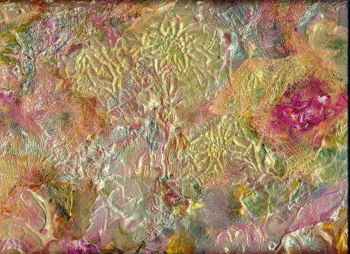
The above watercolor and gouache, “Sunspeak”, is “hot off the palette”, and framed in a 20″ x 24″ ready-made dark blue frame.  Beautiful ready-made frames are available at the BEN FRANKLIN store a few miles from our door.  Colorful frames have consistently dominated our walls at home, but suddenly I began to crave the mellow warmth of wood—maybe because we’ve had winter/winter/winter around here since early November.

Now my husband and I have begun to explore the St. Vincent de Paul Thrift Store (actually there are two of them close by) where we find lovely wooden frames for the proverbial song.   A measuring tape has taken up permanent residence in my handbag, and we search and measure at least once a week.  Joe removes the backing—paper or thin board, staples, whatever, and secures the hanging wires on the frames.  I line each frame up in Joe’s work area—either vertically or horizontally so he knows which way to attach the wire.

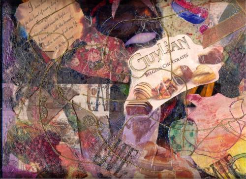
Here’s a sample of a recent painting presented in a St. Vinnee’s frame:

Wood Frame 1

My art is a series of baby steps, I know.  There are real artists out there with real training and real ability!  But every little baby step is a MIRACLE!

Margaret L. Been, February 2015

*NOTE:  I can’t say enough about the value of encouragement.  I’m continually amazed by the generosity of artists I’ve met—people whose work far exceeds my wildest dream.  Quite honestly, I didn’t always experience encouragement from fellow writers; my writing approbation came from contests, sales to magazines, and from people who enjoyed reading what I wrote.

I’ve often pondered why that should be so.  Perhaps writers tend to be more introspective than a lot of people and thereby preoccupied with whatever they are thinking.  I admit I’ve been that way at times—especially when processing the deeper things in life.  But to encourage another person is such a joy!  I’ve basked in that joy through teaching writing classes over the years.

Like writers, visual artists are tuned in to the world around them—to seeing and experiencing.  But then writers must retreat into the process of distilling their gleanings into words.  Words are miracles too,  But writing is a LONELY craft, at best—and it does demand periods of detachment.  We may be satisfied with our words, while wondering if anyone else will ever read them.  And maybe no one ever will—thus the conduit to sharing is severed.

Conversely, artists translate their impressions into explosions of shapes and color.  Regardless of level of expertise or lack of it, these visuals provide gratification.  We are tremendously fulfilled when we are pleased with our colors and shapes.  We can SEE our work, and others can see it as well.  Varieties of art are endless; each one of us is unique.  This very fact, plus the perk of seeing with our eyes, may create a glorious freedom to encourage others, and be encouraged!

Now isn’t the introspective writer coming out in this discourse?!  Gnawing, ruminating, analyzing, processing thoughts into intangible words?!  No wonder we writers can become ingrown toenails, even oblivious.  Time to go back to the palette and let the colors fly.  🙂

Read Full Post »

Swamp Fire

Awhile back I experienced a kind of “painter’s block” where I felt like I would never again be able to paint anything which might serve to slightly elevate my very low blood pressure, let alone anyone else’s.  This has happened to me fairly regularly over the past six years in which I’ve been making art.  Because I love art with a passion, I refuse to give up where my painting is concerned and I’ve discovered ways to boost my psyche out of any potential creativity block.

Along with “keeping on keeping on”, it helps immeasurably to add a new medium or avenue of expression to the art-making so that the process never becomes routine.  I have no desire to become stylized by reproducing cookie-cutter, look-alike work; hence I’ve added gouache to my watercolor stash and periodically I produce collages from a large collection of saved “everything” in terms of visual appeal, textural quality, and treasured memorabilia.  A new-to-me paint color, often from a new-to-me manufacturer, is another exciting form of recharging my art batteries and crashing through the artist’s block.

DVDs and books by artists are an ongoing source of inspiration to me.  I view and read them over and over, constantly finding something fresh and applicable.  Hence I have not one but many teachers.  Recently I received an absolute no-fail “block-buster” via a new-to-me DVD, by a new-to-me artist/art instructor:  British watercolorist, Ann Blockley.

Ms Blockley’s love for nature springs to life through her exquisite paintings achieved with a variety of methods.  She uses acrylic ink, oil pastels, and other materials in her work, reflecting a vitality and sense of beauty in the smallest details of nature alongside a background of landscape bordering on abstract forms which I find tremendously compelling.

Ann’s color choices leap over any possible boundaries which might threaten to confine a painter enamored with, or driven by, objective realism.  Much as I appreciate the incredible skill represented in realistic art, my head and heart are stirred by work that overcomes those boundaries—work that embodies mystery and stirs the imagination.  If I want realism, I enjoy photography—another fantastic art.

In her DVD, Ann Blockley stresses what most artist’s value:  painting what we love, from our experience.  Although Ann paints in her studio (a charming antique outbuilding surrounded by her lush garden on her English country property) she gathers inspiration in time spent outdoors with nature in all seasons.  She sometimes sketches details which capture her interest when walking, and gathers information concerning subject matter to develop in her studio—along with branches of seed pods, leaves, and flowers which bring nature indoors.

I feel akin to this artist, as I never never can go for a walk without bringing in something:  pine cones, some fallen nuts (even just nutshells cleaned out and abandoned by squirrels), stones, leaves, dried on the branch flowers, etc.  Our visiting great-grandchildren love to sort through my numerous stones and rocks—plus shells that I’ve collected myself on inland beaches along with gorgeous ocean shells which have been given to me by friends who spend time on ocean beaches.  Thus, after viewing the Blockley DVD a few times, the above rendering of a swamp emerged.  Like THE GIRL OF THE LIMBERLOST, I have always loved swamps, and Joe and I were privileged to live overlooking a Northern Wisconsin swamp for several years.

So thanks to one more British artist, I have leaped over another incident of artist’s block and I’m re-energized—raring to go on.  My list of favorite and most inspirational water media teachers, through books and DVDs, has grown again.  The list includes one Canadian artist, one American, and four from Britain.  Those stats tell me that since the venerable art of watercolor painting (or rather watercolour) was long-ago perfected in England, we “colonists” can be eternally grateful for our heritage!!!  I know that I am!!!  🙂

Margaret L. Been, November 2014

Read Full Post »

Castle at Oban, County Argyll #2

Have you ever noticed the plethora of paintings that abound at garage sales, resale shops, and sometimes even in an antique mall?  These works, often created by people like you and me (home-grown, everyday artists as opposed to those who are world class or at least widely known) may be sold for anywhere from $15.00 to 75 cents by the artist himself or some family member who simply doesn’t have space (or an inclination) for “Grandma’s art”—or whatever else it might be.

I have purchased a lot of these works at rummages, and I’m always happy to make room for them in our home—even if it’s a bit of floor space against a cabinet or desk.  I marvel at the skill represented in “rummage art”, and always wonder why it’s up for grabs at a ridiculous price rather than adorning someone’s wall, or standing in the studio of its still-producing creator.

Perhaps in many of these cases, the artist just quit making art.  Somewhere along the line he or she lost interest in the process—while quite possibly thinking:  “I’ll never be “good enough”; so why bother?”

Most artists (whether well known or otherwise) agree that given an absolute passion for making art and access to good quality materials, anyone can be an artist!  Of course along with the passion and the materials, one must be willing to devote time—lots of time—to one’s chosen medium of expression.

Likewise, most painters agree that every artist encounters periods of self-doubt—days when nothing goes right in the studio, and times of incriminating flashbacks where we consider a previously accomplished piece far superior to anything we are producing at the moment.  In my life-long discipline and profession of writing, this experience is called:  “Writer’s Block”.

As a writer, what have I done with Writer’s Block?  I’ve gone right on writing.  Thus, with what we can call “Painter’s Block”, I am determined to go right on painting—regardless of whether or not my chimes (or anyone else’s) are ringing over the work in progress.  There are ways to deal with the dry spells, and sometimes even prevent them.  Here are a few:

1)  Periodically invest in new-to-you colors of paint, from different manufacturers.  There is nothing like squeezing a generous blob of fresh, gooey paint from a brand new tube onto one’s palette, to give a person a kick in the rear (reminiscent of the commercial for V-8 Juice®).

2)  On “down days”, generate prints from your computer file of your own scanned-in art.  I produce lots of 3″ x 5″ prints, and affix them to artist quality blank stationery by Strathmore—a fine company located right here the Fox River Valley Paper Kingdom of Wisconsin.  I rarely buy commercial greeting cards or stationery anymore, as I have a huge inventory of art to share.

3)  Try a different technique, paint medium, or variety of art.  Periodically I branch out into gouache, and get excited all over again with its possibilities in combo with transparent watercolors.  On days when the watercolors don’t flow the way I want them to, I may move to my collage table and get atrociously messy with acrylics paints and mediums plus my bins full of saved “everything under the sun”—from Oriental papers, cheesecloth, feathers, sequins, ribbons, family photos, dried flowers and leaves, symphony programs, theatre tickets, wedding invitations, old letters, and scraps of yarn—to dog hair.

Recently I ordered a set of Winsor & Newton water soluble oils.  This is tremendously exciting, as traditional oils are off-limits to my tetchy breathing apparatus.  Scientists have discovered a method of changing the molecular structure of the oil base (linseed oil, most likely) so that “oil paints” will dissolve in and clean up with water!  No turp, no toxic fumes.

4)  Take out a dud which you very fortunately neglected to file in your trash bin.  (Some flops are worth saving, for reworking.)  The above-pictured example was a really stressed out piece of Arches 140 lb. cold press paper—apparently “ruined” on both sides with failed attempts at a landscape.  I had one more go at vigorously scrubbing* the paper, removing all but faint tints of the paint.  (Arches holds up remarkably under such abuse—whereas some other brands of 140 lb. paper will not).

Due to the scrubbing, virtually all of the sizing was removed from the paper, creating a totally different effect from work on fresh, clean Arches cold press.  Without sizing, there is no resist and the paint soaks and soaks.  Therefore any paint containing sediment is apt to look more “sedimentary” with this process; the paint soaks away and the sediment remains—along with the scribble scrabbles of fiber which surface when you were destroy your paper.  Never mind all that.  Just keep plugging along, to see what will happen!

Not all my duds are as satisfying when reworked as this one, which is called “Castle at Oban”—because it recalls a trip my husband and I made to my ancestral home of Argyll.  Scrubbing the living daylights out of paper can create a total mess, but my Scottish Castle turned out to be kind of moody.  I like it.  It enabled me to work through Painter’s Block, and the very next day I created a work that truly delighted my heart.  Here it is:  Kingdom at Sea”.  I must have castles on the brain—and probably beautiful Scotland as well!

*A fantastic aid for scrubbing out paint, is the MR. CLEAN “Magic Eraser”®.  This unbelievable product removes stains and spots from all over the home, as well as on art paper.  My husband says, “It’s just a sponge.”  But I never knew a sponge could do what MR. CLEAN accomplishes with his “Magic Eraser”!

Kingdom at Sea

Margaret L. Been, ©2013

Read Full Post »

The Softness of Dawn I

Recently my husband and I were treated to a visit to the Milwaukee Art Museum, where an exhibition of Rembrandts was on display.  My art museum experience is limited, so I was the quintessential country bumpkin—totally awed and “wow-ed” by the size and richness of Rembrandt’s paintings.  (However, most of them were self-portraits.  One portrayal of Rembrandt goes a long way!)

Obviously, there is nothing like the medium of oils to capture depth and complexity of texture.  Acrylics may mock the effect, yet somehow they look “so acrylic”!  Meanwhile due to the fumes and my dicky pulmonary tubes, oils were never a consideration for me when I began my love affair with art. 

But I have no regrets!  I’m totally besotted with my watercolors—more and more as time passes and I become more versant in the beautiful language of transparency.   

The above rendering was achieved effortlessly—in fact all I did was charge transparent paint onto wet paper.  The water and paint did the rest.  This technique is intensely satisfying.  There can never be a duplication or a knock off, when an artist steps back while letting the materials make the art. 

This humbling experience reminds me that maybe I’m not really an artist at all—but rather just a facilitator.  Obviously, Rembrandt and others of his genius—past and present—really have been and are artists.  But for me, I’m thoroughly delighted with “The Gift to Be Simple”!  🙂

Margaret L. Been, ©2013

NOTE:  Although most water soluble paints (including acrylics and gouache) can be thinned to a modicum of semi-transparency, some watercolors are highly transparent.  Any watercolor starting with the word “Quinacridone” will be transparent, as will many of the Winsor & Newton paints.  As well as Winsor & Newton, I also use (the very affordable, professional quality) American Journey Paints.  American Journey has a gorgeous bluey-greenish transparent color called “June Bug”.  

Regardless of brand Permanent Magenta, Alizarin Crimson, Dioxazine Purple, Indigo, and French Ultramarine are normally transparent.  Gamboge (a gloriously rich yellow) is semi-transparent.  These, along with June Bug, are major players in most of my paintings.

Margaret L. Been, ©2012

Read Full Post »

The collages just keep coming!  Given the plethora of photographs in boxes around our home, textural items stashed in storage units under tables, and jars and bottles of acrylic paints and other media stacked in crates, the collages may never quit!

Last week I took a trip in my mind to Northern Wisconsin, where we have a home (actually two houses) and some acreage on a quiet flowage bay.  Photos propelled me into a landslide of memories, as the cool woodsy/lake colors flowed onto a large gallery wrapped canvas—too big to run through my scanner.  I took the above shot with my digital camera which never quite does justice to colors and textures.  But anyway, here it is.

At the moment this collage hangs over our fireplace in the living room.  I have more art work than spaces here, so I rotate the big pieces.  That in itself is a lot of fun, like rediscovering an old friend when we take one painting down and hang another.  A cool “up north” collage is just the thing for the high 90s we are currently experiencing!

Margaret L. Been, ©2012

Read Full Post »

Older Posts »