Feeds:
Posts
Comments

Archive for the ‘Watercolor tricks such as salt and cling film’ Category

Almost a year — and what a year! I had decided never to blog again, as I so love NOT having to sit at my computer, when I have so many fun hands-on things to do. But in recent days, a current issue surfaced that I simply had to address or I would not have been able to live with myself. Yesterday, I posted that issue on my NORTHERN REFLECTIONS blog. Today, because an art blog is the most fun of all, I am hereback again.

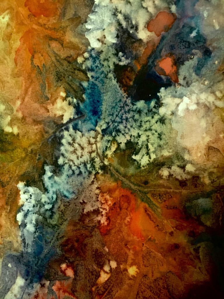
Ever since I can recall, I have been besotted with leaves–especially those that drift from the trees in autumn. As a child, I colored fresh-fallen moist leaves with my crayons, and then pressed the colored leaves onto white cloth with a hot iron. For decades I have been gathering the perfect specimens of autumn bounty, and drying them beneath pages of heavy books. In recent years, I have made collages with these dried leaves on gallery wrap canvas panels, adding acrylic paints and a final fixative before hanging on the wall..

So for me, leaf art is nothing new. But this last fall, I was tardy in my gathering. By the time I was rustling and crunching around in the fallen leaves they were mainly dried, curled, and FRACTURED. Thus the idea of “Fractured Leaf Art” was hatched. The results were so intriguing, so nurturing to my voracious appetite for the abstract that I may never look back!

There are no two Fractured Leaf Paintings alike. And the process is so basic that any six-year-old, given the need for patience between stages, can produce a painting to be proud of. Since I have many young people in my family, I am eager and excited to share THE PROCESS!

I quickly discovered that the best Fractured Leaf Paintings (in my opinion) are achieved on Yupo Paper–that odd, shiny surface that is not paper but rather a “poly . . . . something”, in other words a kind of plastic. I spray the Yupo with clear water, and then spread 2 or 3 watercolors of my choice randomly around the surface, tilting the piece and causing the colors to merge. Then I press the fractured leaves or pieces of leaves onto the wet paint–again randomly. To this beginning I sporadically add more paint colors and salt, and press plastic food wrap (like Saran) over the entire surface. With my fingers, I crinkle and bunch up the food wrap, creating bubbles, creases, and a myriad of lines. This whole bit gets weighted down with heavy books, jars of brushes, or anything else with heft.

After a couple of days, I tentatively remove the food wrap to see if the surface is dry. Obviously Yupo takes longer to dry than normal watercolor paper, because the Yupo is not absorbent. When everything is really dry, I remove the leaves and scrape off the salt with an old credit card. Voila! Fractured Leaf Art.

At this point the painting may need a little tweaking, perhaps some more paint or the emphasis of a few lines or branches along the creases made by the food wrap.* Or the piece may be gorgeous as is. In the above pictured painting, I did not tweak. To me the painting was just right in its natural state, and realizing my tendency to overwork my art I decided to add no more.

Always, when using Yupo I spray the work with an acrylic fixative. While not striving for museums, I do want my art to last for at least a couple of lifetimes.

So you might have a go at Fractured Leaf Art. I definitely live in a four season zone. (Wisconsin: Spring, Summer, Autumn, and Winter/Winter/Winter.) Different locales have different trees, and it would be fun to expand my leaf knowledge. Perhaps my Florida family members will bring me some palm leaves.

Margaret L. Been — January 14, 2021

*When adding branches or lines, I have discovered a trick of using a DERWENT INKTENSE PENCIL which has been dampened, rather than a paint brush. The damp ink pencil adds a soft, blurry line rather than a harsh one. I favor organic as opposed to the popular geometric style of abstract art.

**An excellent Austrian fine artist does amazing paintings using all kinds of wild materials gleaned from her nature hikes. You can check out this mixed media artist and her books by GOOGLING her name, Waltraud Nawratil. You will not be disappointed.

Read Full Post »

It’s that time again—when it’s all about flowers and most anything green. Spinach salads, trips to the local garden center to find more INDOOR PLANTS, dreaming of the outdoor gardens while the temperature beyond our doors and windows hovers below freezing, and frequently below zero.

The end of our lane contains a pristine white mountain, where the plow has heaped snowfall after snowfall so that we in our condo community can get out of our garages. This is Wisconsin, USA, and that snow mountain may be with us for several more weeks. But all I can think is FLOWERS.

The above allusion to flowers has seen many mutations since its beginning in late January. Several times it almost got pitched in the recycle bin, but with each frustrating session I came back with renewed vigor and determination. I simply had to have something to show for the New Year!

This painting is 16″ x 20″, and is now framed in a lovely antique wood frame, on the wall beside my piano. I like the rendering, but up until a couple of days ago I definitely did not! Here is why: It started out with a photo realism approach—something that normally doesn’t work for me! The flowers were a dark magenta, with blobs of yellow here and there and something that was supposed to represent sky—in overly predictable blue.

The magenta was overpowering. My well educated husband walked by my art table and preempted my thoughts by commenting, “It needs some white.”

So I attacked the magenta flowers with white gouache (always my friend in coverups.) But somehow the white took over. More yellow. More magenta. Then some alizarin crimson to deflect the winey magenta.

Then more yellow to light it up even more, more blue to anchor the piece to the table—but this time aqua blue, always a winner. This all sounds fast and frenzied, but it took weeks punctuated with days for drying (I tend to gob the paint on thickly), excursions to our local medical clinic where our body parts are kept in running order, and time out to eat and be sociable. And sometimes I slept.

Finally the paper was so clotted with layers of watercolor and gouache IMPASTO style, that I had a fleeting sense of nausea. “You are going to have a bath,” I almost shouted at the paper which was actually curling up on its edges from the barrage of paint.

A bath indeed. Not a shower, but a soaking in our kitchen sink. I brought the dripping mess back to my table and plunked it down thinking I would attack it once again, as it began to dry. But then the magic appeared.

The gross top layers of paint were gone. Somehow much of the yellow had turned to a soft green when blending into the aqua. The magenta/crimson combo had turned a light lavender when confronted with shades of blue. While the paper was still damp, I covered it with plastic food wrap and squished the wrap with my fingers to create creases.

When I removed the plastic the next day, I felt like apologizing to what I found—a lovely bit of art for which I could hardly take credit. As is so often the case, the paint knows best! 🙂

Margaret L. Been — March 2nd, 2019

Read Full Post »

Growing more and more enamored with abstraction, especially that which is soft-edged, flowing, and organic as opposed to geometric, hard-edged, and harsh, I was tremendously pleased with the above 24″ x 20″ rendering—so pleased that I framed it and the mysterious painting is hanging high in our living room, brightening up the entire wall.

When I study the painting, I imagine different scenarios:  a moonlit swamp; a campfire; the triumph of light over darkness and joy over sorrow; the vicissitudes of a long life on earth.  The print which you see does not do justice to the colors therein; they vibrate and rock.  Recently, the “vibrate and rock” appealed to a seven year old great-grandson/friend who came for a visit and art making.

“I want to do one like that,” Deacon decided after studying my various paintings on our walls.  Then he excited me up to my earlobes by saying, “I like the way the colors run together.”  Do I have a kindred soul here, or what?

Deacon proceeded to create his own mystery painting.  He learned that simply painting color over color with a loaded brush creates blackish-brownish mud, which I praised and applauded because children’s art is ALWAYS wonderful.  Then I showed him how gently introducing colors to different areas of wet paper, while jiggling the paper to let the wet colors mingle, causes mysterious marks never to be reproduced in the exact same way.

There wasn’t time to introduce salt and plastic wrap which add texture to a painting, but hey—we quit art making in order to fly kites with Deacon’s great-grandfather (my Joe) in the park outside our front door.  Kites are important, and highly symbolic of our free and funky Boho lifestyle.

My, aren’t we full of metaphors and similes today!?!  Having written poetry most of my life (since I could first wield a pencil or pen), I tend to think in metaphors and similes.  They are everywhere and—like paintings and kites—the colorful ones are the most fun! 🙂

Margaret L. Been  —  May 2nd, 2018

Read Full Post »

Art Tools

Here are some more items in my bag of tricks.  Working down through the horizontals:  a large comb for making streaky marks*.  I also use a small, rat tail comb; a tooth brush for spattering wet paint; tongue compressors—I can’t recall where in the world I got those things but they are great for measuring and marking on those rare occasions when I use a pencil; a candle for creating areas of wax resist; a defunct credit card for scratching lines—making streaky grasses, etc; a knitting needle for making branches; and a jar lid mainly for making moons.  I have several different size jar lids.

The verticals are craft Q tips of which I found hundreds—I think a lifetime supply—at a church rummage sale years ago, and a Mr. Clean Magic Eraser which rubs out areas of paint for various effects.

Not pictured are masking tape for masking out trees or buildings in order to preserve the white paper while painting a background, facial tissue for dabbing out clouds in a wet sky wash, and probably some other odds and ends which momentarily escape me.

I have always been a pack rat (albeit a very well organized one) and it’s so much fun to have an ongoing excuse for packing stuff in!  Fortunately, I grew up with parents who let me have my own bit of Heaven in my childhood bedroom (probably because I was compulsively tidy); and for nearly 64 years I’ve been blessed with a husband who also enjoys being a pack rat.  It could be disastrous if we disagreed on what is important in life! 🙂  MLB

*One of my favorite artists whose books and DVDs I treasure, British artist Shirley Trevena, introduced me to the comb streaking trick.  Shirley’s still life watercolors are intriguing.  Shirley says what she aims for is “an incredibly messy painting with lots of drips and blobs”, and she demonstrates how she “destroys” a painting—often with a comb streaked through wet paint, blurring the colors.  Shirley’s “incredibly messy”, “destroyed” paintings are gorgeous—whereas when I try her tricks the results are often simply incredibly messy and destroyed.  Good grief!!!

Anyway, for a treat you can GOOGLE “Shirley Trevena, artist”.  You won’t be disappointed!  🙂

Read Full Post »

Heading Home for Good.jpg

I doubt there is any middle ground with Yupo paper.  One either loves it or hates it.  The “haters” are those artists who demand control of their paints, and always work with an unflappable agenda in mind.  These folks create beautiful works of abject realism, and often artists of palpable realism are highly trained and amazingly gifted—especially if they achieve high end realism in watercolors.  Everyone knows that chasing watercolors is a bit like herding cats.

I am neither highly trained nor amazingly gifted, and fortunately the art I love the most does not fall in the category of abject realism.  My favorite artists, the French Impressionists, Post Impressionists, Les Fauves, etc. who worked largely in oils were realistic to a degree, but always with an intensely personal voice.  For anything other than “personal voice” I would use a camera—and for me, that wouldn’t be half as much fun as getting out the Yupo and letting the paints fly hither and thither.

Last week my good friend and fellow artist, Vikki, and I shared an art day at our dining room table.  We began on Yupo.  My rendering was, for starters, terribly generic and dreadfully similar to stacks of other paintings I’ve done:  tree – space – tree – space;  leaves and blossoms on tree – space – etc; and plomp – plomp – plomp – ad nauseum.

Now I detest—and desire to always eschew—the plagiarizing of any thing or any person, including myself.  So that night I looked over this Yupo thingy, almost upchucked, sprayed it with my trusty water bottle, pressed plastic clingy food wrap onto the entire surface, and went to bed.

The next day I removed the cling film and VOILĂ€!  Something I could further develop and live with:  the suggestion of a Viking ship* with sails, and lots of turbulence all over the place.  So much better than plomp – plomp – plomp!

I added delineation and definition via gouache to the vessel and its surrounding sky and water—leaving a plethora of confusion, color, and turbulence in the sails as if the depicted journey was, like many of life’s journeys, fraught with distractions, dead-ends, and disasters.

However I am always a positive-note person, so then I named the piece:  “Heading for Home the Last Time”—reflecting my blessed assurance in a glorious destination through it all, and eternal joy in the presence of my Lord Jesus.

Margaret L. Been, May 2017

*Because this painting is matted and framed to 12″ x 16″, it was too large to entirely fit in my scanner.  Thus the ends of the ship do not completely show on the print.  The original in its full size is more representative of an actual Viking ship.  Since my husband is descended from Vikings, and loves ships, I wanted to be somewhat realistic.  🙂

Read Full Post »

Ex 4

Ex 2

Ex 3

EX 1.jpg

Years ago I giggled when I heard of art instructors telling workshop participants:  “The paper is talking.  Listen to the paper!”  But now, in my eleventh year of art-making and experimenting with different watercolor grounds, I no longer giggle.  Paper talks!  Paper says different things about the paints and techniques applied.  For a fun demonstration of this fact, I did an almost identical landscape on the above four papers using identical techniques, with a slight variation in my DaVinci artist grade* colors.

First, I applied clear water to a wide horizontal strip at the top, and a smaller swath on the bottom—leaving a dry streak between the wetted areas.  Then the top wetted strips were washed with blends of phalo and French ultramarine blues—and the sky areas were sprinkled with Kosher salt.  Avoiding the dry parts, I added color to the dampened below sections:  red, green, gold, and a bit of blue—while, as always, letting the paints mingle on the papers rather than on my palette.  On each piece, I pressed plastic food wrap onto the bottom area while the paint was still wet.

The papers represented are, from top to bottom:  1) Yupo paper with its especially unique voice, particularly in the way it talks back to applications of plastic wrap; Numbers 2) and 3) 140lb sketching pad paper—American Journey available online at CHEAP JOE’S, and Canson available at many chain craft stores; and 4) Arches 140lb cold press paper by the sheet, available at online art stores (and neighborhood fine art stores, if you have one.)  (Arches is pronounced “Arshe”.  Remember it’s French, and I may scream if you pronounce it like those golden thing-a-ma-jiggies on the MacDonald’s fast food signs!)

Yupo has no tooth whatsoever; rather it has a shiny, slippery surface so it will always make it’s own statement, without even trying to imitate.  You may notice a smoothness because of a lack of tooth on the 2 middle papers as well:  the sketch pad papers.  Also, note that on the 2nd of the smooth-surfaced sketch pad papers the food wrap film caused the paint to slide up and nearly obscure the strip which I had left white and dry.

The Arches 140lb cold press displays more texture around the salt, and somewhat more under the plastic film, due to the presence of tooth.  And on the Arches sample there is a charming bit of “cauliflowering” where wet paint has oozed into the dry area, also caused by tooth.

(Cauliflowers will normally be very prominent on paintings where wet colors collide on Arches 140lb cold press and comparable fine papers—especially when freshly painted strokes touch not-yet-dry parts.  Traditional watercolorists will practically do headstands to avoid cauliflowers, while I perform similar gymnastics just to make sure that I create and preserve them!  “Different strokes for different folks!”)

Different papers have different stories to tell.  By listening (LOOKING!) you can begin to ascertain what more you might want to add or change to complete the work, or do alternatively on another kind of paper.  In the above cases, done mainly for the purpose of illustrating variations in papers, I have done nothing more to any of the samples.

Margaret L. Been —  April, 2017

*My husband and I are blessed with many great-grandchildren.  (Dare I brag?  Well, I’m going to:  we are blessed with 18 of them—so far!)  Frequently, we have art days at our dining room table; what a delight!  Although I sometimes let the very young children slosh around on the economical sketch pad 140lb papers before launching into the high quality “Arshe” sheets which I nearly always use for my own finished work, I am terribly fussy about 2 aspects of art for all ages:  good brushes and artist grade paints.  No matter how young the beginner, good quality brushes and paints are essential.  Poor quality yields disappointing results, and the potential future joy in a pastime of art-making is not to jeopardized:  not at my table!!!

And that’s no April Fool!

Read Full Post »

more-mossflower

Brian Jacques’ REDWALL Chronicles* are a treasure trove in every way:  gripping cliff-hanging plots, amazing characterization, plenty of humor—both subtle and downright slap-stick hilarious, AND painterly descriptions on every page.

Now I have the entire series of 22 novels, and am reading them in order.  Currently, I am into the 4th book, and have begun underlining or otherwise notating passages which may move my brushes and paints into action.

Above is another rendering of “Mossflower Wood and the Quarry”.  When I first painted this 24″ x 20″, I positioned the rocklike slabs at the top, and the nebulous tree shapes and foliage at the bottom of the horizontal format.  After matting and inserting the painting in its protective, clear plastic envelope, I accidently turned the piece “upside down” and immediately decided that I would hang the “upside down” as “right side up”.  That’s part of the fun of abstract art; it’s flexible and open to many interpretations!

Margaret L. Been, 1/26/17

*I have an inkling that Brian Jacques was a fan of Charles Dickens, judging from some of the hilarious names in the REDWALL Chronicles, especially the names of the scoundrels who are typically personified foxes, rats, stoats, ferrets, weasels,  and predatory birds:  names like Dripnose, Halfnose, Skinpaw, Ashleg, Ratflank, Darkclaw, Deadglim, Fishgill; and these are merely starters.  🙂


Read Full Post »

Here is another British watercolorist who inspires me again and again through her books and DVDs.  Ann Blockley creates unforgettable, unique scenes which are, in her words unlike the “candy box scenes” we are accustomed to seeing.  Rather they are imaginative, and deeply personal—inspired by sights, sounds, and fragrances of familiar places around Ann’s home in the Cotswolds.

While demonstrating techniques for using watercolor in tandem with India ink, water soluble crayons and ink sticks, salt, plastic wrap, texture and granulating mediums (employed with a relaxed realization that the tools and techniques may decide their own path on paper, different from that which the artist has foreseen) Ann has challenged me not only to experience nature with all my senses, but also to take a deeper look at my photo books and computer files of favorite places I have lived:  to let the essence of these scenes penetrate my mind and heart, with the goal of more effectively expressing beloved places in my art.

The photos recall a lifetime of favorite places including:  my small-town Wisconsin  childhood home with a quiet stream at the base of our apple orchard; the Wisconsin Northwoods and waters where we vacationed when our children were young and where Joe and I lived full time for eight years beginning in 2001; my “home away from home”, Colorado where I spent a year at school, where Joe and I lived during his stint at Ft. Carson, and where we have visited many times since; more western vacation areas—Northern New Mexico and the farthest NW corner of Washington State; and our present home in Wisconsin’s Southeastern  Lake District:  a pleasant blend of small communities northwest of Milwaukee with lakes, rivers, woods, and a few remaining farms.

I will never live long enough to even begin capturing on paper the abundance of beauty which has underscored and punctuated my 83 years.  But I’m making a start, greatly motivated by the work and encouragement of UK artist Ann Blockley.  Here are a few of many scenes which I’m studying with a mind to painting—not with photographic accuracy but rather in response to their essence, in the coming year:

my-childhood-river

my-prairie

goldenrod

autumn-bog

DIGITAL CAMERA

under-our-windows

river-bank

gorgeous-clouds

Margaret L. Been — 1/22/17

NOTE:  If you GOOGLE Ann Blockley’s website, you are in for a TREAT!  MLB

Read Full Post »

under

far-out

No, I haven’t been lazy since the last entry.  But most recent renderings have been too large to put through my scanner—like 16″ x 20″ and 20″ x 24″.  Large paintings can be photographed, but that never works for me as well as a scan.

Featured above are a couple of little guys that I’ve sandwiched in between the biggies.  In the top painting, the watery effect was achieved with thinned white gouache drifted randomly over the rocks.  The second painting was experimental, with lots of goopy gesso topped with acrylic bead gel.  When the gesso and gel were thoroughly dry, paint was added to drizzle and drip on the textured ground.

Meanwhile, I currently have a hole in my head.  Maybe that’s not so funny as it sounds, but HEY!  Let’s laugh.  Arthritis is the creator of a one centimeter gap, causing (GOOGLE this one!) a diagnosis of Atlanto Axial Instability.  In plain talk, I’m a BOBBLEHEAD—the treatment of which, at this stage and perhaps in lieu of surgery, is a very fashionable neck/head brace fitted for me at our local Hanger Clinic.

The pleasant young man who fitted the brace commented that I have a long neck.  Then he chuckled when I shared that my maiden name is “Longenecker”.  I doubt very much that he caught the double entendre cached in my name; he is too young.  Had he fully grasped the joke, his chuckle might have been a guffaw.  Moreover, unless you readers have connections with the 1930s and 40s you may not realize that once upon a time the word “neck” was a verb as well as a noun—with “necking” being an active, enjoyable present participle!  🙂

Grammar and vintage fun aside, my brace is downright elegant.  With a red tint in my hair, I look something like Queen Elizabeth the First.  So what in the world does this stream of consciousness wandering have to do with art?  Namely, this:  for years I’ve painted standing up, with my head bending over a waist high table.  Now that I’m de-bobbled by a neck brace, this position is no longer comfortable.  When the head falls forward and down, I feel more like Elizabeth the First’s motherthe Unfortunate Anne.

I refuse to stop painting, so what to do?  Joe and I cuddled on the couch with my I-Pad, and scrolled down pages of standing easels.  Unanimously we concluded that spending an arm and a leg just to accommodate my compromised head would be stupid.

Then suddenly a light went on in said head:  my sturdy, adjustable music stand.  Although my violin retired from active duty years ago, the music stand has continually served in the capacity of displaying art.  Now the music stand has morphed into a standing easel.

Voila!  There’s always a way to make minor adjustments—even major ones when needed.  Life is GOOD!  🙂

music-stand

Margaret L. Been — November 20th, 2016

NOTE:  Happy Thanksgiving!

Read Full Post »

winter-sunrise-4-1

Like many Wisconsin children in the 1930s and 40s, I loved winter.  We would race home from school, scarf down some hot cocoa and cookies, put on a few extra layers, and go outside to build snow forts or bombard each other with snowballs.  In the depths of winter, it would be almost dark by the time we quit and went inside to hang our wet wool snowsuits on a steam radiator to dry.  (Oh, the aroma of wet wool heating up!)

I recall several occasions where I realized I was getting sick and could feel a fever rising in my body.  Thinking the outdoor cold would squelch the flu bug (or whatever),  I’d avoid mentioning how I felt to my very solicitous mother, and stay outside as long as I could stand my hot cheeks and shivering self before going indoors and allowing myself to be put to bed with hot lemonade and honey.

(“Sick” was no joke in pre-penicillin days when front doors of homes frequently sprouted warning signs such as:  Scarlet Fever, Diptheria, Measles, etc.  Children were put to bed when they had a fever, no matter what!)

What in the world does all this nostalgia have to do with THE MESSY PALETTE?  Simply this:  Now I am 83 years old and I no longer LOVE winter!  I have become a WUSS!  Granted, snow is beautiful.  In fact, I actually go out and tramp around in the first couple of snowfalls.  But in recent years winter has gotten old very fast.  By March, when I’ve wanted to peel off layers of clothing and renew my store of solar energy, I have found the snowy cold weather to be absolutely annoying.

Now, suddenly, I am tired of being such a WUSS!  I have some really fun and funky leggings and tights, and a drawer full of lovely, colorful sweaters.  I can dress like a clown.  And I’m psyching myself up for winter with my paints.  Case in point is the above sample titled “Winter Sunrise.” 

Determined to put a positive spin on the days ahead, I have created a Three Pronged Plan:  1) putting on another sweater when the indoor temperature drops to 70 or 68 degrees, rather than bumping the thermostat to 75;  2) staying outdoors longer each time I need to take my beloved corgi out to do his jobs; and 3) the aforementioned—celebrating winter with my paints.

Sometimes old geezers* go into a second childhood mode.  Since our corgi Dylan LOVES to roll in the snow, maybe I’ll start rolling with him.  🙂

Margaret L. Been – 10/1/16 

*Yes, I know.  The expression “old geezers” is certainly not politically correct.  Yikes!  Who cares?  Anyway, I can use the label because I am one!  And proud of it!

art-statement-photo

Read Full Post »

Older Posts »