


When I began art making in in 2006, I entertained a short period of thinking each rendering had to be of a different subject. But I quickly realized how silly that was, having had some exposure to art history in college. Didn’t Monet do a lot of haystacks? And lilies?
And how about Degas with his ballerinas? Winslow Homer at sea? Not to mention (but I will) Georgia O’Keeffe with her massive flowers and striking New Mexico scenes. Not that I am placing myself on a level with the above, but rather to simply say it is good to paint favorite subjects again and again. Each work will differ from its predecessor, and there is infinite variety possible via palette, season, details, mood, and the list goes on. Again and again.
I like to do waterfalls, ships in peril (I don’t want to BE on one, just to paint it), trees waving in the wind, adobe structures, gardens, bowls of fruit—and pots, pitchers, bottles, and jars often in the setting of a windowsill. There is something about the bones of structure, even in the evanescent ideas I like to present.
At the top of the page you see what is one of my very first attempts at watercolor. In a book, I’d found a repro of a painting by Fine Artist Jeanne Dobie, where she portrayed bottles in a window not by painting the bottles themselves but rather through showing the liquid color contents of the bottles surrounded by white paper representing light. Pretty leaky bottles (mine—Jeanne’s were stunning). But that was 2006 and it was what it was.
The next one down is a quick colored pencil sketch through the window of a rented condo in Santa Fe NM, where we spent a wonderful Easter week with our son, Karl, and his family in 2008. The NM scene is followed by three more window bits with stuff in the windows, then followed by an albeit primitive and super child-like rendering of Milwaukee’s South Side as viewed through a lobby window at St Luke’s Hospital where my husband was undergoing cardiac care. That painting, as odd as it is, is close to my heart because of the stressful time it represents in our family. Painting IS therapeutic!
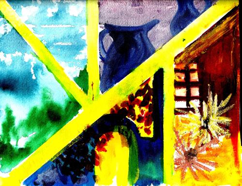
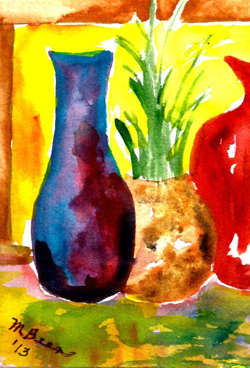
The domes of Milwaukee’s South Side, historically Polish and Serbian, are followed by a 2013 window scene—getting just a little bit more presentable. Then comes a 2016 scene which I like a lot. The print doesn’t do the painting justice, as in real life the colors and shine are noteworthy—and so is the real life size, which is 20″ x 24″. I like wet, blurry effect, which was achieved with Gum Arabic. (I tend to get that name mixed up with what I put in my gluten-free baking: Xanthum Gum. I hope I don’t get the gums mixed up in the cookies!))
One more of blurry bottles. I like the frayed and fringy effect in the yellow/purple on the right side—produced by wet color introduced alongside another, slightly drying paint. This works best on wet paper, and I love it even though it drives some watercolorists crazy.
And finally, the 12″ x 16″ pictured below is my very latest studio creation. The wood on the window was textured by dropping Winsor & Newton Texture Medium onto the wet paint with a pipette or medicine dropper—one more tool of the trade available with acrylic ink bottles, or from your local pharmacist.

Since I will probably go on doing window scenes, along with Peril at Sea, etc., I am covering the latest in this series with one name, “Dans la Fenêtre”—because I am besotted with the FRENCH LANGUAGE (in which my proficiency is nearly zero on a scale from one to ten. 🙂
Margaret L. Been — March 18, 2018


